Initial ideas and concept development
After being given the first part of the project brief me, Leoni and the marketing team discussed what we would like the project to look like. While the marketing team went off to do their own side of the research into trends and users, Leoni and I created a set of mood boards. The main one we created shows the visuals that the official world cup has created. We will be using this in our project so the fans of the world cup can easily associate our work with the world cup.
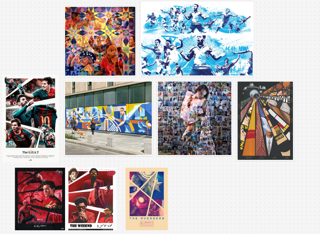
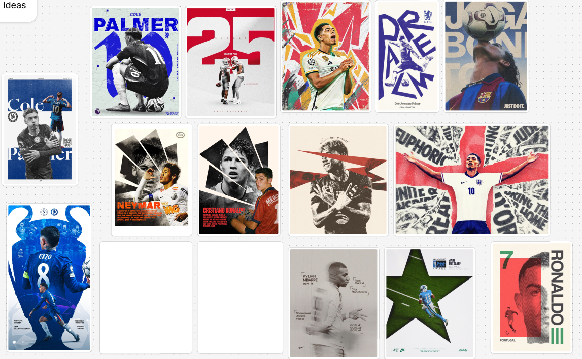
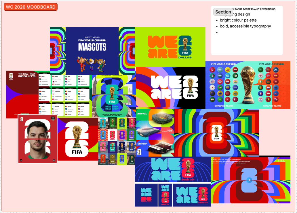
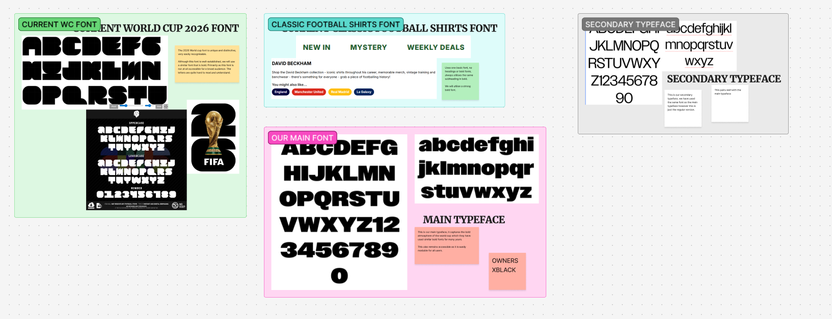
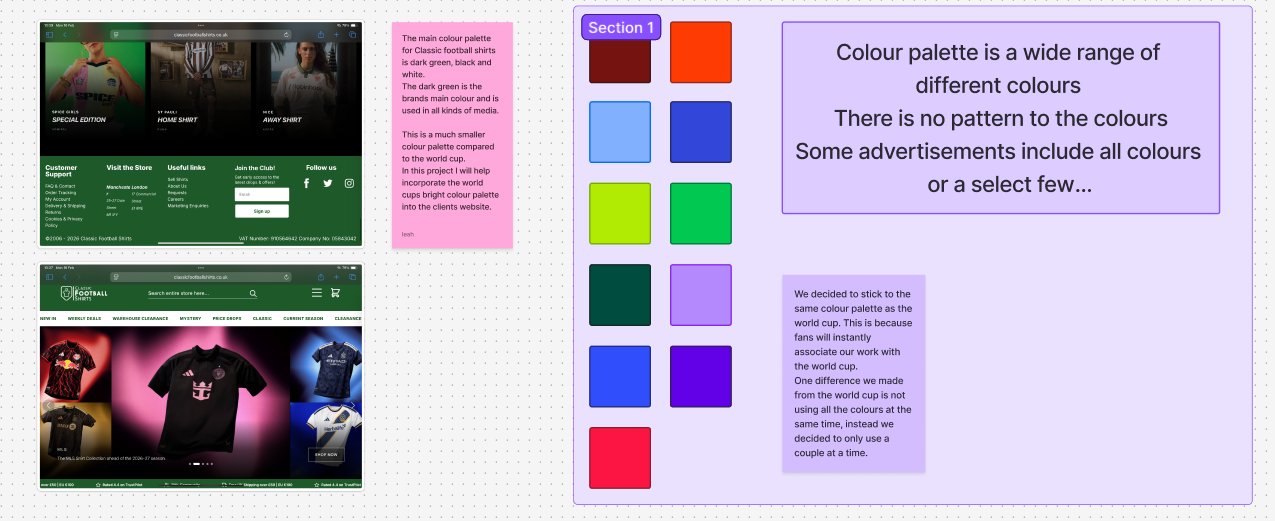
The next mood board is full of inspiration that Leoni and I think would work in our project and looking at brands previous advertising. Throughout our and the marketing teams research we discovered what users best interact with and what sells better. Keeping with the world cups branding we decided to use a bold font. For this reason, we also decided to keep to the world cups colour palette as possible. However, unlike the world cup, we won‘t be using them all together as we think it would take away from the imagery we want to add of popular teams and players. We also need to add some colours from Classic Football Shirts.
Before we made any posters, we investigated the research some of the marketing team sent us and met up with them to talk about what they want. They showed us research that they did and informed us of the most important parts we need to include in our work. This includes what social media would reach the most users and what players and teams are the most popular. This will help our work stand out because using the what’s the most popular will create the most engagement and draw the most users to the client’s website, Classic Football Shirts. The marketing team researched into the main demographic of football consumers and those most likely to buy merch. We also found that users are most likely to buy football shirts around the time of the world cup
The Big Idea – Teamworking
After meeting up with the marketing team Leoni and I got to work making some early designs based off our mood boards. The marketing team asked us to make posts for Instagram, TikTok and physical media. We made some sketches and early concepts for the marketing team and our client, Ash to look at and give their feedback. The main feedback we got was the colours and how to not let them take away from the imagery. The next piece of feedback was on the players we chose. Our work mostly used t-shirts from the current team’s design and current players. The problem was one of Classic footballs shirts main products is vintage shirts. To improve our future designs, we will add shirts from past world cups and the star players of the time. In some of our early work we added the slogan ‘shop classic’ because the marketing people told us it helps make a memorable impression. After showing our first outcomes to the marketing team, they brought forward their own inspiration to us. Unfortunately, the inspiration was ai generated so we had to meet up and find a compromise as these images are unachievable and can draw users away. We explained to them why none of these images would work well with the style, colours and font we have already chosen for this project. They eventually saw our point and let us continue with the design we made.
The Big Idea – Design Responses
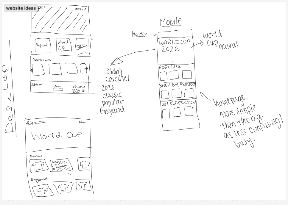
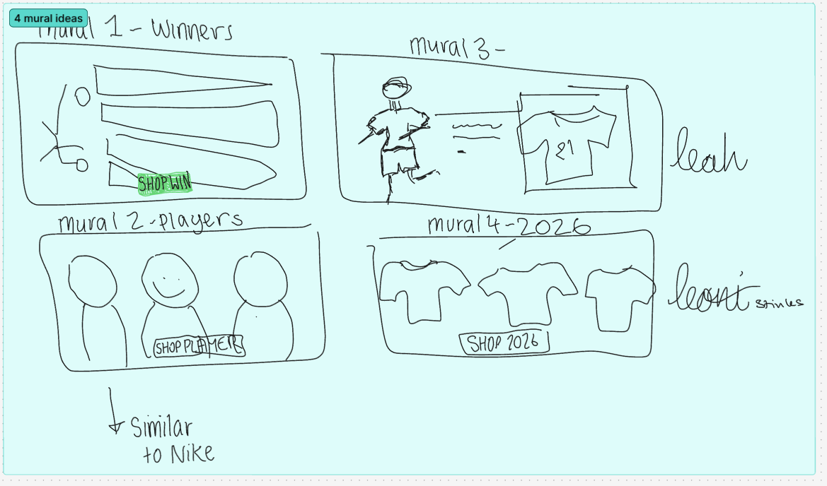
Here are the first sketches Leoni and I made based off our mood boards. One of the first design concepts we came up with was a mural for the sights landing page. Here we both made some sketches based off the research we did.
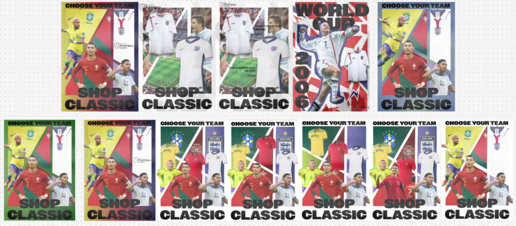
Our next idea was to make some Instagram posts showing off the shirts for sale from Classic Football Shirts. The first concept included multiple shirts from different teams. The focus of this post was the team’s logo. The main reason for this was to catch users’ eyes. We also came up with a slogan as the marketing team found it would be good for advertising and building brand recognition. After a couple different layout and colour ideas we decided no not continue with this design. The main reason was the colours didn’t compliment the football shirts well and didn’t make them stand out like we wanted. The other reason was the text stood out too much and distracted you from the main selling point, the shirts.
From the feedback we got from the client and marketing students, Leoni and I now have a clear picture of what they expect from us. Later in this project I will continue to create more designs and get feedback on it.