This is a collaborative project that is targeted at a young adult and teen audience to convince them to eat their 5 a day. We took into consideration the types of fruit and veg chosen with what’s cheapest at the time of making this. Our goal with this project is to bring to light the importance of eating healthy to our audience.
First Project
Initial Research
Here is the initial research me and my work partner did into existing posters surrounding fruit. When choosing our fruit and veg we made sure to choose cheaper options so that it’s more inclusive. The style of post we chose uses striking visuals of fruit with bold text usually with the name of the fruit .
Early designs
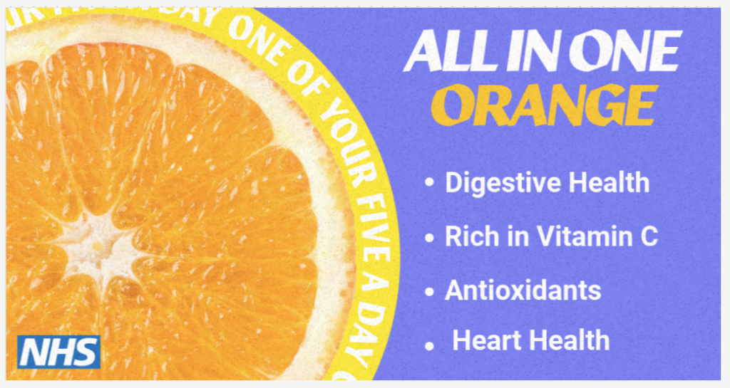
Here are the early designs we made based on the research we did into existing posters. I chose to start with an orange. I wanted the colours of the orange to stand out so I chose a colour that clashes best. Here I experimented with type and layouts.
Rejected designs
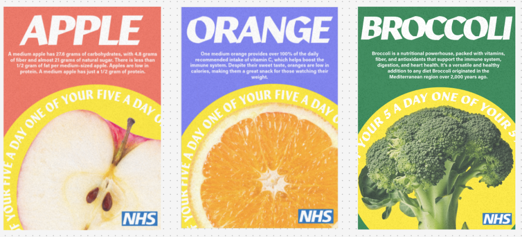
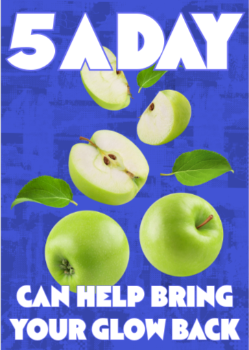
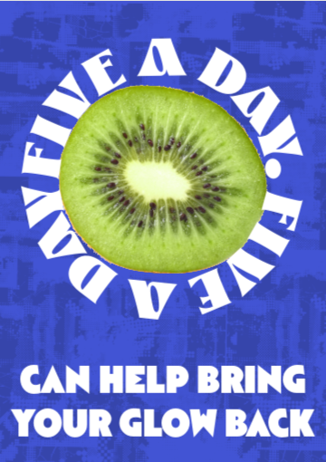
Here are the first outcomes of the posters we made. I like the colours chosen for this and the striking visuals of the fruit. I think the posters do well to inform the viewers on the subject of 5 a day. However I think there is too much information on the poster that can be hard for users to read from a distance. I also think the large text with the name of the fruit or vegetable is unnecessary because the audience is old enough to know what fruit or vegetable it is based on imagery alone.
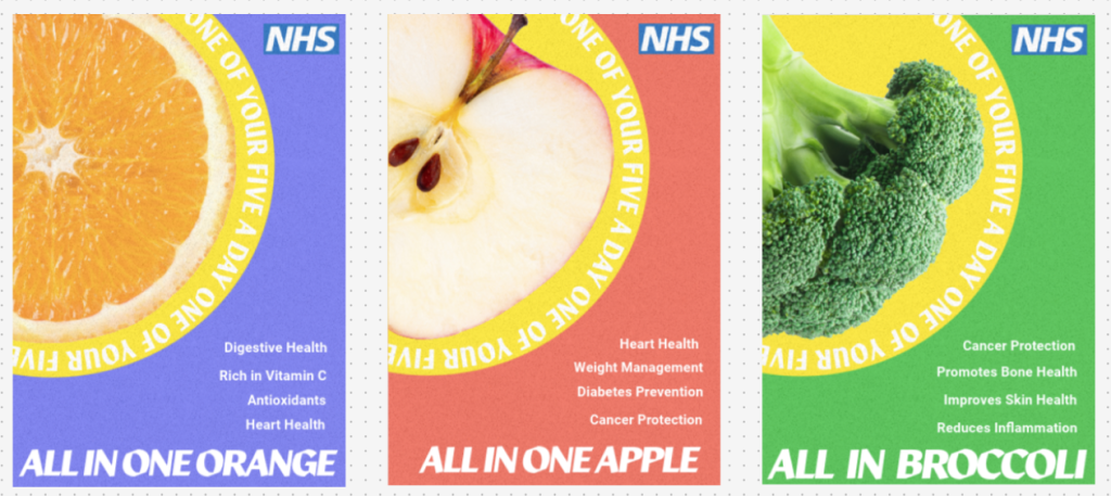
Final Outcomes
Second Project
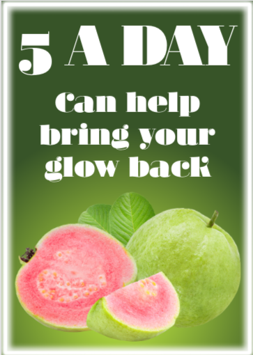
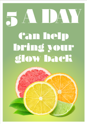
This second project is a collaborative project between me and Leoni (Graphic Design) and the marketing team. The purpose of the project is to influence the residents of hull to include more five a day in their diet. The campaign we decided on focus on is women in Hull dealing with dry and dull skin. The goal of this campaign is to encourage more vitamin C in women’s diets.
Here is the intial research me and Leoni did into different styles of posters to present to the marketing team. We wanted to give them a wide range that Leoni and I both liked and thought would fit well with our chosen project. Unfortunally they did not like any of them so we had to go back and find different inspiration.
Here is my first set of outcomes that I made based off the reference images they gave us (That were made with AI). I did my best to make it in my own style and created my own tag line. Unfortunatally they did not like these outcomes so I tried a different design.
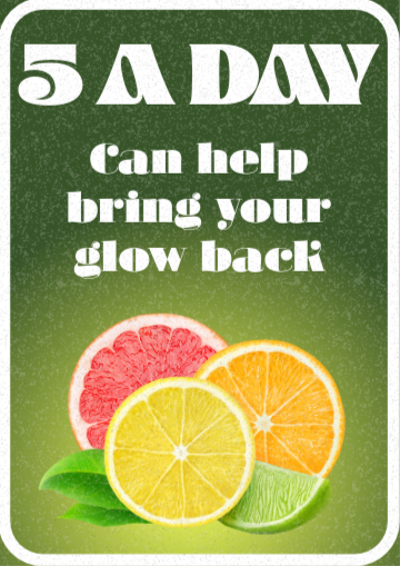
These are my next outcomes, I tried to follow the colour scheme of the reference images closer. I was not happy with the outcome of these posters so I decided to not continue with it.
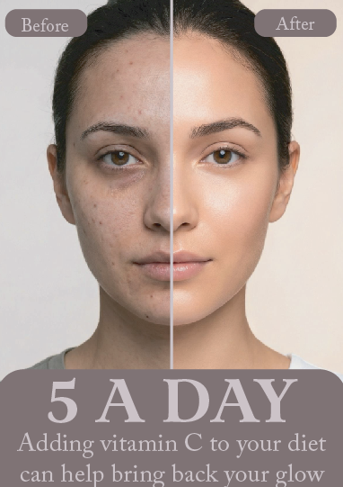
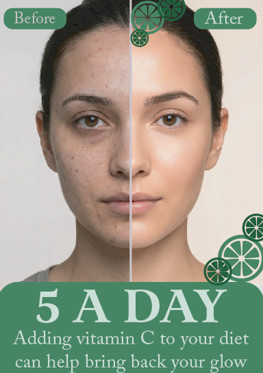
Here are the final outcomes for my part of the project. I asked the marketing team what they wanted. They requested I make a before and after with someone’s skin. They wanted it to be as close to the project subject as possible. The poster on the right is my final outcome and what was used in the final presentation. I’m happy with the outcome as it shows the user the positives of five a day.