Here are the mid-fidelity layouts for my website. These layouts include the same as the app I created. Like my app pages I used previous research to make my website as accessible as possible to different types of users. I made sure these pages require the minimum amount of clicking and scrolling to accommodate for users with mobility needs who struggle to use a mouse.
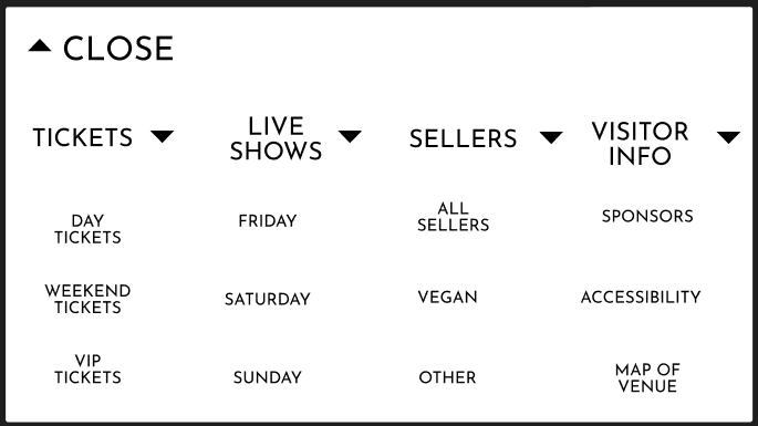
This is the menu where users can select the page they want
When I transformed these pages from my mid-fidelity app layout, I made the headings at the top of each page bigger so users, especially with sight needs, would be able to read them easily. Another thing I changed from my app’s layout is the menu.
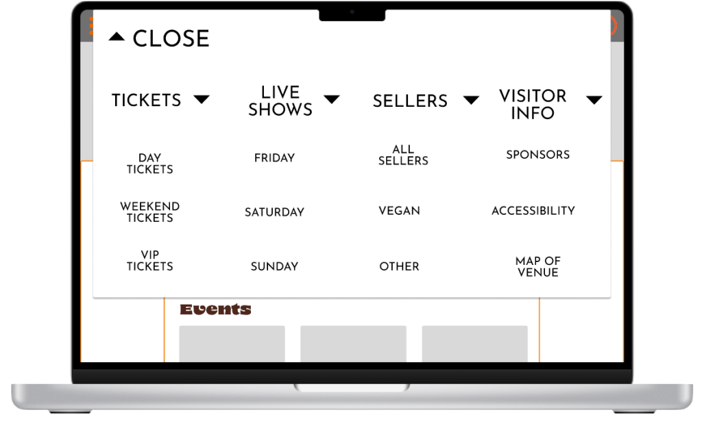
How the overlay look on the website
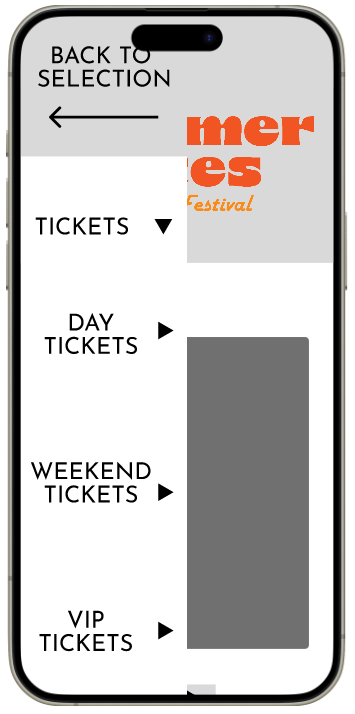
How the overlay looks on the app
On the app the menu opens from the left side of the phone, however on the website the menu opens from the top of the page. I changed this so user don’t have to move the mouse as far to click the different selections. For my website I included two bars each side of the page. This is white space that can be used for advertisements or extra information.
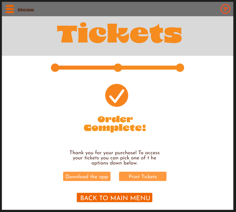
This is the final page users see once they have purchased tickets
One difference between my app and website is how the user receives the tickets. In my app the tickets can automatically be accessed by the ticket button. However, the user can’t show tickets on a computer so on the order complete page there are two buttons that let the user select if they want the tickets printed or suggests them to download the app to access them. There are clear instructions above the buttons telling the user what they must do next.
Rejected Designs
This is one of my rejected designs for my website. I changed the overlay that lets the user select which page they want. This was to make it simpler and requires less movement from the user. This also reduces the number of overlays that I’ll have to make. To make sure the user isn’t overwhelmed by all the selections being close together I made sure to put plenty space between them so one won’t be accidentally clicked over the other. The category all the selections will be under is bigger so the user can’t get confused. To make sure the user knows what they are clicking, I will add a box that highlights the selection when the mouse is hovering over it.
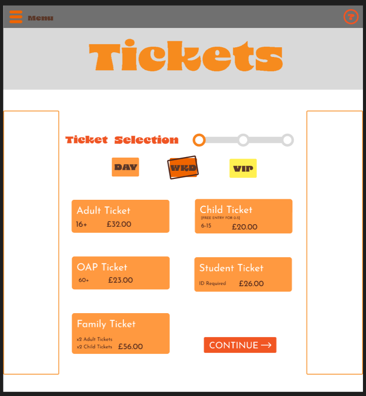
How the progress bar looked before
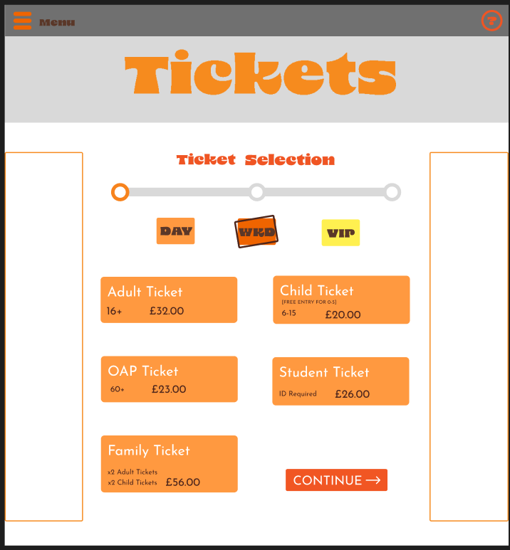
How the progress bar looks after the redesign
Another design I changed was the progress bar on the ticket sale page. Originally the progress bar was the same size as the one in my mid-fidelity phone layout, but I think it isn’t clear as its next to text of a similar colour. I also think users with sight needs will struggle to understand it. To fix this problem I made the progress bar longer to fill out the page more. I also put it below the text to separate it and make it clearer.