These are the brand standards for my project, which is advertising the aquarium I made, Ocean Wonders.
Typography
Logo
These are the brand standards for my logo for my aquarium, Ocean Wonders.

What my logo should look like in advertising.
This is how my logo should look. The two words in this logo should always be stacked on top of each other. This light blue is also the staple colour for the logo and should not be changed unless it is over a similar shade of blue background. The logo must never be in another font than Gill Sans Ultra Bold.
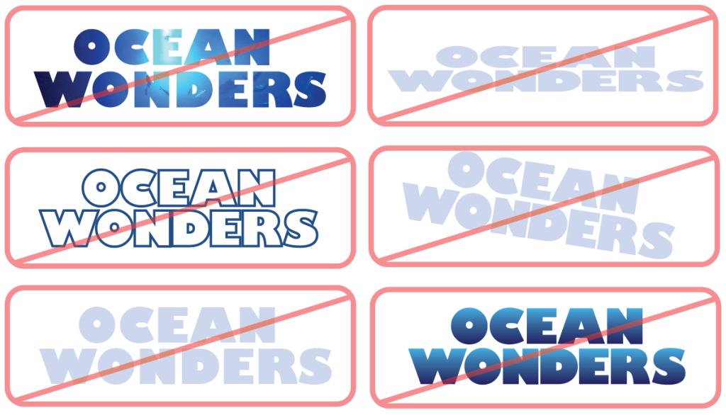
Do not:
. Fill the logo with images
. Stretch or squash the logo
. Outline the logo
. Tilt the logo
. Change the spacing of the logo
. Fill the logo with a gradient
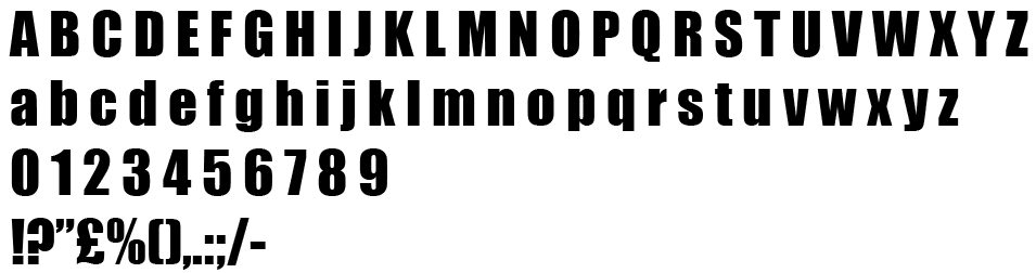
Fonts
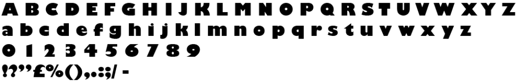
Gill Sans Ultra Bold
I chose to use this font for my logo because of its bold appearance. This is to catch peoples attention and is more noticeable in advertising.
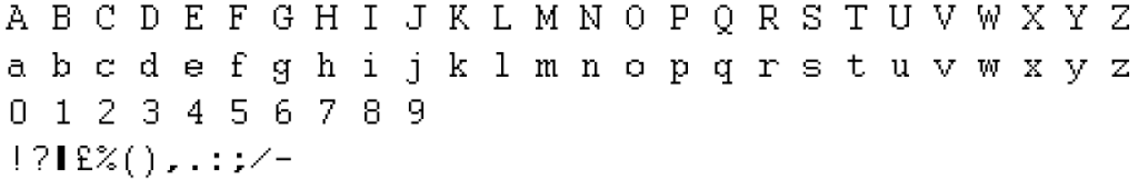
Courier
This is the font I used for most of the writing in my leaflet. I chose this font because its a big contrast to all the other bold fonts I used. It is also easy to read even when its small.
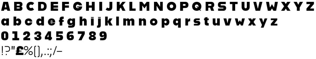
Alfarn 2
I used this font for the headings of my leaflet. The reason I chose this font is because of how bold it is and easy to read. While it is bold like my logo font its still different enough to not be mixed up.
Impact
This font was mostly used on my posters. I used it because its bold and stands out from the rest of the poster. The other reason I chose this font is because it’s compact together so it doesn’t take up too much space on the posters.
Colour
Main Colours
These are the main colours I’ve used for my project. I chose these colours because the colour blue is heavily associated with the ocean. I made sure to use more softer colours because I wanted my posters and leaflet to have a more calmer and softer feeling rather than in your face bright colours. The colours I’ve chosen show a range of shades of blue used for different things.
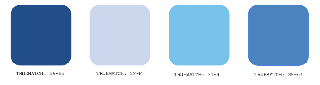
These colours contrast each other well while still working together. All four of these colours have been used in both my posters and leaflet. The first colour 36-B5 has been used the most for4 the background of my poster and various parts of my leaflet because its dark enough for brighter colours to stand out.
Secondary Colours
These are the main colours I used in my posters, each posters secondary colour has been separated.
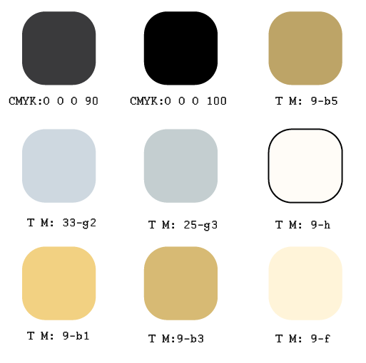
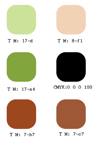
Shark
These are the colours that should be used for creating a shark in any promotional imagery. No unnatural colours should be used for the shark e.g. a green body.
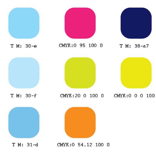
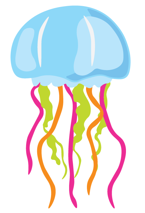
Jellyfish
These are the colours that are used for my jellyfish poster. Unlike my other posters, this one uses bright colours. This is because the jellyfish exhibit is bright and colourful.
Turtle
These are the colours that should used for creating turtle in my posters. No unnatural colours should be used for the turtle e.g. a purple body.
Illustration
These are the brand standards for the illustrations I produced for my poster and leaflet.
Overall Brand Standards For All Illustrations
Fully coloured illustration

Outlines of the same illustration
All of the Illustrations have to be made using shapes layered on top of each other. All the edges of the illustrations must have curved edges with only a couple exceptions e.g. sharp teeth.
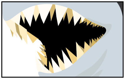
This is the one exception to all the lines always being curved. The lines are pointed to exarate how sharp the teeth are. If the teeth had curved ends then it wouldn’t make the shark look as intimidating.
Details

There is not enough detail, this can blend in with other parts of the body.

There is enough detail in this to make it stand out but is not overcrowded.

There is too much detail here compared to the rest of the illustration. This is too overcrowded.