Recap
This project is to create a website for the Participatory Collective, a foundation that was created by the Ideas Fund. The ideas funds goal is to help fund local charities around the UK, including Hull. Their funding helps local projects support others that are in need. The main focus of this project is to create an accessible website that can represent all the collectives charities equally. Accessibility is an important goal of this project as users with all kinds of disabilities, physical and mental, need to be able to easily navigate and access key information on the website. Another goal for this project is making sure users who wish to volunteer have easy access to all the information they need. Advertising volunteering is also very important as it makes visitors to the site aware that they can get involved with the charity.
Final High Fidelity Website
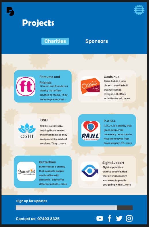
Here is my high fidelity website and mobile app. I did not change much from the previous mid fidelity outcome because I liked how the lay out looked and flowed. In my final outcome I used real life images to help give the user some visual keys to what a page could be about before they read anything. I made sure that all the writing on my website was legible because I used a lot of colour in my final outcome and needed to ensure that final page was easy to read. To test if my final layout was user friendly I had two people navigate through the site and made some changes based from their feed back, such as making important images bigger and changing the colour of some text.
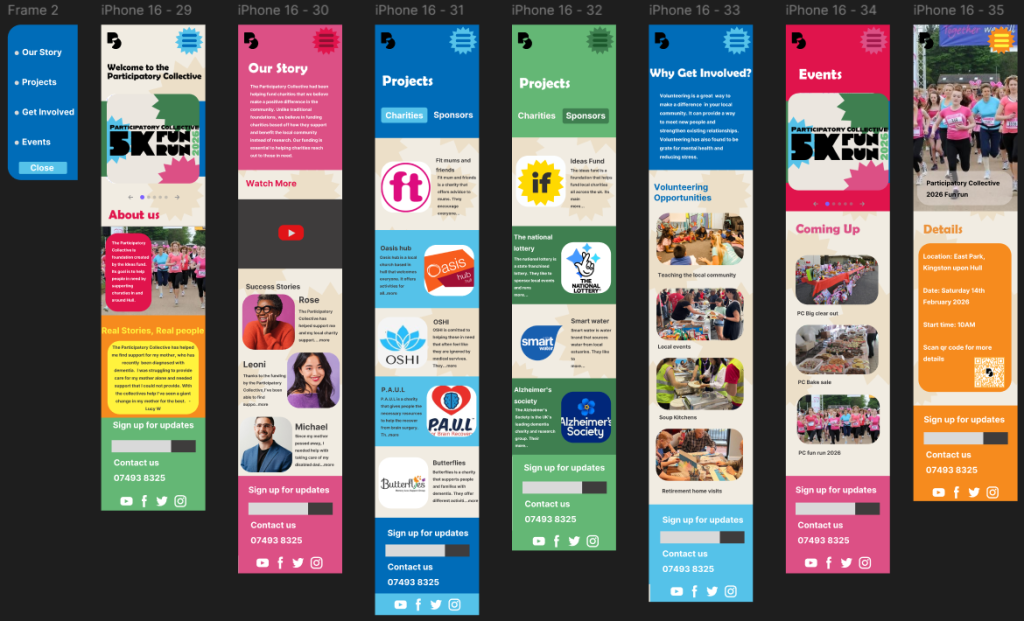
Here is the final mobile version of my app layout. I am happy with the way it came out. While making this app I had to take into consideration the sizing of text and images. This is because users with sight problems might struggle to read smaller and close together text. To prevent this I made sure my text was legible from a distance. I also had other people read out the test on my pages to get an unbiased opinion. All charities and stakeholders names are clear, accompanied by a picture of their logo and a brief explanation of what the charity is about. The majority of the writing is in black and white, this is because when other people test read my app the biggest problem was colourful text. So in my final outcome I made all of my text either black or white so users with sight needs and colour blindness can read it.
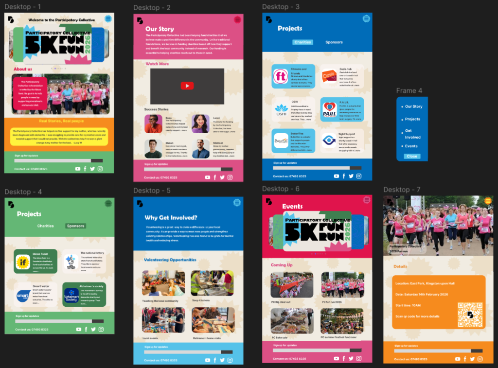
My final website outcome is similar to my app. Due to its larger size I was able to make my images and text bigger. I made sure that my website requires minimal scrolling and clicking for users with mobility/dexterity problems. All of the most important information is at the top of the website to make it simpler so its clear for any users to navigate through, for example, elderly users who might not be as tec-savvy. All the interactions in my website are clear and simple.
Brand Elements
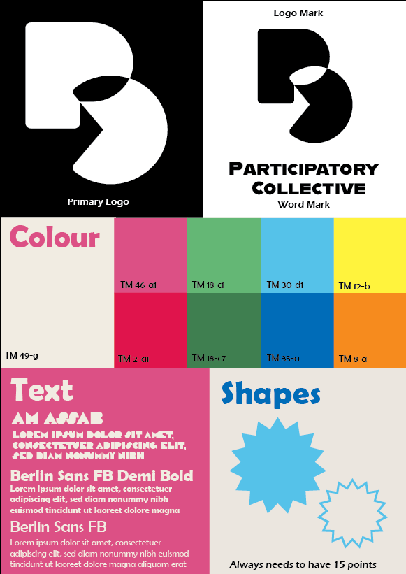
Here is my visual identity for my project. I believe that the choices of logo, colour, font and image direction all align with the Participatory Collectives values and needs. The first reason is that the logo for my project is simple and easy to adapt into any form of media. I believe the simple design is better as it’s easily recognised without the user needing to read anything because the logo is the most memorable part of any brand. Another reason is the choice of colour, from my research into the participatory collective they want a brand with bold lines and bright colours. The variety in colour also allows more flexibility for different types of posts and branding. My font choices are bold so they stand out to the user but are still legible even from a distance so users with sight needs can easily understand and navigate the website and app. Throughout my work I added these star like shapes to add personality and a pop of colour to my website and marketing. They also help users recognise and associate the shape with the participatory collective because a user is more likely to remember the shapes than a piece of text even from just a glance. From my research I found that the participatory collective wanted pictures in their marketing. When designing my final outcomes for my website and app I made sure to add plenty of visuals so that users don’t need to read anything to summarise what the page is about. I also made sure that all the images I used match the wording underneath, such as not putting a picture of a festival for a charity event.
Here is my project in three different forms, mobile, website and social media post. I made sure to keep my visual style consistent across all platforms so users build brand recognition. The mobile and website look identical with only a couple minor changes in sizing to fit the screen. Another thing I kept consistent across all types of medias was the shapes I used. This helps to tie my pieces of work together because its a constant visual that anyone can instantly recognise even if there’s no colour. This can also help users with colour blindness make the links between media because they cant see colour in the way that non colour blind people do.
Omni channel media
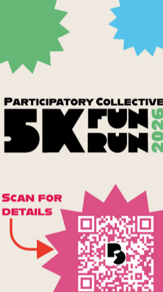
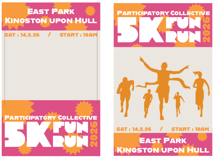
For my omni channel media I decided to make a fun run. This is because this type of event can attract all types of users. I decided to make the running route in east park, in Hull, to tie it to the participatory collectives location.
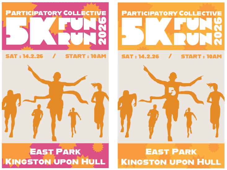
Here is the logo I created for my fun run. I used the same fonts as my logo and website so that users can link the two together with just one look. The fun run part is the biggest text on the logo as that is the main attraction when advertising this to users. I couldn’t fit in the original logo mark I made for the participatory collective so instead I used a word mark. I think this flows better with the fun runs’ logo. It also advertises the collective to new users as some wouldn’t know what PC stood for. In different forms of media, I changed the 2026’s colours to match. I think doing this makes it stand out more against the rest of the logo. It also tells users that this fun run is a yearly event.
Social media
Here is some research I did into other companies posts related to running. A common theme I found was nearly all of them used some kind of imagery with running. The majority of the posts I looked at had little to any wording on them because they were usually in the caption of the post. For my social media I wanted it to contain information that would be helpful to users that are interested.
Instagram Reel

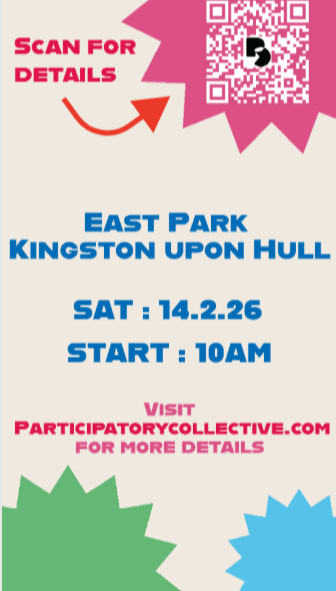
Just like my website, I kept the wording of my post simple and informative. I wanted to just give the user basic information with the option to find out more. In this post I used a qr code with a call to action saying ‘scan for details’, this is to make the user curious and want to scan it. On the second slide, I added more of the basic details and the Collectives website so users have a direct way to find out more. I also kept the qr code just so users don’t have to replay the video if they missed it the first time or if the addition of information has peaked their interest. I kept the style of this post consistent with my website so users can quickly relate the two together.
Mobile Banner
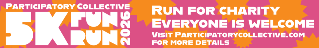
This is a mobile banner ad, designed to pop up at the bottom of websites. I kept the visual style the same apart from the colours background. This is because I thought the regular light background would not stand out against most websites. Another change I made was the wording because unlike an Instagram reel, a banner ad can’t have a description below giving details. Instead I tried to summarise what the whole event is about. The simple wording, similar to my website, is meant to reach out to the user and make them want to participate. I included the Collective’s website at the bottom in case the user wants to check them out later on.
Traditional media
Posters
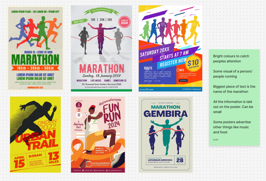
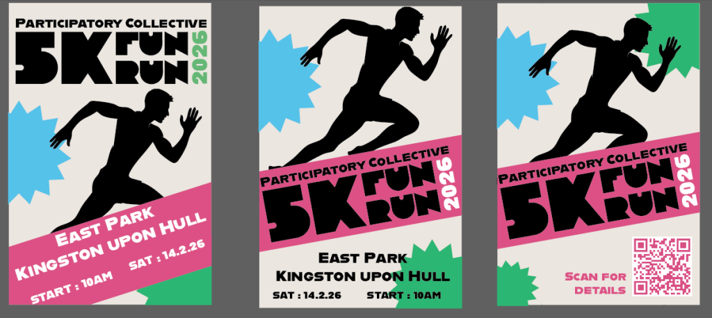
Here is some research I did into fun runs/ marathons posters. While they all had their own style, the most common visual was someone running which makes sense since most users only take a quick glance when walking past a poster. A lot of them also contain some info on the event, I chose not to include this because I want the user to scan the qr code or look up the website so they can get interested and want to read more about the Participatory Collective.
This is the development of my first poster. I was figuring out what colours and what visuals I wanted to use. I like the visual of the people running and decided to keep that although I thought these posters look too busy and overload the user with too many words.
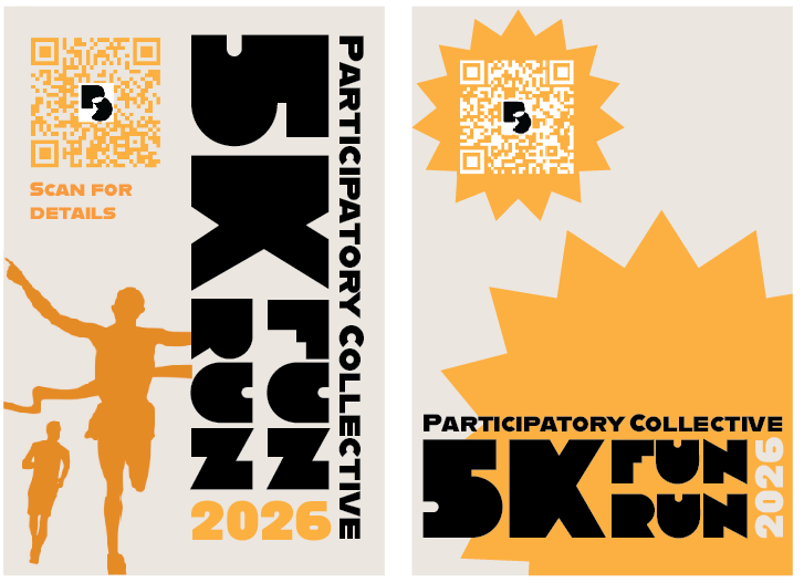
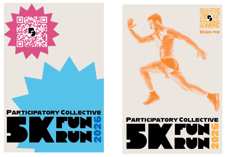
Here is some more development. This is when I tried to add in a qr code instead of putting all the information on the poster. I also tried out some different colours which I ended up liking more than just having one colour.
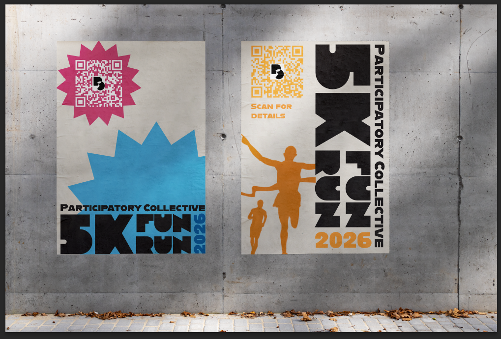
Here are my first final outcomes for my posters. At first I thought they would be fine to represent the Collective fun run, however looking back at my references I realised that the posters don’t really tell you anything. Also if you didn’t read the first poster you wouldn’t know what its about.
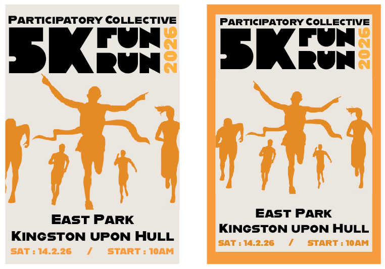
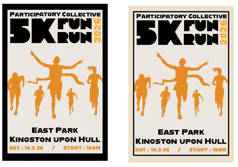
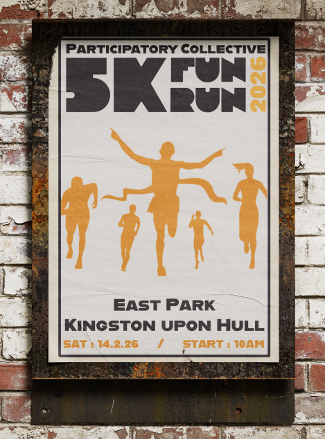
Using the same colours and visuals from my first outcome, I tried moving around this visuals to make it flow better. I also made sure all the information didn’t blend together or overload the user. I think the border around the poster makes it stand out more.
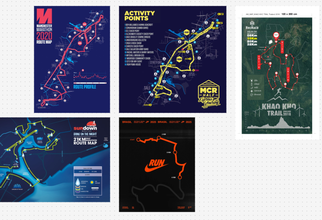
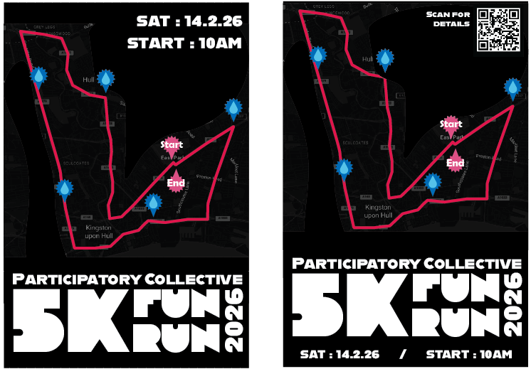
When researching posters I found a specific style that uses the runs route. I wanted to try this for myself and used a map of Hull I edited. I used the same colours as my other media to show the route, start/end and the water stations. Even though I used the same colours and type as my other outcomes, this style didn’t fit into my project. The black background is too different from my usual light backgrounds so I decided not to continue this further.
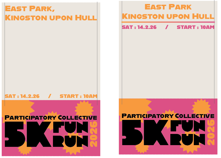
Here I wanted to try make a poster that has a similar style to my website. This time I made sure to include a clear visual that gives users context without needing to read it. I wanted to make this different from my other outcome by using multiple colours. I also added back the qr code and the call to actions so users can scan the poster while on the go.
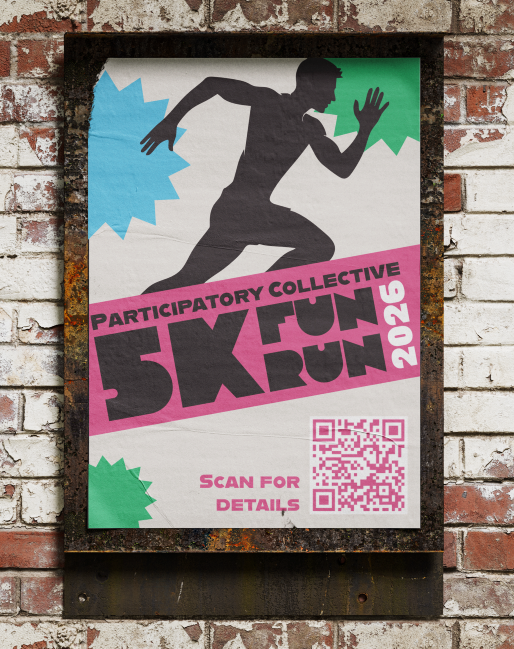
Here are the final two outcomes for my posters. I like how they both turned out. They both look different in styles but still can be associated with each other.
Physical Merch
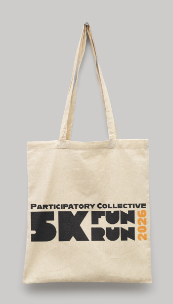
Tote Bag
This tote bag is designed to be give out at the event. I made the style simple so it can be read from a distance even when someone is wearing it. Another reason I made it simple is so users can reuse it as a lot of people like to reuse free bags instead of buying new ones.
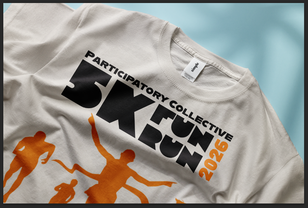
T-shirt
This is a t-shirt I designed for runners and event staff to wear during the event. The design is similar to my tote bag in that its design is simple so users will want to wear it again.
Overview
Overall I believe my campaign is successful across different platforms. Its use of different colours makes it more marketable to multiple users. It also has a recognisable logo that can be used in both physical and social media. The tone of my campaign is simple and straight forward so anyone can understand its goals. I believe that my campaign reaches out to key audiences who are users that want to help raise money for charity, and makes them want to get involved by making them more aware of how they can get involved and how easy it is to do. The goal of this campaign is to reach out to as many users as possible and inform them on how they can help raise money for charities in their local area. The goal was also to draw attention to the participatory collective and its mission. I did this by adding a qr code that takes them straight to the website and the websites name so that users have a clear way to find out more. This campaign connects back to the Collectives values and needs as it wanted branding that had a distinct style and stood out.
Video