Initial Design Prototyping
Figma boards
Here is the initial research I did into the three fictional design briefs. I explored what products and websites are already out there. Out of the options I felt that the eco future brand would fit my goals as I would have more creative freedom. Choosing an eco friendly brand allows me to showcase my knowledge and understanding of sustainability and how I can make it relate to my brand and its products.
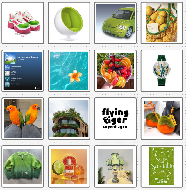
Once I chose my brand, I did further research into what eco friendly brands are already out there and what products they make. There was a wide range of brands with the most popular being clothing and food products. The biggest selling point for these brands was the eco friendly packaging and how users purchases help fund projects to help the environment, for example, one product purchased equates to a tree planted. Another common theme with these brands are the websites, lots of these brands use different shades of green and imagery relating to nature. The Body Shop and Bloom use green on the website that I think would be great to include in my design and add to the theme of sustainability.
User Personas
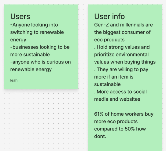
Here is a bit of research I did into my potential customers. Through my research I concluded that the main audience for my brand would be Gen-z users. The main reasons are, they are the most environmentally conscious and are willing to pay more for sustainable products. Their generation is the biggest consumer of soft drinks as ‘soft drinks are helping to bring the buzz back to the sector, most notably for Generation Z’ (Figure 1: Dine Out/ May 2025). As a result of this my marketing needs to be directed towards Gen-z. The best way to do this is with online ads because that’s where the majority of that generation get their information.
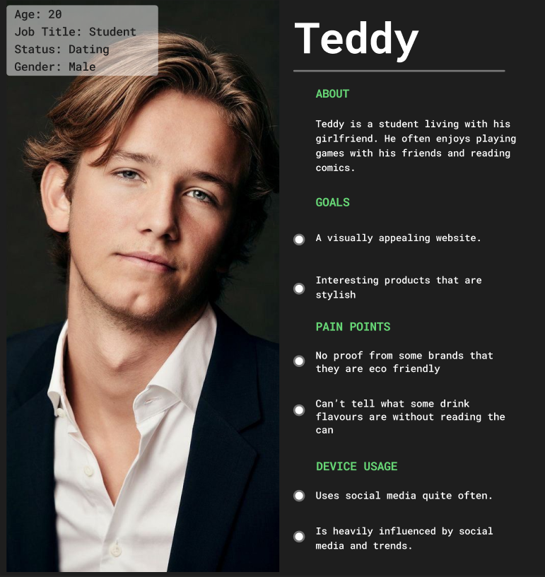
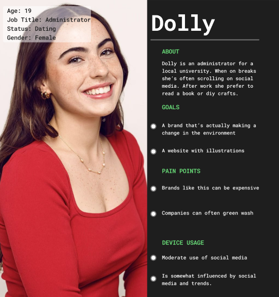
I made these user personas to help get an idea of what and who my consumers are and what their goals and needs are. My main users will be teens and young adults. Most advertising and influence will be online because this is where the majority of my potential customers spend their time. In my branding and advertisements I need to show the users that the brand is committed and confident to staying eco friendly and not green washing. ‘Greenwashing is a PR tactic used to make a company or product appear environmentally friendly, without meaningfully reducing its environmental impact.’ (Figure 2: Lead Das/Apr 2022)
Brand Matrix/ Personality/ Matrix
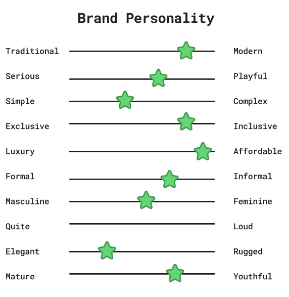
I created a brand personality and brand matrix to help understand what vibe I wanted my brand to represent. I want my brand to feel welcoming to the user while still being clear in its mission and promise to be eco friendly. These visuals from my brand matrix will help me pick out a colour pallet for my brand that stands out against competing brands.
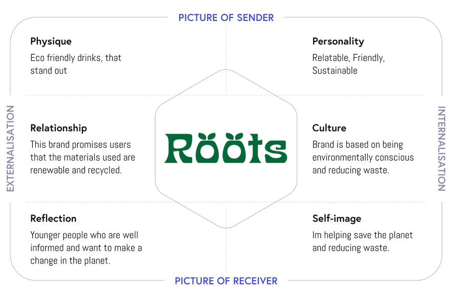
I created a brand prism to help me understand how different users will understand and communicate with the brands identity. Building the brands identity is important because it creates a memorable brand that helps build trust with customers. ‘It won’t only improve sales and customer loyalty but will help you build trust with stakeholders’ (Figure 3: Michaletz Zwief/ Jan 2025)
Logo
A logo is one of the most important parts about a brand, it is a visual piece that represents a brands identity. Making an eye catching logo is especially important in a growing digital world as our brains process visuals faster than text. I wanted my logo to be quick and simple so users can easily understand what it says at just a glance.
Sketches
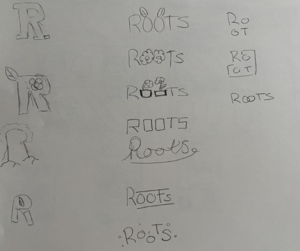
Here are the early sketches I made for my logo. I experimented with just the first letter, the whole word and even a shortened down version. I wanted it to be clear to the user that the brand is eco friendly at a first glance. I tried to include different visuals that are related to nature or eco friendly such as flowers and leaves. I had to consider when drawing if the word would still be easy to read if the letter has been replaced with a something else.
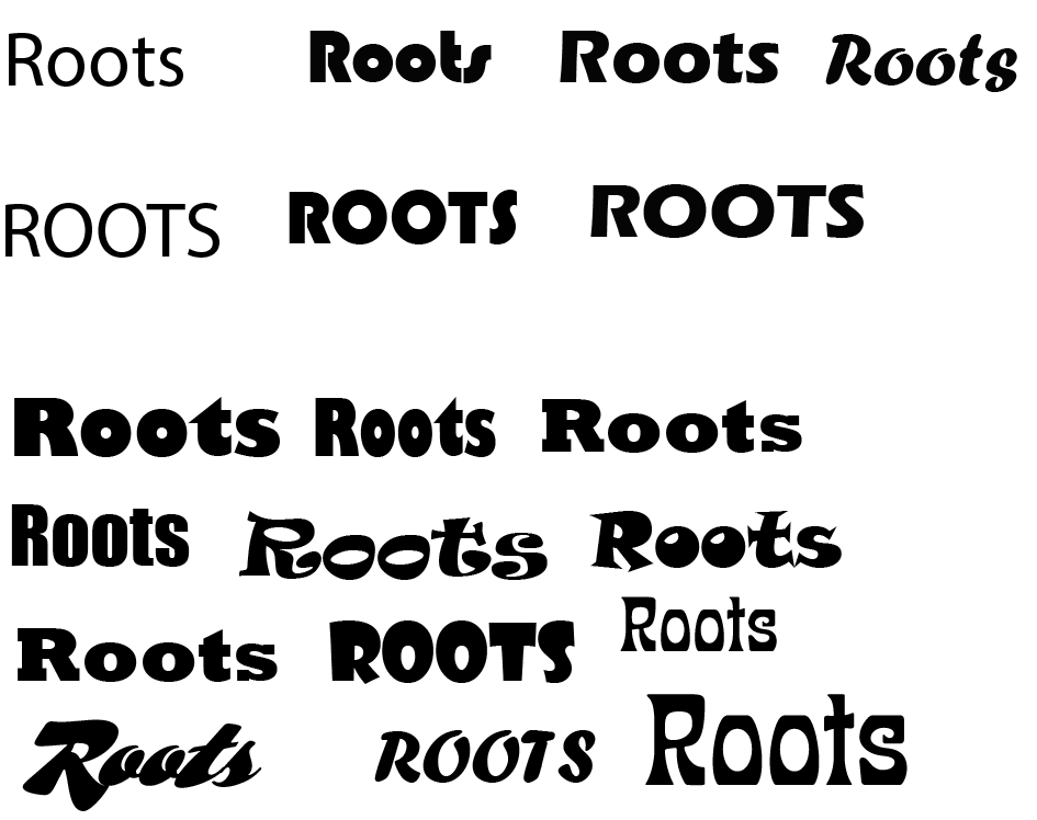
Here are all the fonts I explored. The font needs to be clear and easy for users to read even from a distance but still unique enough to be recognisable. Most of the fonts I selected are bold and thick, this is because I want my brand to be loud and stand out to users from the shelf. A lot of the cans I looked at in my research have the logo as the biggest visual on the product.
Some of my fonts have a 60s/70s hippy vibe to them as that subculture related to nature and being eco-friendly. This link could give users a good idea of what the brand is about with just a look.
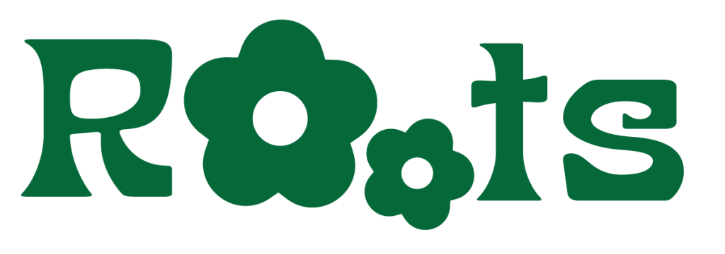
First Logo
I wanted to see what my logo would look like if I replaced the O’s with something else. When making this I had to consider if the user will be able to read what the word still is. I think the flowers look better and still are legible for the user. I decided that the flowers should be the same colour as the logo to make it easier to read.
For my final outcome I chose to make the flowers two different sizes as this can make the logo more eye catching to users.
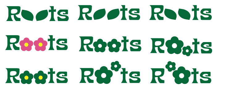
First Logo Outcome
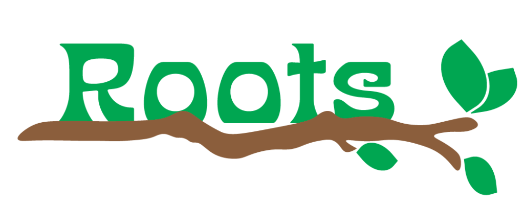
Second Logo
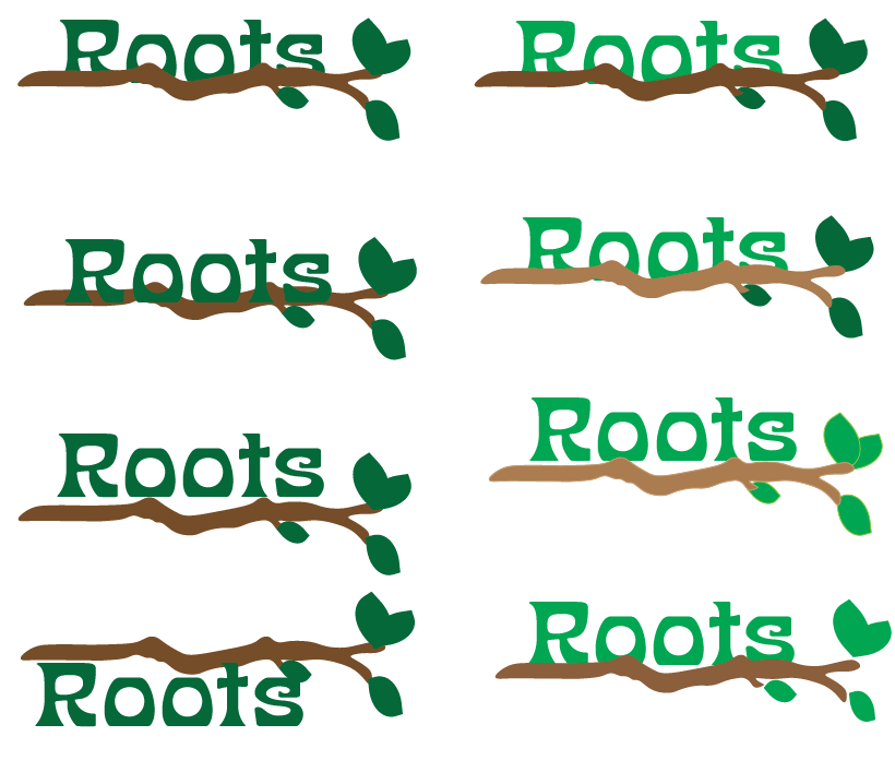
Here I wanted to try make the logo stand out without changing the word. I decided to use a branch to underline the word to tie in the word roots and accentuate the fact that it is from nature. I made a couple different variations, exploring colour and placement. I think this logo would be harder for users from a distance to read. Overall I felt that this didn’t work at all as the branch detracts from the words and if I want to put in on something narrow it would be very difficult to read as it would be too small. It is oversimplistic to work in a professional and competitive environment where people are making a visual reference to decide if it is a good product.
The logo is good for close up but I think it would be hard to understand when its smaller. I also think the logo looks more like a outdoors brand than a drinks brand.
Second Logo Outcome
Third Logo
This is the font I chose. I think it stands out well even from a distance. It is easy for users to read while still being unique. The o’s in the word looked like fruits so I put a pair of leaves on there. The addition of this can give the users an idea of what the brand is about. I looked into different shades of green as the colour green is heavily associated with nature and a lot of eco friendly brands use it as their main colour. I then experimented with how the logo would look with outlines to see if it’s still legible from a distance without colour which it is but does not make as much as an impact. Some other examples I made have different colour leaves which makes the leaves stand out more but could distract the user from the name.
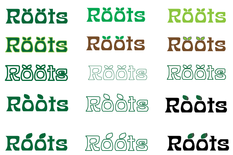
Third Logo Outcome
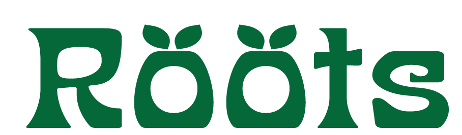
.
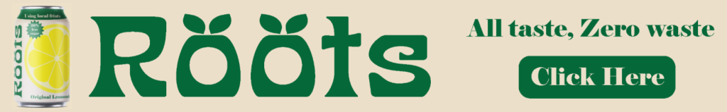
I believe that this logo represents my brand the best. The logo is simple and easy for users to read at a distance and in different sizes. This logo is also simple so when scaled down, none of the details blur or get lost. The logo I’ve chosen is relevant because of 3 reasons.
1 – The colour, the colour green is heavily related to nature and something being eco friendly.
2 – The leaves on the top, the addition of these gives the user an impression of the brands identity. The logo will be used in all types of media to advertise the brand. Using consistent colours and fonts helps users instantly associate even just the colour with the brand.
3 – The logo needs to stand out is so users can easily identify the brand on the shelf next to other competing brands.
Wireframe prototyping
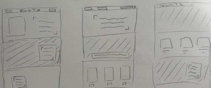
Here are the sketches I made for my website. When creating these I needed to be able to tell the user the brands story but also advertise the product to potential customers. In these rough sketches I’ve made, I used references from a couple of eco friendly websites I researched such as Ten Tree(Every Item Plants 10 Trees | Sustainable Clothing by tentree®) and whole earth(Whole Earth)
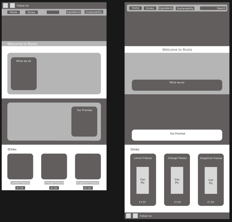
Mid Fidelity Wireframe
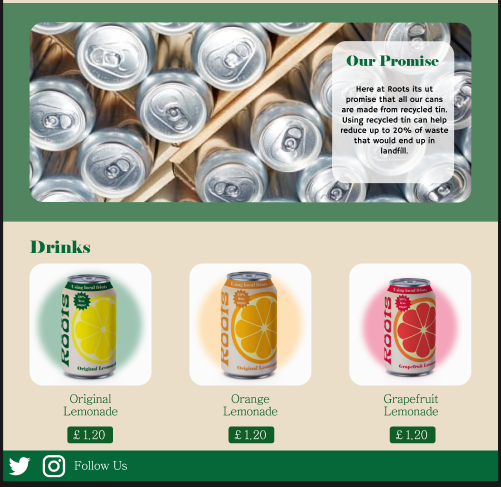
These are my two mid fidelity wireframes. I made sure the users had all the options at the top of the page for easy navigation. On both layouts I added a ‘welcome to roots’ banner. This is to make the user feel more welcome and wanted so they’re more likely to make a purchase. On both of these wireframes the drinks selection is down at the bottom of the page, this is so users have to scroll past other parts of the website and might stop if some part of the website catches their eye. However if the user doesn’t want to scroll the whole way down, there’s a drinks option at the top that will let them view and purchase the drinks.
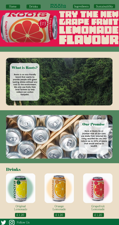
Final High Fidelity Outcome
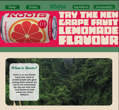
This is the final high fidelity lay out for my website. All the colours I’ve used are the same colours I’ve used on my cans and in my advertisements so they can all relate together. All the options are at the top making it easy for the user to navigate. The advertisement at the top of the website is bright and will draw in users attention and make them want to view more.
The companies agenda is to attract a wide audience but also have aspects that cater for Gen -Z as a main target audience and because research proves that this generation are more environmentally conscious and want to make sustainable and green purchases. This website will benefit the companies agenda because with just one look users can assume the company is about nature and being eco friendly.
The logo has a feeling of nature, the use of green and the facts about how the product is produced in the ‘about us’ section gives it a feeling of authenticity and its green credentials.
3x Banners
Wide Skyscraper
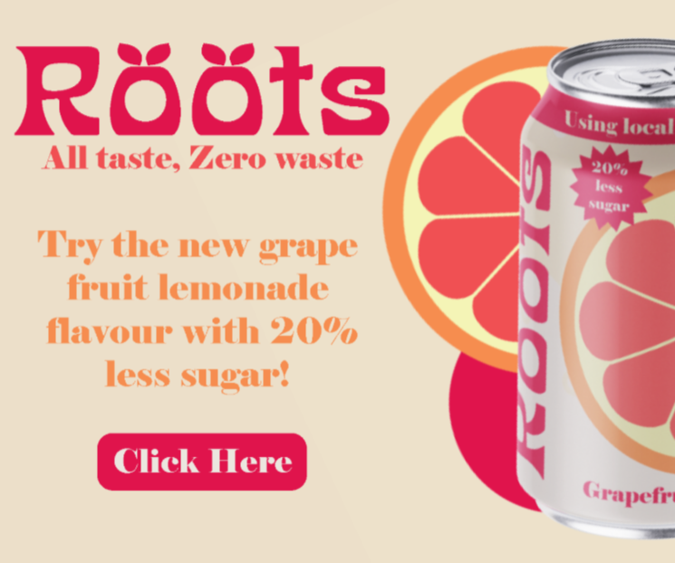
Here is my wide skyscraper ad. This is designed to appear on the side of websites. The visuals all relate to my brand as I’ve used the same colours, text and visuals. This ad is made to capture users attention without annoying them or making it too distracting from the website. The click here button is a call to action designed to quickly take users to the website. The tone of this ad is straight to the point because the large image of the can should already draw the viewer in. This is important because this ad needs to draw the users attention away from whatever website they are on as well as other ads that are visible at the time.
Mobile Banner
This mobile banner is in the same style as the skyscraper ad. It uses the same green and ‘click here’ call to action. On this ad I decided to make the logo the biggest part. This is because when users take a quick look at the ad, it is important they see something memorable. I also added the brands slogan to give the user a sense of what the drink is about to convince them to buy it.
Rectangle
I made this ad different from the others by advertising a different flavour and changing the colours. Users will still be able to relate this to my website because I used the same logo and font as my other posts. It also makes it more eye catching as a new colour and flavour as the viewer would have already seen the lemon flavour ad and hopefully be familiar with that one already. It would make the viewer aware of other flavours and want to try it out.
Social Media Advertising – Motion
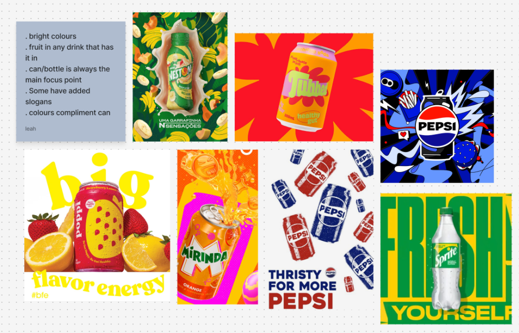
After looking to a couple of examples of social media posts on how drink companies advertise their different flavours I made note of what stands out the most and what is the ads main selling point. Through my research I found some key points that stand out to me the most. Firstly, all the advertisements I watched make the can the biggest visual as that’s the main selling point. The second thing I notice was the way the ads promote the flavours, if the flavour includes a fruit, then they are always in the ad. I want to include both these into my videos to keep the user engaged and make them want to view the website.
First Video
The first video I created focuses on advertising a new flavour that the brand just launched. This is to create some hype and get users interested in the brand. The brands logo comes immediately after showing the can so that users know what brand it is and can later identify the logo. At the end of the video I showed all three cans so that users know there is other flavours to try, and potentially get them even more interested in the brand. At the bottom is the brands website, so that users that want to check out the brand or make a purchase know how to find it. I kept the colours typography the same as my other advertisements so that users can remember and associate the brand across all platforms.
Second Video
In my second video I decided to show all of the cans so that it can invite in all kinds of users. Each can gets accompanied by a colour pallet that compliments the can and makes it stand out more while still sticking to my brand kit. At the bottom of each can is all call to action saying ‘click here’, this is so users have an easy short cut to more information about the brand and how to purchase the product. Like my first video at the end of the video is the roots logo by itself, this is so users build up brand recognition.
Brand Kit
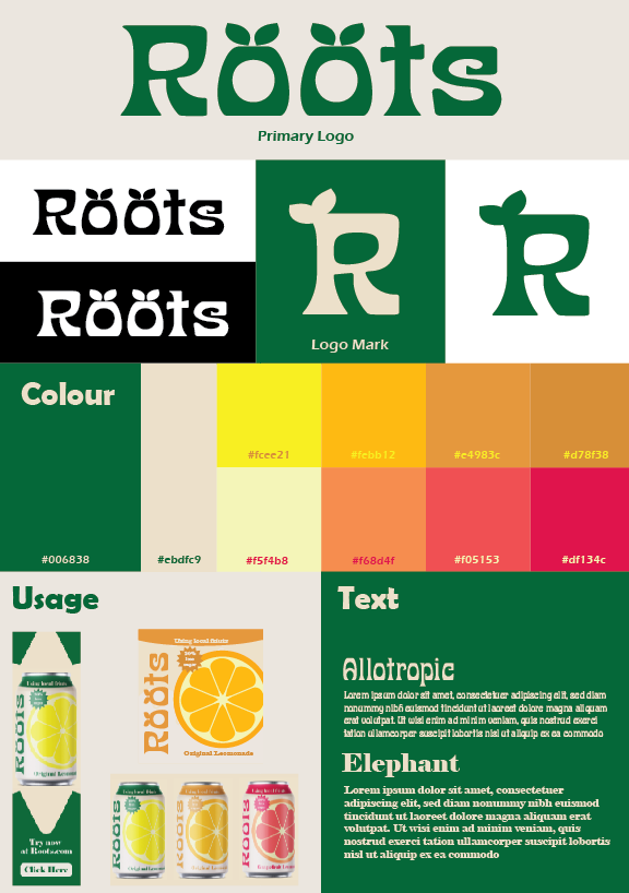
This is my brand kit. It shows all key parts of my brand’s identity such as typography, colours and logo usage. I have kept to this kit for all the content I made for my brand to keep me aligned with my brand identity. It helps users easily associate my brand across all platforms and media. In my brand kit I included visuals of how I used my branding in marketing and physical products to show how versatile it is. I’ve also included my logo in black and white to show how the silhouette is still recognisable even without its signature colour.
References
Figure 1: Dine out (May 2025) A new generation is reshaping the soft drinks market A new generation is reshaping the soft drinks market (Accessed 31/12/2025)
Figure: 2: Leah Das (April 2022) Greenwash: what it is and how not to fall for it Greenwash: what it is and how not to fall for it – Greenpeace UK (Accessed 2/1/2026)
Figure 3: Michaletz Zwiet (January 2025) The Brand Identity Prism: Why It’s Valuable and How to Develop One The Brand Identity Prism: Why It’s Valuable and How to Develop One (Accessed 2/1/2026)