Development Research Blog - Year 2

Task 1: Art Direction campaign analysis

National Building Museum

This the logo for the National Building Museum The NBM is based in Washington DC and visitors can see building techniques, designs, history and techniques for the future. This rebrand was created by Pentagram to modernise the overall aesthetic and make more attractive to younger audiences however due to this older audiences could get left out.  It uses a mix of bold and thin typography that is clear and easy to read and more of a minimalistic feel. This is effective because it makes the logo visually interesting and can catch the user’s eye. It also relates to the architectural parts of the museum, it is structured to reference building blocks, and the typography looks like a basement, first floor and roof in their proportions. The other typography used in most advertising is a serif font which is inspired by the classical architecture in the museum.

Throughout all the branding in this rebrand the same shade of red has been used which is reminiscent of red brick that are traditionally used for modern buildings and reflects the museum itself. This is effective because it helps users build brand recognition. This means that users can see physical advertisements out in public and immediately associate them witthe NBMThe museums name, National Building Museum already gives users an idea of what the place is about so that means the branding can be more abstract without losing the message. 

The website for the National Building Museum follows the same branding as the rest of their media. It uses simple fonts that are easy to read and are very clear. The website mostly relies on photography and text. One change made is the logo being in black and white, this was a good change because it’s easier for the user to read than if the logo was the same bright red so they have thought about the user experience rather than just sticking to the brans main colour which wouldn’t have worked.   

The social media sticks to the same branding as the rest of this rebrand. The NBM social media uses moving visuals and videos to interest the user. A lot of their visuals are inspired by the architecture of the museum. This is effective because it shows off key features of the museum without using the same images repeatedlyA lot of the posts use the same font as the website. In every post the logo of the museum can also be seen which can help users build brand recognition. The marketing for the museum is simple and clear; it gives users basic information such as the event name plus the date and time.  

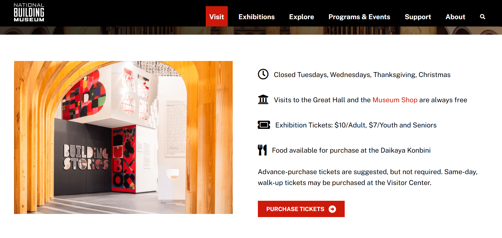
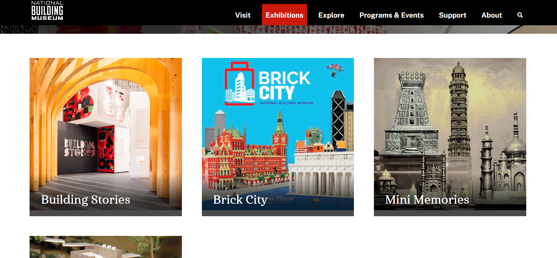
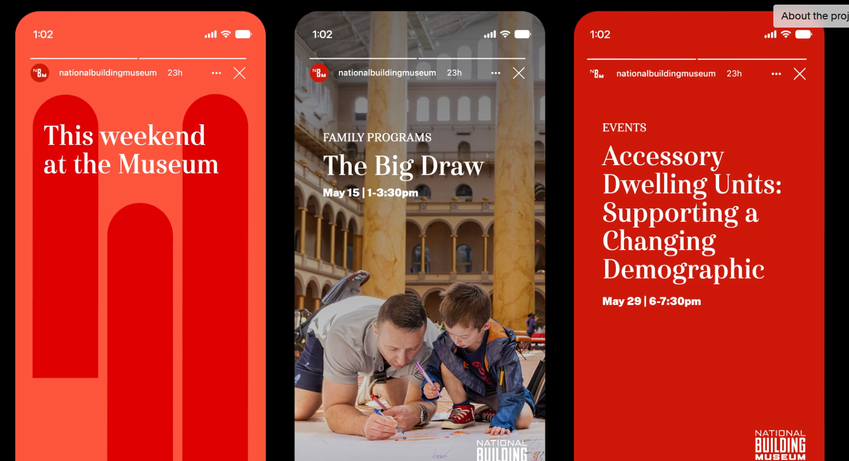
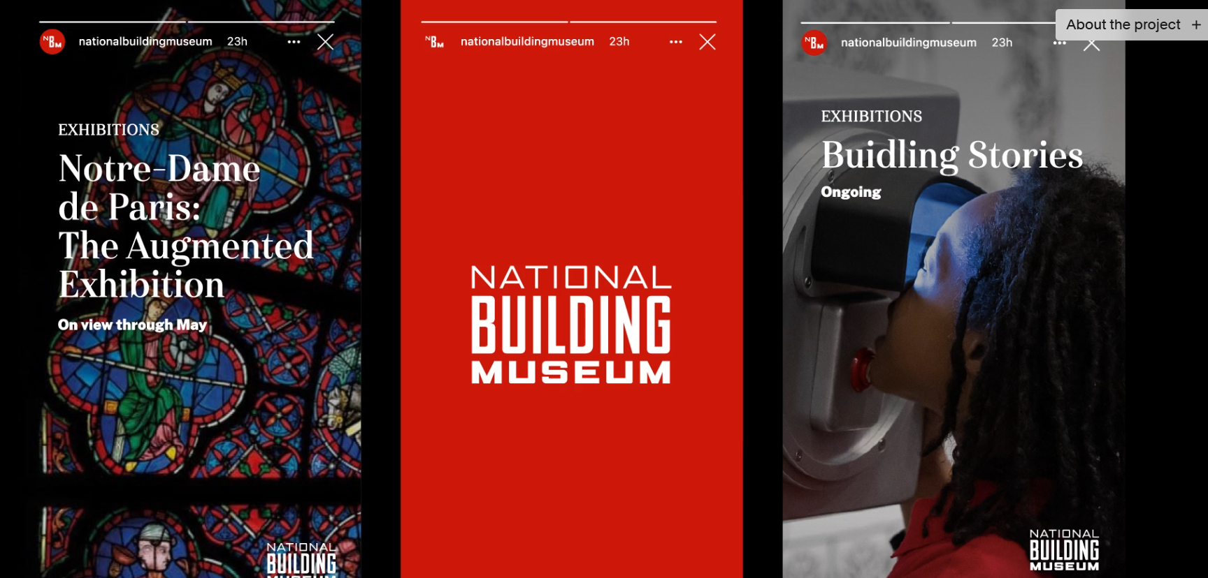
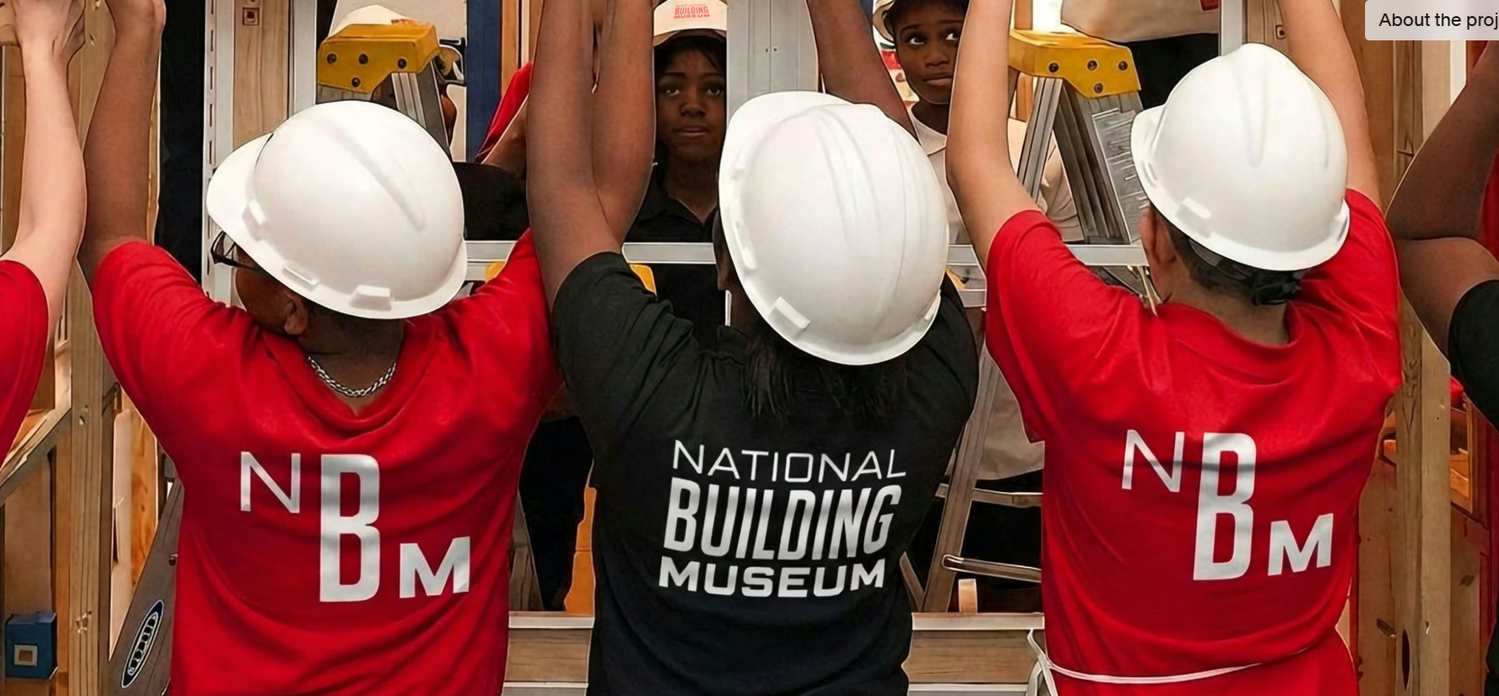
I feel like this project colud reach more audiences if they added more visuals that show off the history of the building and its exabits. I believe that just showing the events and modern parts is drawing away from the museum part of the building. This can also drive away older users because all their seeing is events targeted towards children.  

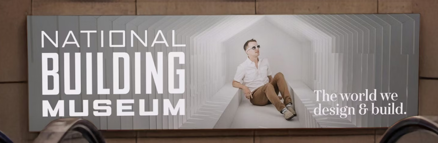
If I was the art director for this project, I would have made a mix of advertisements showing both the modern and historical exhibits. Since the user doesn’t need visual hints because of the name of the museum, I would’ve made some of the branding more abstract.