Recap
This project is to create a website for the participatory collective, a foundation that is made by the ideas fund, that helps support local charities in and around Hull. Its main goal is to help fund charities and projects that they think can make a difference. Their goal is to spread awareness of different charities, give users a place to find resources and fund projects that will help better those in under funded communities. The focus of this project is to create a website that brings charities across Hull into one space for users. This gives users an easy way to find the necessary resources for themselves and others. Its also a place for users to find out how they can get involved with their local community by either participating in events put on by the charities or volunteering for the charities themselves.
My goals for this project
My goals for this project is to create a website that is accessible to many different types of users. I also want this website to remain as sustainable as possible so I can reduce my carbon footprint. Another goal is to make sure the people and communities are represented in a meaningful way that makes users feel welcome and included.
Figma Prototype
First Outcome
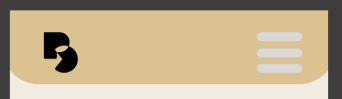
Here is my first mid fidelity prototype, I have made a lot of changes from when it was low fidelity. One big change I made to my mid fidelity is taking away the on boarding page because its not necessary to grab the users attention. In some feedback I got they thought it was also not necessary. The next big thing I changed was the menu. The first change was the shape, I moved all the options to the right to make it easier for users to click with their thumb and avoid too much movement. I also changed the background of the menu from transparent to a solid colour. This will make it easier for users to see the menu clearly and not let any text underneath show.
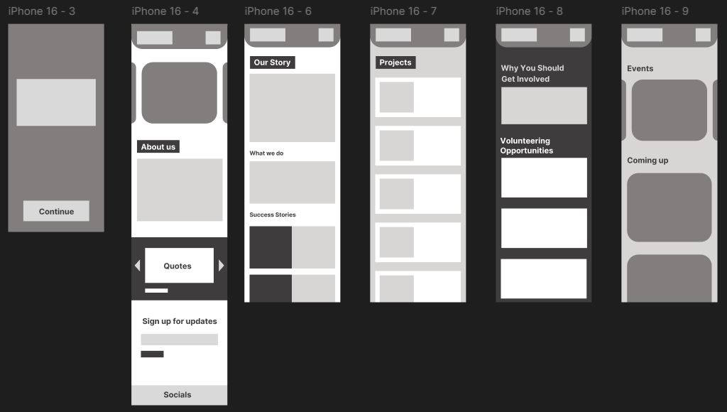
My first outcome of my website, mobile and desktop
Overall the first outcome is really under developed and needs more experimentation and some stuff moving around for user convenience. There is a lack of colour in this prototype because I wanted to prioritise the lay out if the website. The main problems with this website layout is its too simple and some users could find it boring. There also is not anything on here that makes it feel user cantered because its so plain. Overall this first layout is a good start but needs parts improving to make it more user centred and also visually pleasing to keep users engaged and want to explore the website further.
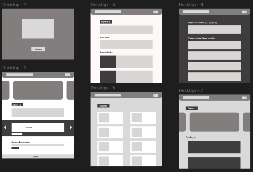
Second Outcome

Second outcome – Mobile only
Here is my second mid fidelity outcome. Here I added text and colour to the pages. The colours are the same one from my brand standards in my first post. I think the solid colours, especially green, will make it harder for some users to read. This web design is also not sustainable as the bright colours will use more power, especially if they take up most of the websites page. This layout is not changed much from the one before, I mostly used this prototype to experiment with colour and how I will incorporate it into my design. Overall I do not like this outcome and will not be using it in my design because I do not like the full colour backgrounds.
Third Outcome
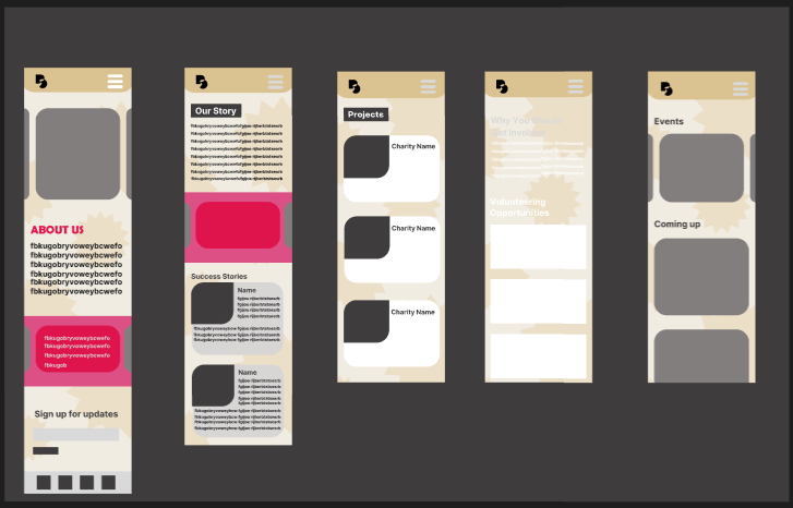
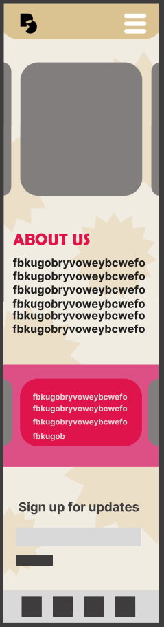
Third outcome – Mobile only
This is another mid fidelity outcome with the same layout as the last one but with a different, more muted background colour. The background has a small pattern in the background to make it stand out and make it visually appealing to users but not too distracting. This time the pops of colours are smaller and more spread out over the page. The biggest problem with this outcome is how bright it is when there is no colour. The white text is not legible on the background and even though the black shows up well, I think it looks too harsh. This harsh black text can be difficult for users with dyslexia and others with reading difficulties to understand. Another problem I have with the outcome is the header at the top of the pages. This is because they look too plain and the menu button in the top right of the page blends into the top of the page, which could make it hard for some users to see. Overall I like this design better because of the background change I made. There are still many improvements I can make such as changing the menu button to be more visible and finding a way to make text look more visually appealing while still catering to users with reading and sight difficulties.
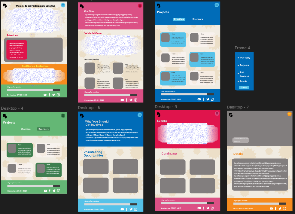
Final Outcome – Before Wireframing

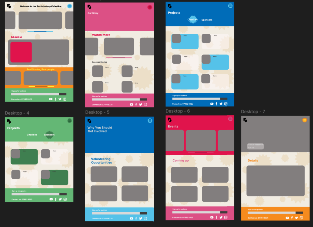
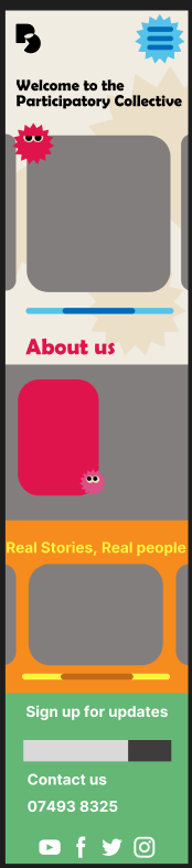
Final outcome before wireframing, a couple more changes were made after I wireframed it.
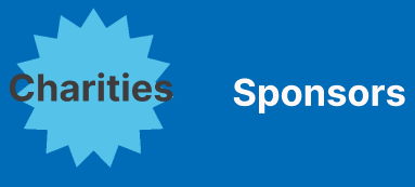
This is my final outcome for my mid fidelity webpage before wireframing. I really like the variety of colours in this outcome, it is defiantly more eye catching and keeps more to what the participatory collective wants the website to look like. A new addition to the mobile version is small star shapes with eyes. The reason I added these is because in out briefing by the participatory collective, they explained that one of the things they would like in the website is illustrations, because of this I wanted to make little characters that appear around the website. I only experimented with this in one outcome as it was not the most important thing to focus on and decided to leave them out of my design for now however I will try them again in my high fidelity prototype. There are many changes I made between this outcome and the one before. The main change is the colours, I made the sight more colourful to attract more users and make it visually appealing. Another big change I added was two additional pages, a second projects page and an addition to the events page I created. The reason I made two projects pages is to separate the charities from the sponsors so that users won’t get confused between the two. The addition of a sponsors page also honours the stakeholders by giving them recognition for all the contributions they have made to the participatory collective. The next page I have added is accessible by the user clicking on one of the events listed on either the events page or a visual from the carrousel. This page is to give the user more details on the event such as the date and time, what the event is or what its raising money for.

Headers comparison
One other necessary change I made from my last outcome is the header at the top of the page. As I said at the end of my last outcome, the headers colours are too similar and because of this some users will struggle to see it. To fix this I got rid of the long bar at the top of the page then added a bright coloured shape (the same one in the background of my website) because it captures the users attention quicker and is more obvious so users are more inclined to press it.
Home page comparison
The main difference between these two home pages is colour. The final out come catches my eye much more than the previous one. I have also added a couple smaller things in my final outcome such as, a sliding bar, to hint to users they can scroll across the images, a short welcome message that makes the website feel more personal to the user. The welcome message also tells the user what the name of the website since it is not made clear by the logo I made.
Overall I am happy with how the final outcome for my prototype turned out. I tried to keep the design simple so that users, especially less tec-savvy ones, can navigate themselves across the website without any trouble.
Final Outcome – Wireframed
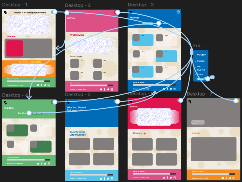
Wireframe of my mobile and desktop outcome.
Here is my final out come fully wireframed and I am happy with how it turned out. The design mostly stayed consistent across from my final outcome with only a couple minor changes. One change is the carrousel on a couple of my pages. Unfortunately I could not get it to work properly on my wireframe so instead I used a free asset here (Carousel | Figma). This free asset is well animated and fits into my design well. Underneath the carousel there is a couple circles that tells which user image they are on and an arrow each side that users can click on to get to the next image.
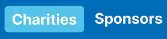
Buttons change I made after wireframing
Another small change I made, is the buttons on the projects page have been changed from stars to rectangles. This is because the size of the stars did not cover the whole word and made it difficult to read. I think that rectangular boxes stand out better and are more clear to users that they can be pressed but if that is not clear enough, when the mouse hovers over the rectangle that is not selected, it will show a faint box.
Final outcome after wireframing
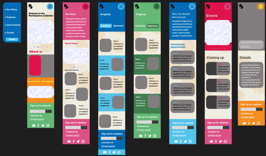
Link to figma board
Videos of wireframes
Calls to action
Firstly I made a clear section at the bottom of the page that allows users to sign up for updates. Although its located at the bottom of the page so users might miss it. Then I added an About Us section on the opening page so the user can get an idea of what the participatory collective is about without the need to scroll. This is where the information is expected to be by people visiting the site and they can easily get basic information about the charities and events. There is a whole page about getting involved and text explaining why this would be such a great idea to users who are curious. This will get users more motivated to get involved and participate in volunteering opportunities which will benefit the local charities. The Events page which lists anything that is happening near to the user are clear and easy to find from the menu page and easy to navigate
User-Centred Design Decisions
Personas
My design has been heavily influenced by my user personas in a number of different ways. One goal that was common in my personas was the need for the website of be easy to use because the users are not as tec savvy. As a result of this, I have made sure my website is easy for users to navigate even users with limited technology skills. I have made sure that most of the information that users need requires minimal clicking. Another user pain point I considered while making my design is from the investor, they wanted to make sure the Participatory collectives mission is clear to all users. As a result of this I made sure the about us page is clear and is visible on the home page without needing to scroll. Another thing I added was a details page that gives the user all the information they need to know about an event. I added this because a couple of my personas showed interest in getting involved in their local community by participating in events such as a marathon.
Accessibility considerations
There are many considerations I had to make to ensure that my website is accessible for all users. One consideration I had to keep in mind was text size. This is important to consider as many users, especially elderly one, can have problems reading small text on websites. As a result I made sure that my text is big enough to be seen from a fair distance away. I have also made sure that the colour of the text do not blend into the background. Finally I made sure that the font is easy to read as some fonts can be difficult to read for users with dyslexia and can be off putting. Another important consideration is contrast. This is important as some users with problems such as colour blindness might not be able to see certain parts of a design properly. I made sure that colours in my design do not blend into each other by changing the prototype to grey scale and making sure everything is still able to be seen properly.
Community values
There is not much real text in my mid fidelity prototype as I wont be adding it until high fidelity. When I do make my real text I need to consider the tone and language I use. The collective wants clear wording using everyday language and simple sentences to get the point across to everyone. The words need to be able to grab the attention of the user. One important consideration is simple wording for users with dyslexia and other reading difficulties because longer words or drawn out sentences can confuse them or put them off reading entirely. The tone of this wants to be confident and action-orientated. This needs to be used for more difficult subjects. There needs to be a compassionate/heart warming tone to make to donators feel like they’ve made a change and sympathise with the families going through anything.
The tone also needs to be kind and approachable so users feel encouraged to get help.
Feedback & Iteration
From my feedback I have made a couple changes to my design. The first change I have made is taking away the arrows from the side of photo carrousel. Feedback included the comment, ‘I think its not necessary because you can see the next ones so you know to scroll’. I agreed with this comment at first but then I thought about older users who may not be as tech savvy and not necessarily know that the photos can move however I decided to continue with the change as this would be a very small section of users but just modified it a little by making it smaller and moving it from the middle of the photos to below. This would ensure the arrows are not taking away from the photos and less confusing. Another piece of feedback I received was that my sign up sections at the bottom of my page were hard to read because of the colour I used. To fix this I changed the text colour from a darker version of the background to a plain white.
Ethical & Sustainable Design
Sustainable
One change I have made to my design to make it more sustainable is making sure videos do not load unless the user click on them as when a video automatically plays it uses more energy. I reduced unnecessary content load to improve speed and carbon footprint. The background of my website uses a cream colour instead of white which reduces the amount of energy needed by the devise being used to view the site. Another way I will make my work more sustainable is avoiding the use of AI generated images or language. This is due to the fact that when anything is generated by AI it uses local water sources to cool down the systems. This water can not be recycled and takes away water from local communities.
Ethical
People in communities are represented in two main areas. Firstly quotes are from people who have benefited from the participatory collectives contribution to the charities. This shows users visiting the site real experiences and opinions/comments that makes it more personal and is not just the charity talking about themselves. Secondly projects page that highlight each charity in their own words and this helps the viewer to see how the charities see themselves and how they want to be represented. It makes the charities seem more approachable and friendly as they know who their viewers and audience are and ensures that the charities message gets across.
Goals for High fidelity prototype
In my high fidelity prototype I want to create an eye catching website that can properly represent the participatory collective and its partners. In my final outcome I want to make sure all my headings at the top of each page match the font on the homepage while still being easy for users with sight needs to read and see. I also want to make sure that when writing for each section in my website, I keep to the same appropriate language that best represents the Participatory collective as a whole, clear and straight forward. I will make sure that the tone of my writing will be action orientated, to make users feel the urge to get involved and help out their local community. The tone also needs to have a heart warming tone as some charities that are partnered with the participatory collective talk about sensitive topics. A heart warming tone can also pull at users heart strings and make them want to help out. Also in my final outcome I want to create meaningful visuals using a mix of photos and graphics to capture the readers attention. This is important because one of the first thing users see when they click on the website is a carousel of images meaning they need to be interesting to the users so they want to stay on the sight and find out more. These visuals on the carousel will also advertise events happening in the area, this can hook users attention and make them want to get involved. Finally in my high fidelity prototype, I want to experiment with adding illustrations to my design because it is one of the design features that the participatory collective wanted in the design. I will make sure these images fit well into my design and brand standards. The reason illustrations are important to include is because they capture the users attention and can give them context clues to what the page is about even before reading anything if the images are about what is on the page.