The ideas fund is run by the British Science Association who are a grants programme that helps local charities. The ideas fund was established in January 2021 to help uplift local charities that have a focus on mental well-being. They fund projects that they think will make a difference. The goal is to help spread awareness of different charities, give users who are in need a place to find different resources, help family members get support and fund charities/projects that will better those effected in the local communities. The Ideas fund has a different approach to applying for funding, they offer support to charities so they can develop ideas and decide for themself on what matters most for their cause and the local community. This is a big change as most charities are often more research lead. The first 42 projects that helped start the ideas fund have received a further £1.8 million in funding so that these charities can keep growing. The focus of this project is to create a website/mobile app that brings together different charities across hull. This will give users a way to find all the information they need in one place on different charities and events that are happening in their local area.
The participatory collective partners
Butterflies
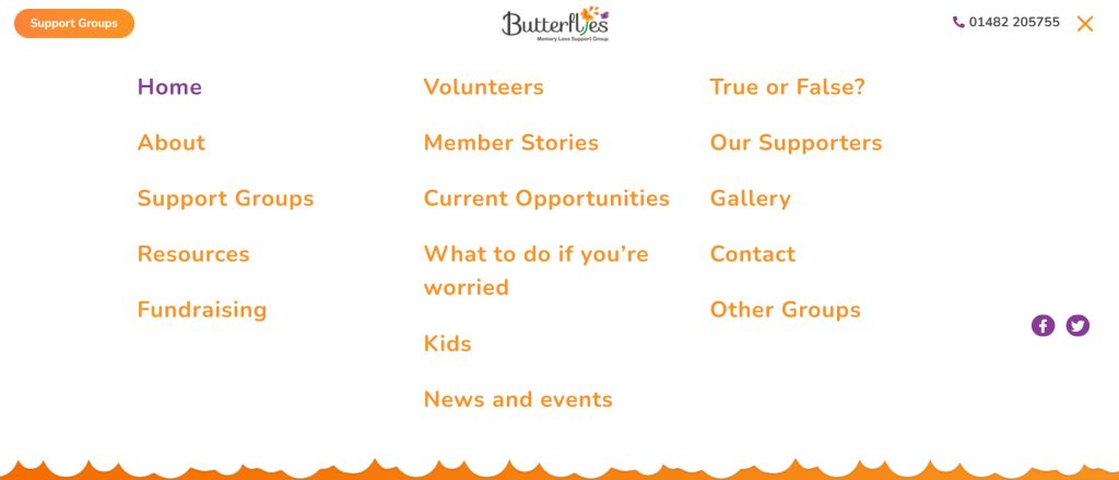
Butterflies mission is made quite clear from the front page. There are short tag lines that give the user an idea of what support is available and the charity’s missions. The site is an information page where users can find out more about the group and how to get support. The website accepts volunteers but no donations and advertises fundraisers and charity events. The primary users for this charity is elderly people looking for support. The other users are people looking for support for their elderly family. The charity is also partnered with The Alzheimer’s society, Carers support, Older peoples partnership, Dave Windass and The Smile foundation.
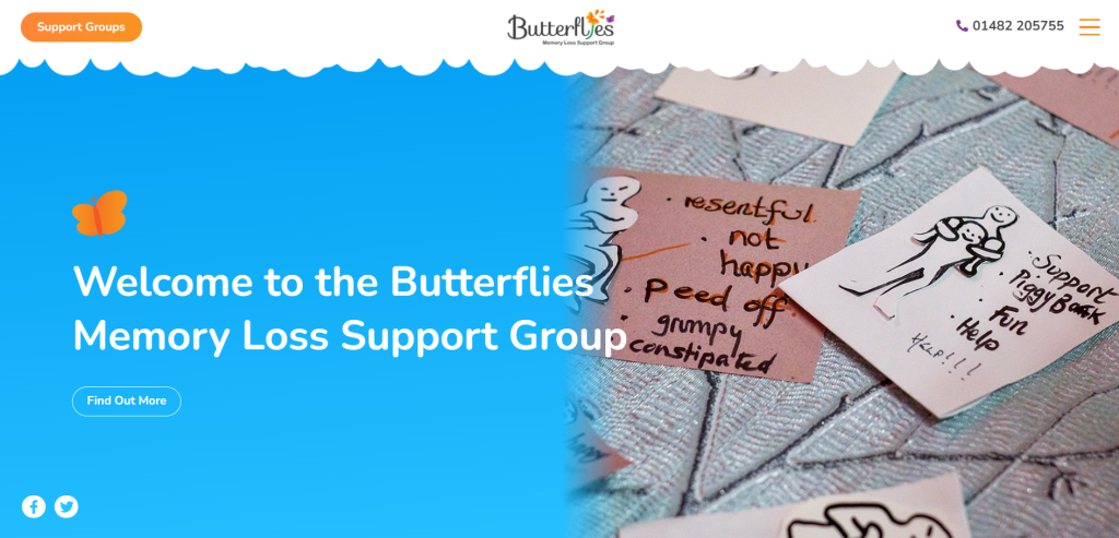
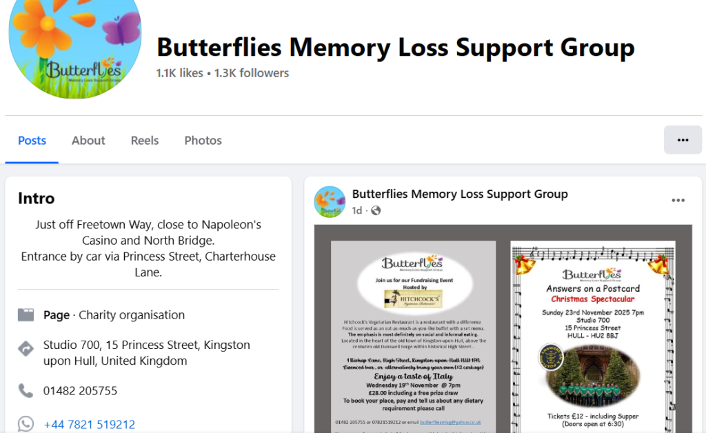
The website is quite easy to navigate as the most important parts of the website (charity number, button for support groups) are right at the top of the website. There is a lot of extra info that can be found just by scrolling down. This means that the site is good for elderly users as they don’t need to take a lot of actions. The important actions are clear and easy to find. The visual design of Butterflies is pretty consistent across the website. The colour pallet for this website doesn’t work together or compliment each other. All the visual for the websites are photos of the support groups events. This can give users an idea of what the group will look like and help them decide if this is for them or a family member. The tone of the website is an understanding/sympathetic tone. The subheadings are clear and eye catching. The social media for butterflies doesn’t keep the branding from the website, apart from the logo, it mostly posts . Most posts would be hard for users with sight problems to read. The posts get little engagement because they aren’t eye-catching or bold. There’s too much writing which can put users off when scrolling.
Fitmums & Friends
Fit mums mission is a walking and running club used to help people socialise and helping mums get support. The organisation, while targeted towards women, is for everyone to get involved. The sight gives information about events. It doesn’t accept donations directly but it does sell items. The users are mostly older women that are looking for support. Users could also be new mums looking for advice. However the charity doesn’t limit its users to just women, they welcome men to join in. The charity is sponsored by The national lottery and Sport England.
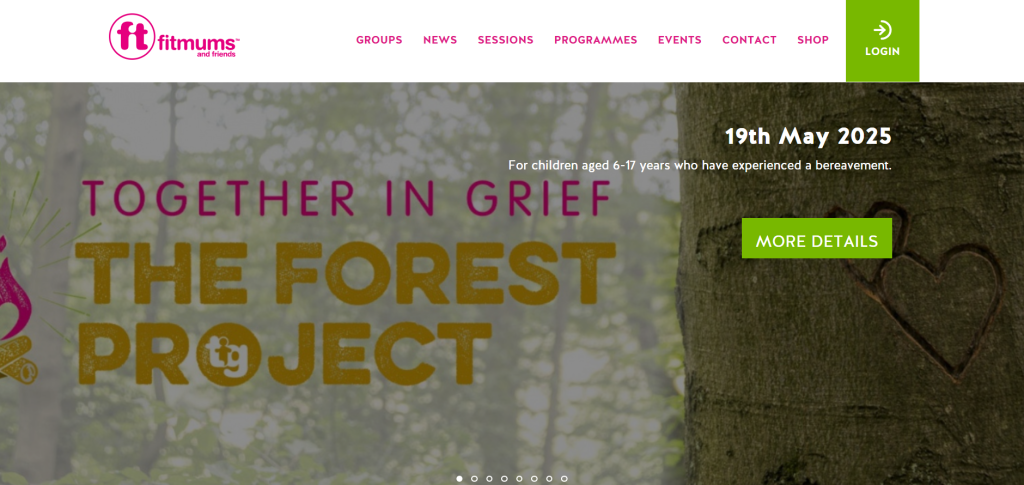
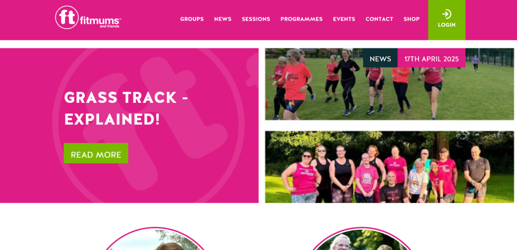
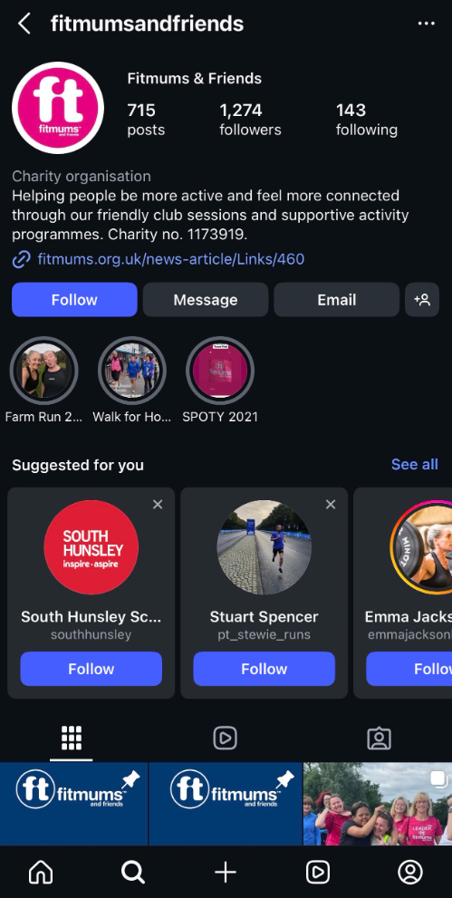
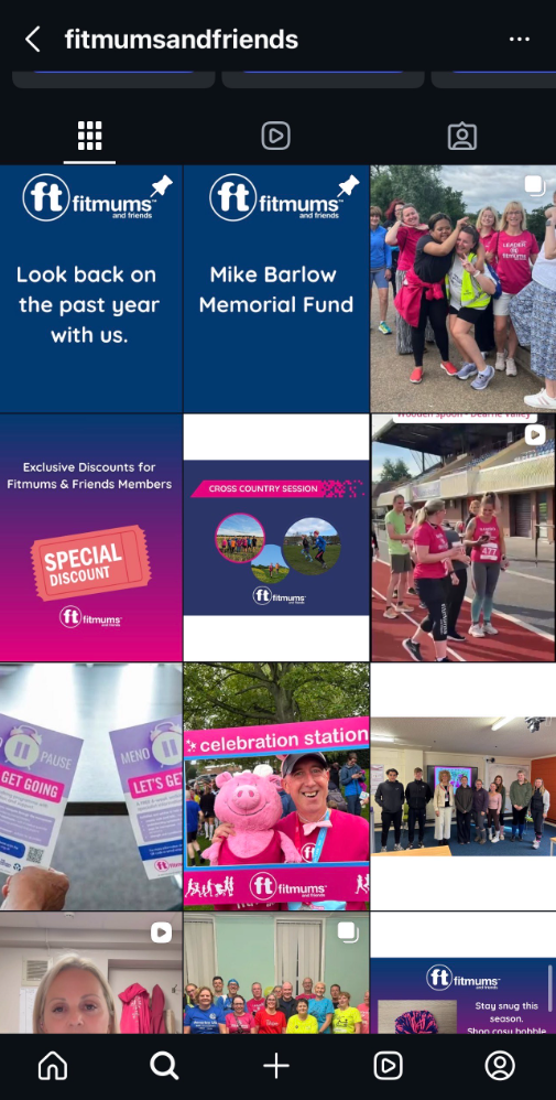
The website is quite easy to navigate. Most of the important actions are at the top of the website. They are big and easy to read. There are large buttons for each activity that the charity offers. That change colour when the box is hovered over. The subheadings are clear and easy to read. The design of the website has no structure. It starts off with a carrousel of images with a large ‘find out more’ button. Then it goes into the charity’s mission and what their about. User experiences and events are further down. The site needs a more organised layout. The colours for this site are bright pink and green. The green is used for the call to action button, this is a good style choice as it stands out more. Some images are blurry and others are stretched. The fitmums social media is consistent with the website. Their social media mostly consists of photos (some professional) and videos from the runs and other events they organise but they sometimes post just captions posts with a short piece of info related to events or meetings. There isn’t much engagement on their posts.
Sight Support
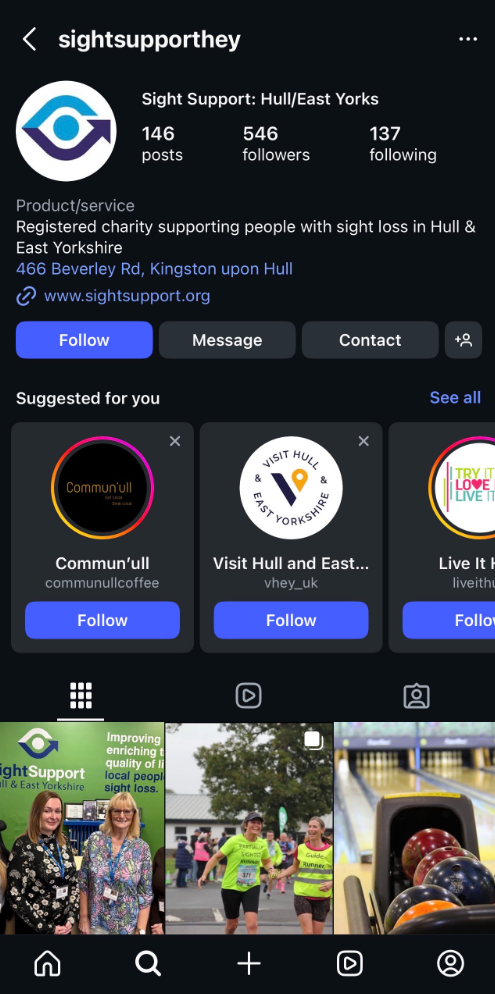
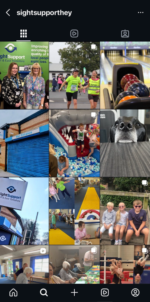
The mission of sight support is a charity that provides support for people with sight loss in hull. They offer enrichments and mental health support to young people. The primary users for this sight will be parents and carers looking for support for their family member.
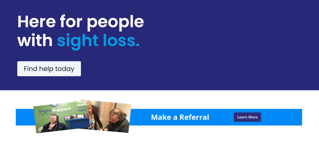
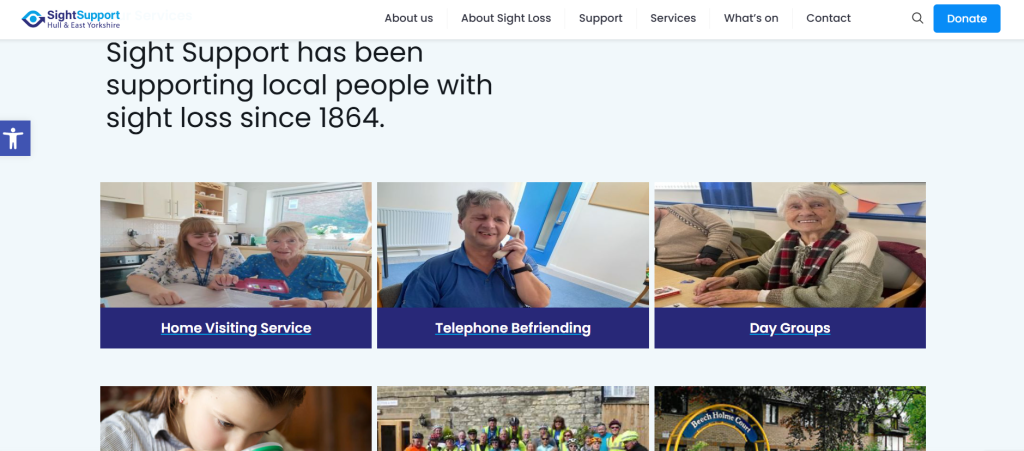
The website also has a range of accessibility options so that some users with sight problems might still be able to use the website. The website has large call to action buttons at the top of the page and fonts are large and easy to read. The wording is also simple. To the side of the page is a small accessibility tab that gives users the option to make the sight easier for them to read. The one problem with this is the tab is small and doesn’t make it clear that it can be pressed so some users might miss this. The sight gives the user a lot of information with visuals of how some people with sight loss see the world, however the pictures need to be laid out better. The colour pallet for the website is consistent. However the colours don’t work together. The sight uses its own images, which gives them more meaning. The images however are either blurry or stretched, some have a difference with sizing making the site look inconsistent.The sight support social media only post pictures and videos of their meetings and events. There is no professional photography, only ones by staff. Their social media gets little engagement and the branding isn’t consistent to their website.
Overall the participatory collective partners don’t have very developed websites and social medias. While the websites follow the charities branding and are quite easy to navigate, two of them are not accessible to users with sight needs or users who aren’t as tec savvy. The one exception to this is sight support because if the accessibility settings that is on all the pages. This allows the user to change the font size and contrast on the website. I want to try add something like this to my own design. All of the social medias I looked get little engagement. Only Fitmums follow their branding from the websites. Butterflies and Sight supports posts are too wordy and don’t stand out much.
Inspiration from Other Campaigns
Water Aid
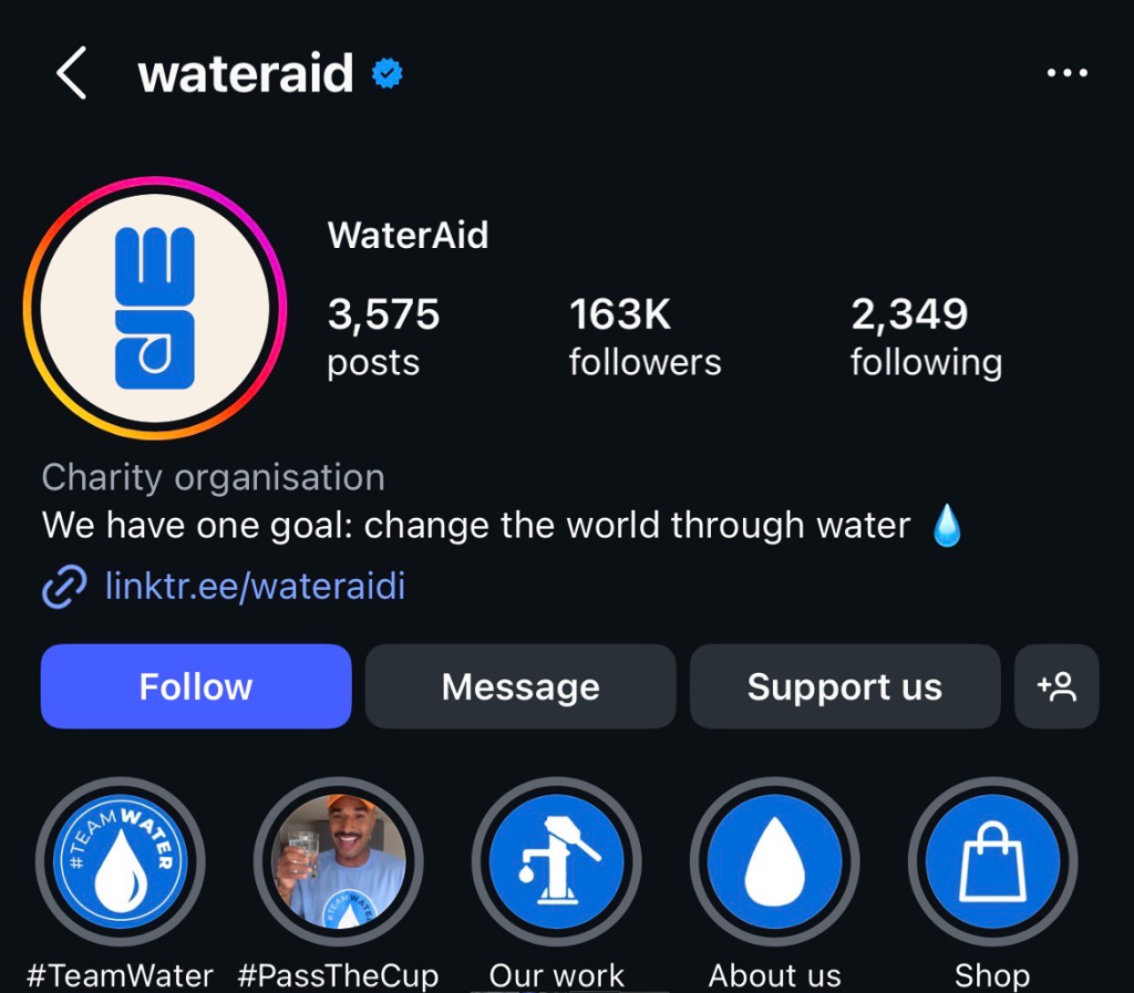
Water aids mission is to bring fresh, clean water to rural communities that suffer from water deficit and unsanitary conditions. They also branch out into other projects such as building toilets and help children attend school. Their users will mostly be people looking to donate as water aid is well advertised on social media and tv. Other users might be younger children learning about water scarcity and how to save water.
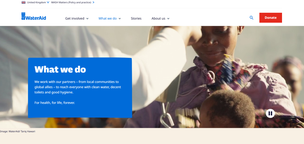
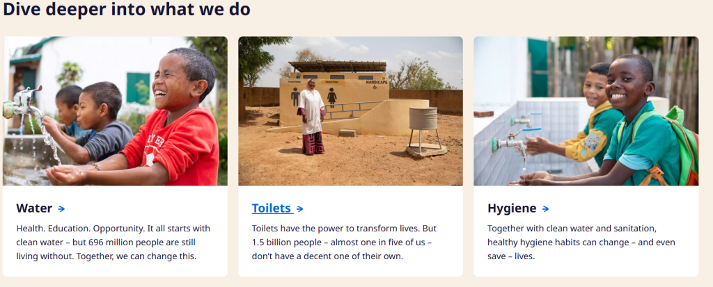
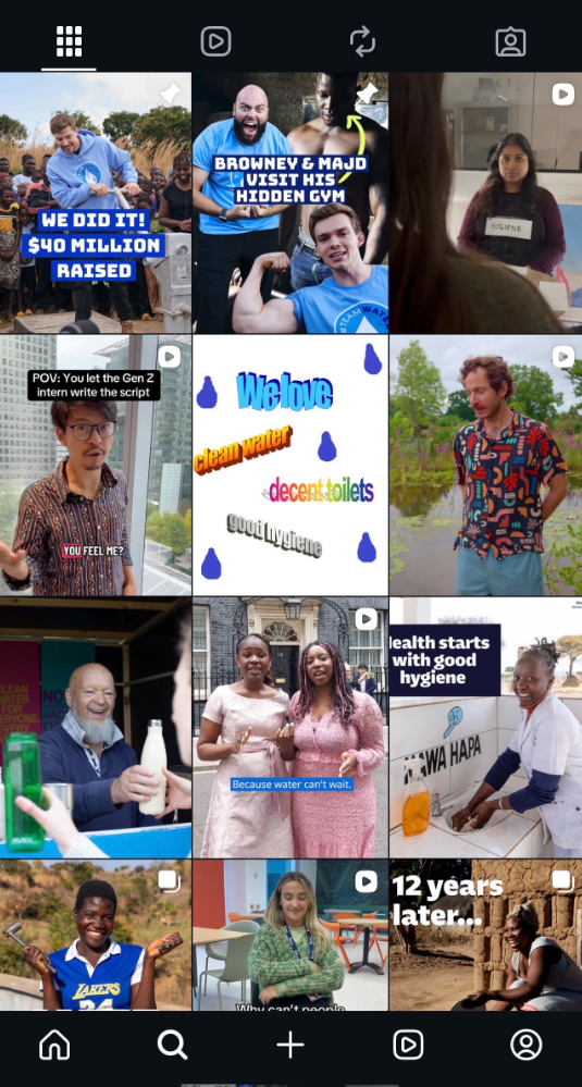
The website is easy to navigate. The websites first page when you click on is a donate page, this could put users off as they might interpret it as the company just wanting their money. The subheadings at the top of the page are clear and easy to follow. There is a large donate button at the top of every singe page on the sight. This button is the only red button on the site. The design of the website is simple and it uses a lot of photos and videos. This shows users proof that the charity is working and actually making a change. At the main page for each section, there is a tiny box of text that gives a whole overview of the page the user is about to read. The Water Aid social media has variety of posts from skits to information about their cause. Some of the posts follow tend or make references to pop culture which can attract a younger following. The reason their posts get a lot of attention (apart from the fact they’re a big charity) is the short posts as users will be more likely to stop and read if there’s bold text that is quick to read.
The Donkey Sanctuary
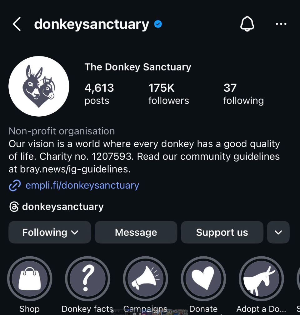
The mission of the donkey sanctuary is to help fund projects that rescue and rehabilitate donkeys all around the world. They have a main sanctuary in Devon. The sanctuary partners with other organisations to help the future of donkeys, from teaching locals about veterinary care to stopping the donkey skin trade. The main users for this website will be users between 25-50. this is because most people will use the site to donate to the sanctuary. The users could also be using the website to ‘adopt a donkey’ for themself or their children.
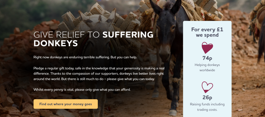
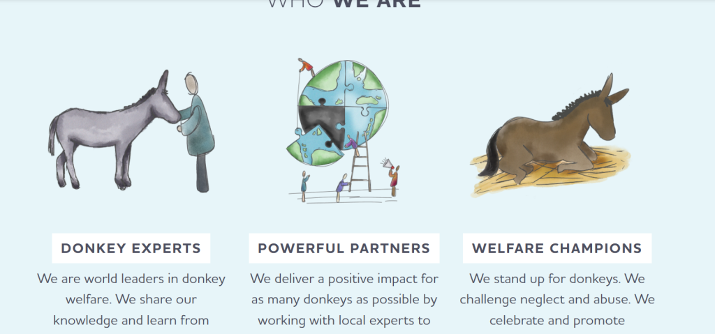
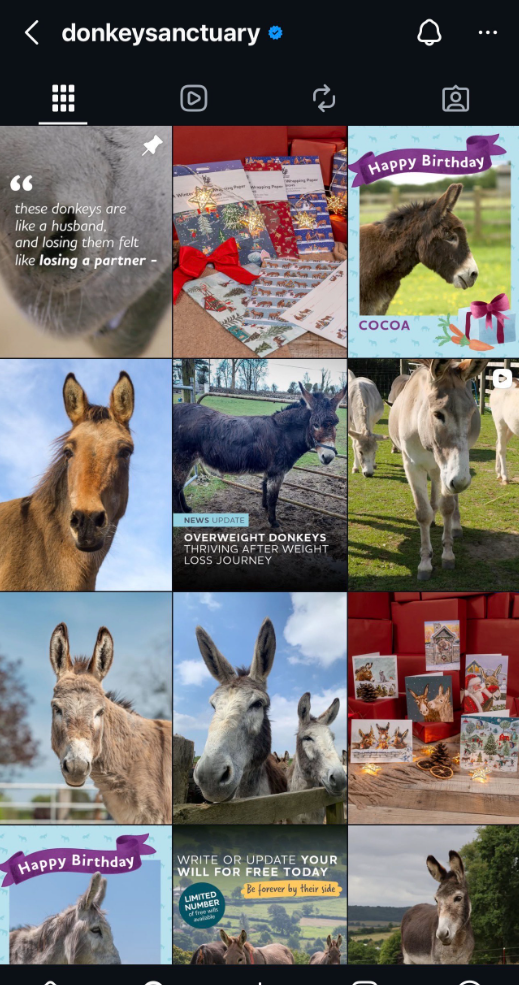
The website is quite easy to navigate however users might get confused from the landing page. The website goes straight to the donate page, however from this you can scroll down to find out more which isn’t made clear at first. Each subheading drop down is quite difficult do navigate, some parts are clickable while some are not. When pressed the logo in the top left corner of this page doesn’t bring the user back to the same landing page. The majority of the visuals used for this are photos taken of the donkeys in good situations and bad. This can show users the work they are doing and how its making a positive impact to donkeys life. The website also uses a couple illustrations that shows the story of the donkey sanctuaries journey. The font is easy to read and the writing is large enough that users with poor eyesight would find it easy to read. The writing is clear and direct to the point so the user can get plenty information with out needing to read a lot, this is also good for users with dyslexia to understand better. The social media posts vary from informational posts, updates on the donkeys and advertisements. There are a lot of posts with updates and information on the donkeys could engage users who love animals, making them more likely to donate. The branding and posts are all consistent across all platforms.
Overall these two sites provide inspiration for my website especially in layout. Both websites use imagery in interesting ways such as overlaying it with text. Their social media posts are bold and stand out well when scrolling.
Mood board
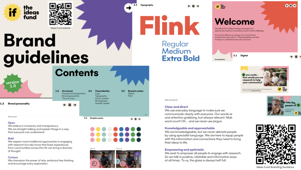
This is the brand guide lines that was given to us from the ideas fund.
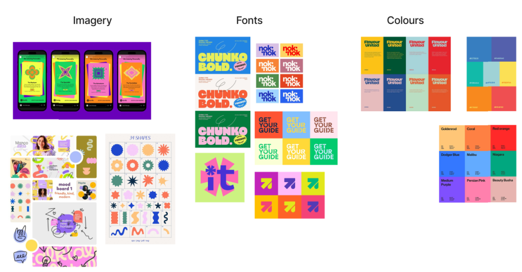
From those brand guide lines I made my own mood board. I looked into different colour combinations similar to what they provided. For fonts I knew I wanted a bold logo that stood out. In a lot of my inspiration the logos are shown in different colours which is some thing I want to include in my final design. Imagery is important for the collective as it can capture users attention before they read anything.
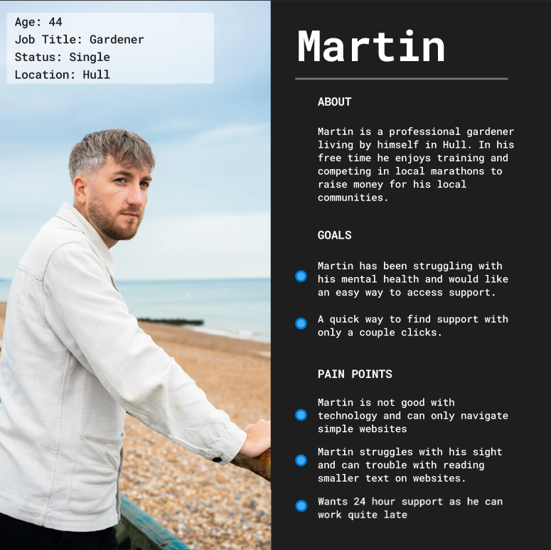
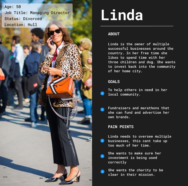
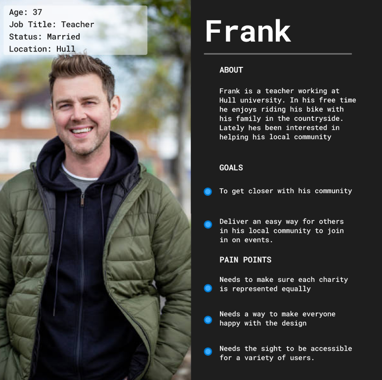
User Personas
Design Ideas
Logo
When creating my logo I had to research what other charities logos look like. From what I found most charities use a long logo with imagery or a symbol next to it. To make my logo stand out I wanted to try stray away from this. For my logo I looked into what each type of logo would require.
Long Logo- The name of the fund, participatory collective, is made of two long words. This means the logo needs to be clear and easy to read. To make sure of this, I won’t use small or cursive fonts. I will also make sure each letter has enough space between it so it can be read from a distance.
Short Logo- For a logo using the first letter of each word, it needs to be clear to the user what letters they are reading. The logo also needs to be positioned correctly or the user might read the letters the wrong way around.
Symbol Logo- There are many symbols associated with charities such as trees, people, ribbons and mostly hands and hearts. A lot of the symbols associated with charities are also used for symbols of piece. The participatory collective is about highlighting mental health charities in hull. The main symbols I associate with this is people, brains and support e.g. hands.
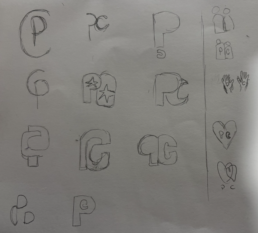
Out of all these options I wanted to explore a short logo an a symbol logo. I started with the short logo as this was the one I had more ideas for. I made some sketches to get some ideas. I knew I wanted to use a bold font so I experimented with different fonts. I tried different approaches such as putting the letters next to each other, inside of each other and overlapping them. After that I realised that putting the C inside of the P makes a question mark however that symbolism doesn’t really apply to the participatory collective.
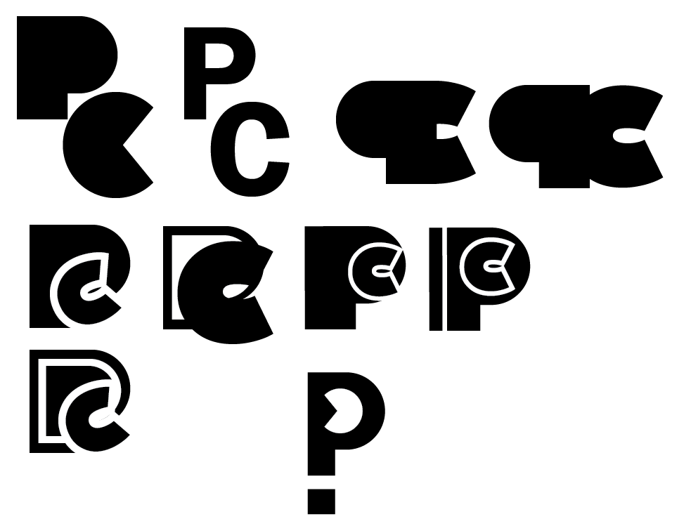
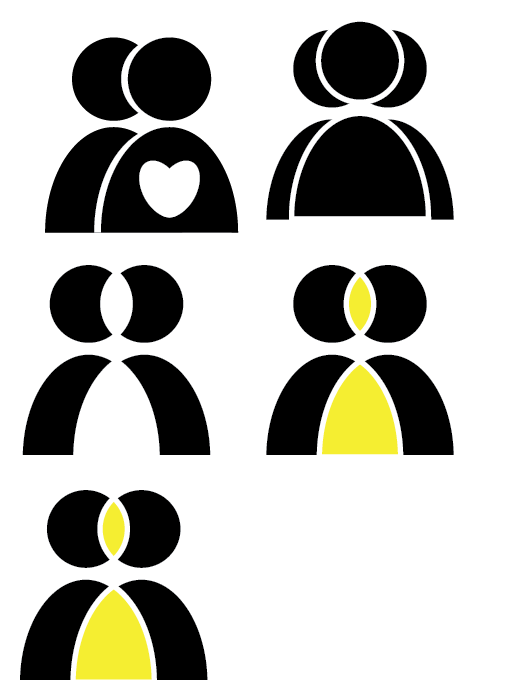
After this I decided to explore symbol logos following the themes in my mood board such as bold lines and bright colours. As the participatory collective is for communities, I made a couple logos with simple shapes that look like people. I tried a couple different versions of this logo by changing the positions of the people and adding colour but decided that I prefer the logos I made with letters.
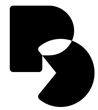
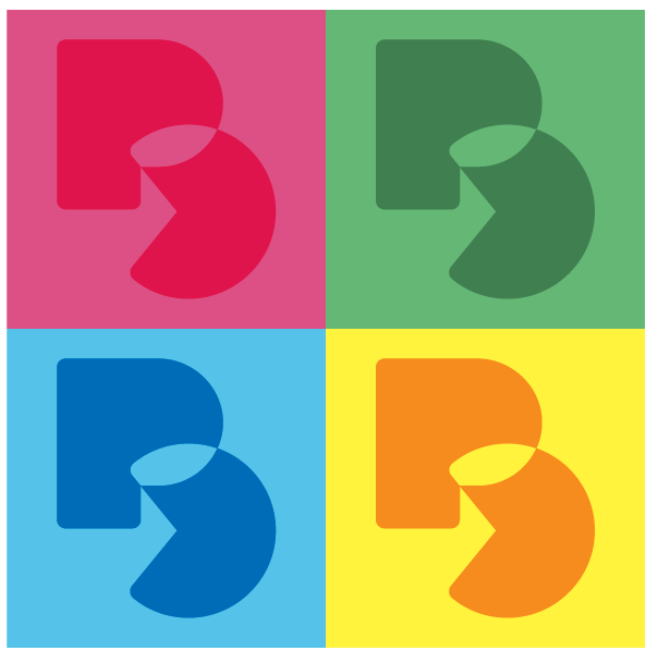
Here is my final logo. The letters are bold and clear, making it more noticeable to users. If you look closer at the logo between the bottom of the P and C, there is an arrow. This was not intentional but I think an arrow could be interpreted by the user as ‘being progressive’ and ‘taking action’. All the space in the logo gives freedom for it to have images or illustrations inside depending on what social media post or advertisement its used in. After this I experimented with colour. I like how the logo can be used with any colour so no matte what colour the post is, the logo can match.
Colour
For colour I wanted to use similar colours that the participatory collative wanted. I chose to 9 different colours that I think represent the collective well. The range of colours can be used for many types of posts.
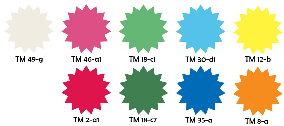
(TM-True Match)
Typography
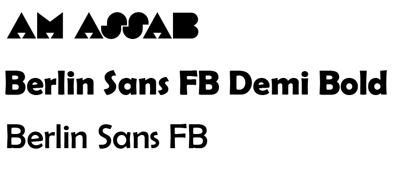
For the typography I used bold fonts that match the logo and work well together. The first font is what I used for the logo. This font is better used for single words as in longer sentences it can get harder to read, especially for users with poorer eyesight. The second font is bold and easy to read and eye-catching. The font could be used for titles or pieces of text. I think this font would be good for social media as most users sometimes only read the larger letters when they are scrolling. The final font would be best used for larger pieces of text such as on the website. The font is clear and printed, meaning that users with reading difficulties will find it easier to read.
Design
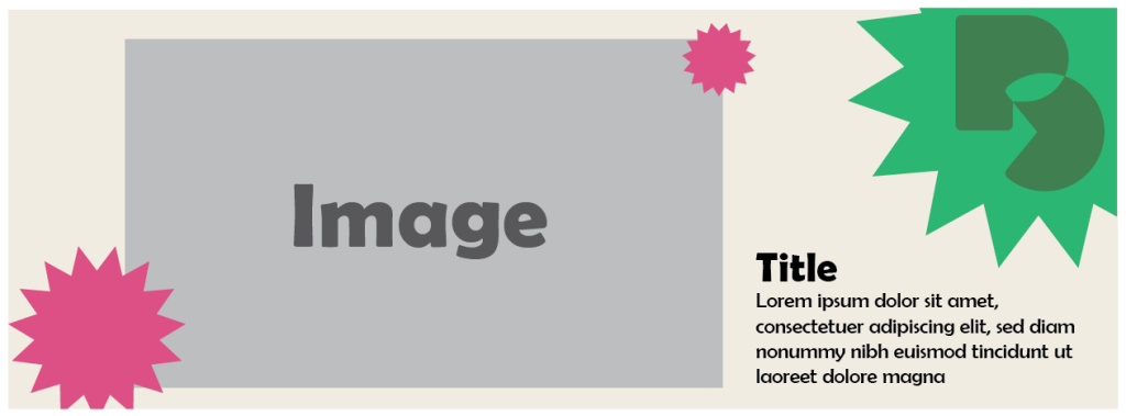
The images below are a combination of the logo, colour and typography I’ve made. I wanted to see how well they work together in one piece of design.
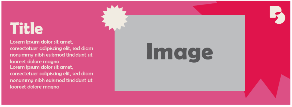
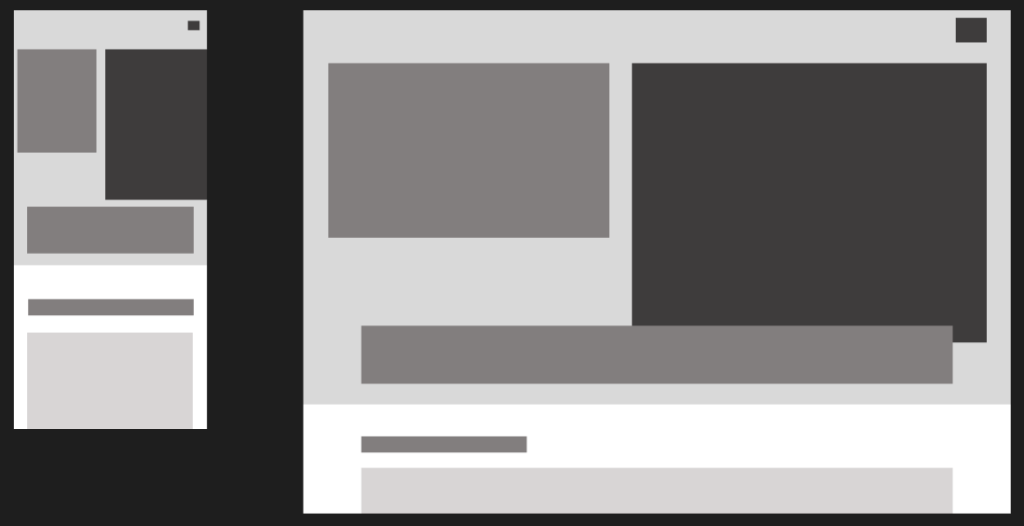
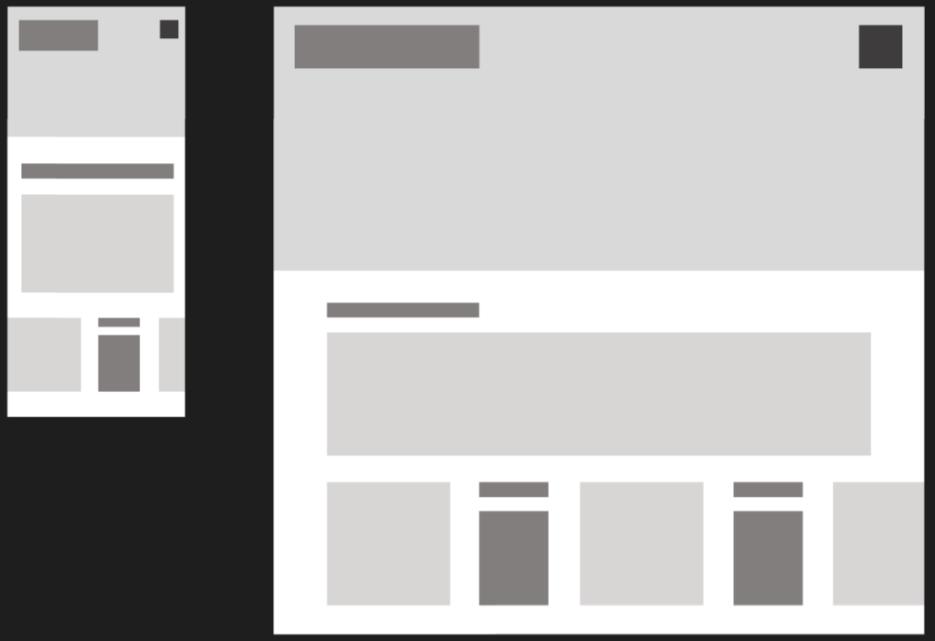
Low fidelity web and app layouts
When designing my low fidelity layouts I made the mobile version first. I wanted the landing page to be eye-catching and colourful. I don’t want the logo to take up the most of the landing page as I think visual storytelling is also important.
Storytelling, Ethics, Accessibility
Storytelling
Storytelling is important when creating a website, especially charities. While the visuals are important to catching the users eye, its the story that hooks the user. A good story can help users sympathise with people they haven’t met. Helping users understand and see through others perspective connects them more to the charity and its mission. This will make the user more likely to donate or help in any way they can. In my website I want to add stories and quotes from the charities to help connect the user more.
Ethics
There are many ethical considerations for web design as the internet produces 3% of all global conditions. Its important to reduce energy especially considering the rise of AI and its use of hydro cooling which is taking away water sauces from towns. One way I can reduce consumption is using a small amount of photos and videos on the website. Another way is to use low energy colours such as black and grey.
Accessibility
Accessibility is important to design because it opens your website to a larger audience. Adding things like a screen reader helps users with sight needs access the website and find what they need. Another way to make the website accessible is to use clear and simple wording to help those with dyslexia.
My Design Goals
The collective wants clear wording using everyday language and simple sentences to get the point across to everyone
The words need to be attention grabbing. The tone of this wants to be confident and action-orientated. This needs to be used for more difficult subjects. There needs to be a compassionate tone/heart warming. To make to donators feel like they’ve made a change and sympathise with the families going through anything. The tone also needs to be kind and approachable so users feel encouraged to get help. I want my final outcome to include different options on the landing page that lets users with sight needs customise the page to improve their experience. Another thing I want to include is simple wording to help users with dyslexia. In my final outcome I want my final design to be bright and stand out to users. The design across socials will also be consistent with the website.