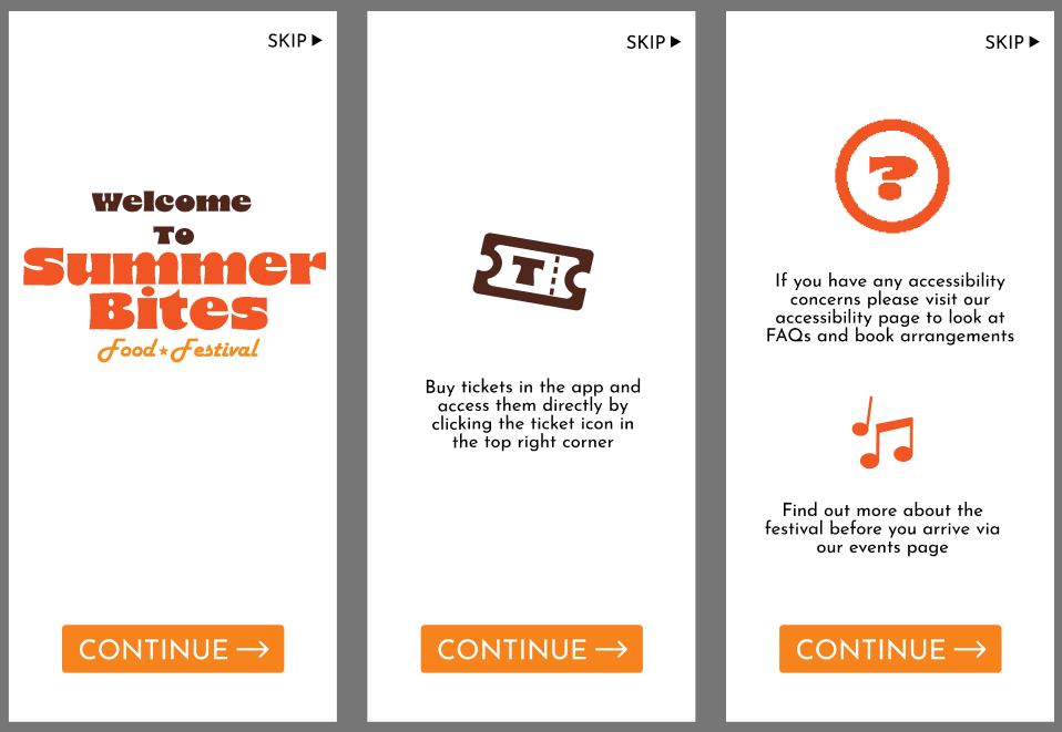
Final Mid-Fidelity app design
Here is my final layout for my onboarding, this is three pages of information that will help users navigate the app. I am overall happy with how this looks and will add more detail in my final outcome, such as images or patterns to replace the white backgrounds.
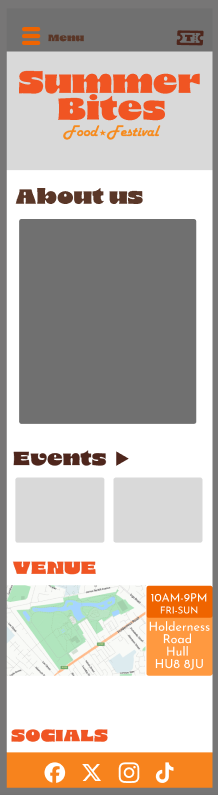
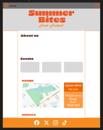
Here are both the home pages for my app and website. There is not much difference between my home pages apart from the top right corner where the ticket button on my app is replaced with a help button. I made sure both of these home pages are easy to navigate even for people who are not as tec-savvy. These pages include a map and address of where the festival will be and the days the event will be on. At the bottom of these pages are a list of socials that lead users to the festivals socials.
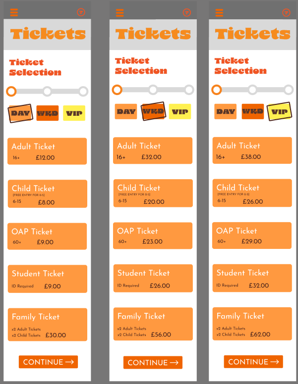
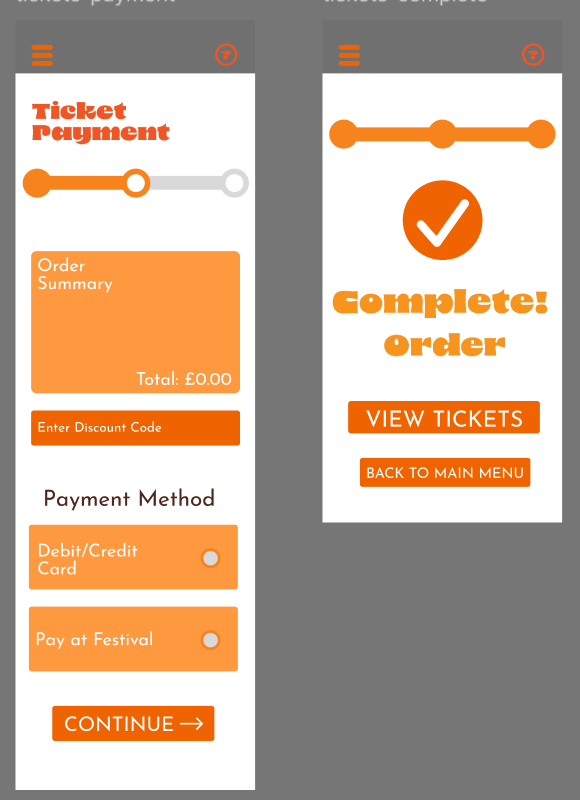
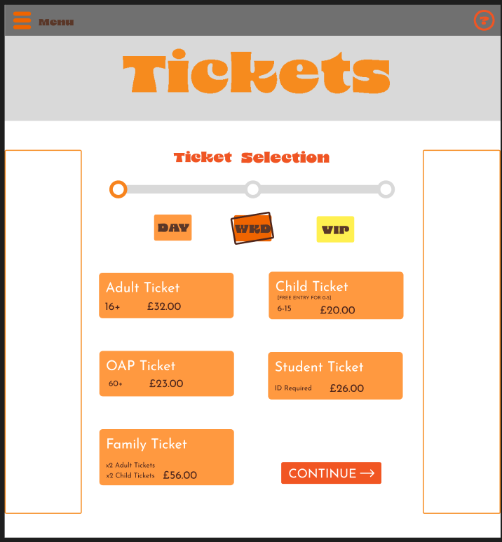
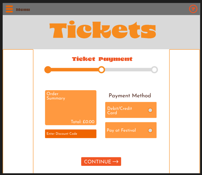
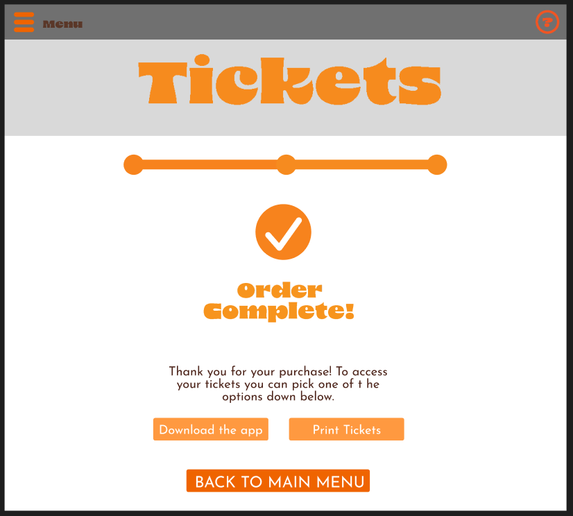
This is the final mid-fidelity lay out for my ticket sales pages. I tried my best to make to process as quick and easy for users with simple instructions. At the top of the first pages are clear boxes that let the user know what type of tickets they are buying. At the bottom of each page there is a clear ‘continue’ button with leads users to the next step. An important part of the design is the progress bar, this lets users know what point they are at and how far they are from completing it. On the check out page it gives the user two options of going back to the home page to view the tickets they just bought, this makes it easier for the user to click out the last page than pressing the menu button and selecting another option.
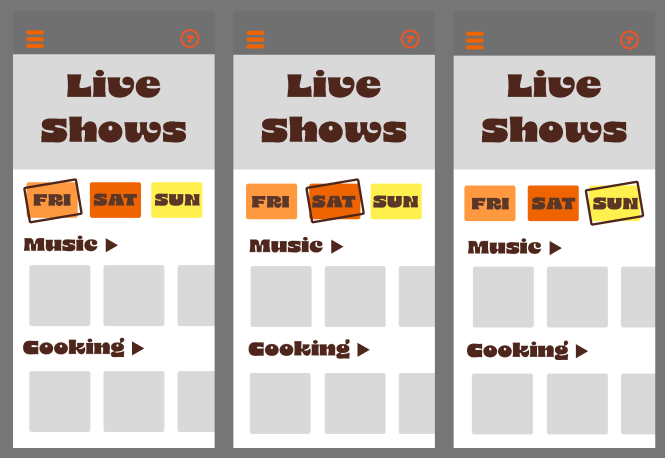
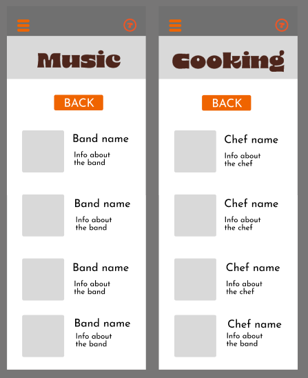
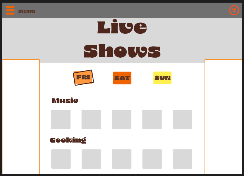
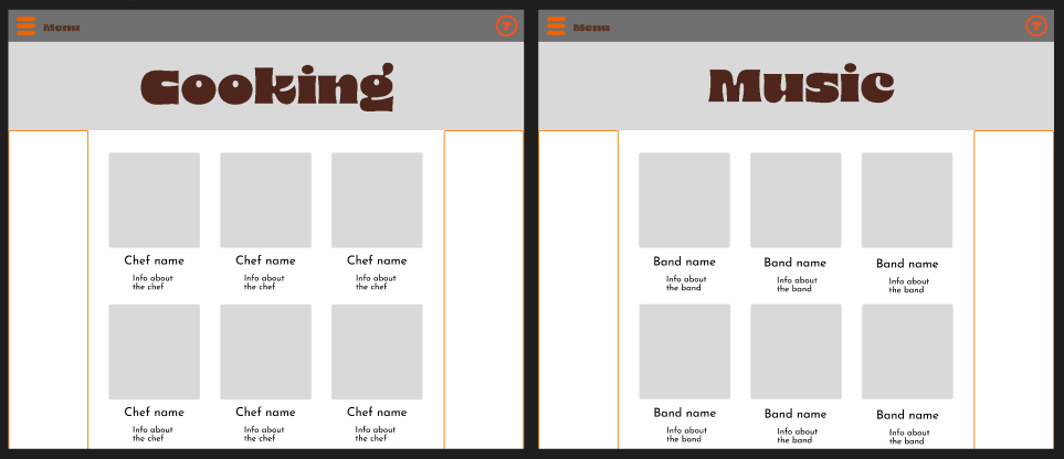
Next is my live show pages, this tells users about all the events that will be at my festival so they can see if they are interested. The user can change between each day at the top of the page. These buttons are in the same style as the ones on my ticket sale page. On the option page will be a couple example bands and chefs and when the users press either the music or cooking button they are brought to another page where they can look at different artists and cooks. At the top of this page is a back button that takes the user back to the first live show page.
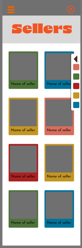
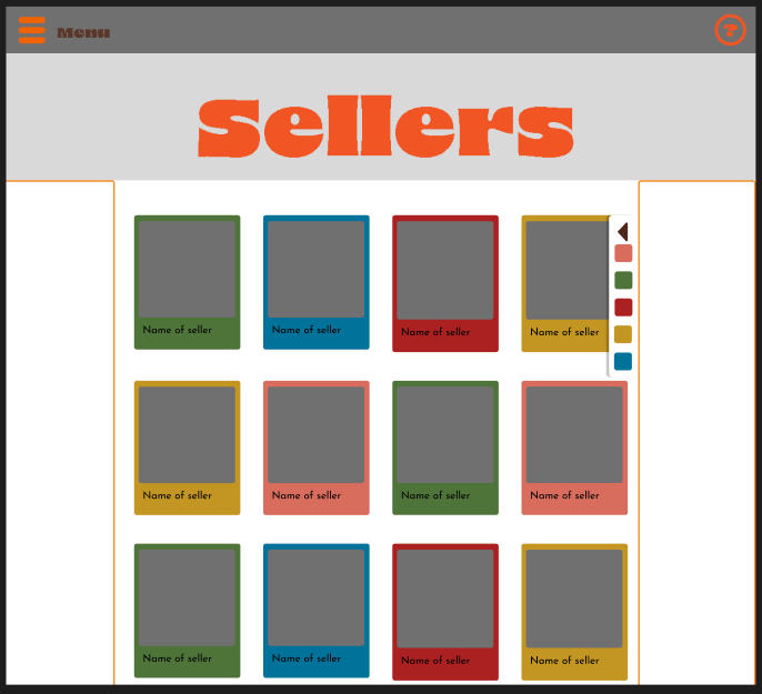
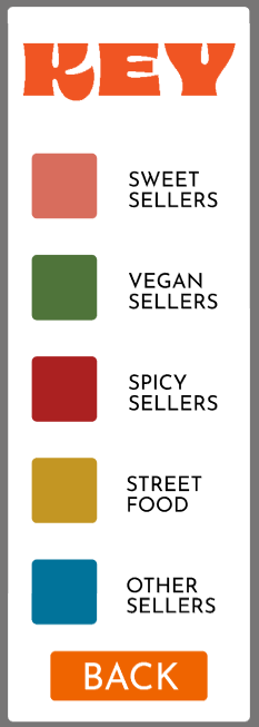
After this is a sellers page where users can see what types of food and sellers will be at the festival. Each of these sellers are colour coded by what type of food they sell. At the side of this page is a key that when clicked, pops out with a more detailed key to let users know exactly what each colour means. On each seller part, the picture is the biggest part, this is so users can look at the logos before reading.
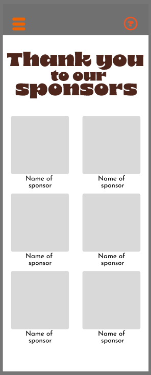
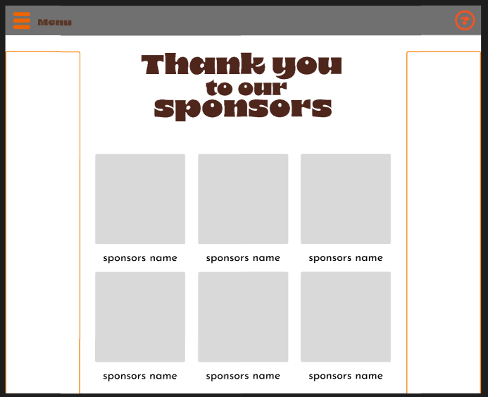
Next is my sponsors page, this is to accommodate for the stakeholders. Each sponsor has a large photo of their logo and smaller text for their name.
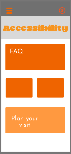
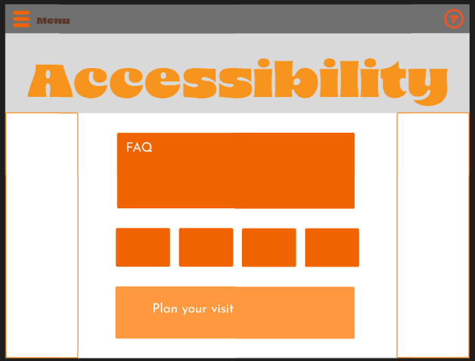
My final page is the accessibility page, this page is to answer any questions that users have about the event and if needed, help them book any accommodations they would need.
App Video