Onboarding
Onboarding is important to include in my design as it guides users to key points of the app and reduces confusion in the future. For my onboarding, I chose do 3 slides that tell users different things such as information on how to buy ticket and where to find them. An important part of the onboarding is a skip button that allows users to chose if they want to read the onboarding steps or not.
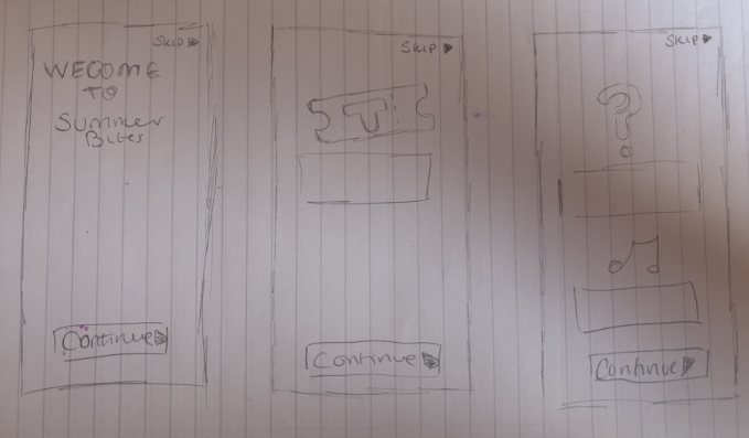
Sketches of my onboarding page
Here are the sketches I made for my onboarding pages, I had a clear idea of what I wanted to add to the pages. I think the first page having the logo is important as it shows users right away what the app is for and they can also recognise the logo. The second page has the most important information on it because ticket sales are the main purpose of the app. The final page just has some additional information about accessibility and how to check the events that are happening at the festival. I wanted to keep it to three pages as too many can turn the user away from the app.
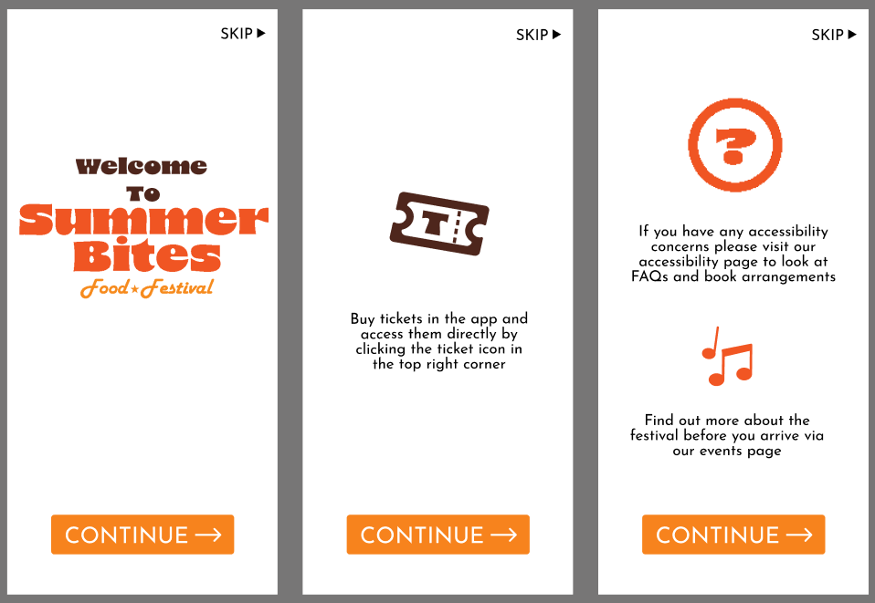
My onboarding layouts
These are my 3 onboarding pages. I made the instructions as clear as I could because some of my users from my servery had reading difficulties. I also included icons above each piece of work so users can know what each part is about before they read it. For my high fidelity I will make the skip buttons stand out more and be clearer. The white backgrounds will also be changed in the high fidelity layouts.
Responsive layout
This is the responsive lay out for my festival. The design of my app is easily transferable between app size and desktop size. Both layouts remain the same with only a couple changes, such as the size of the logo at the top. Its important that the responsive layout is consistent between different devices so there is continuity and is recognisable to users. This is also important because will know its the same festival by just the layout without reading anything on the website or app.
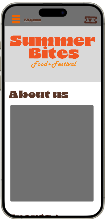
My home page on mobile
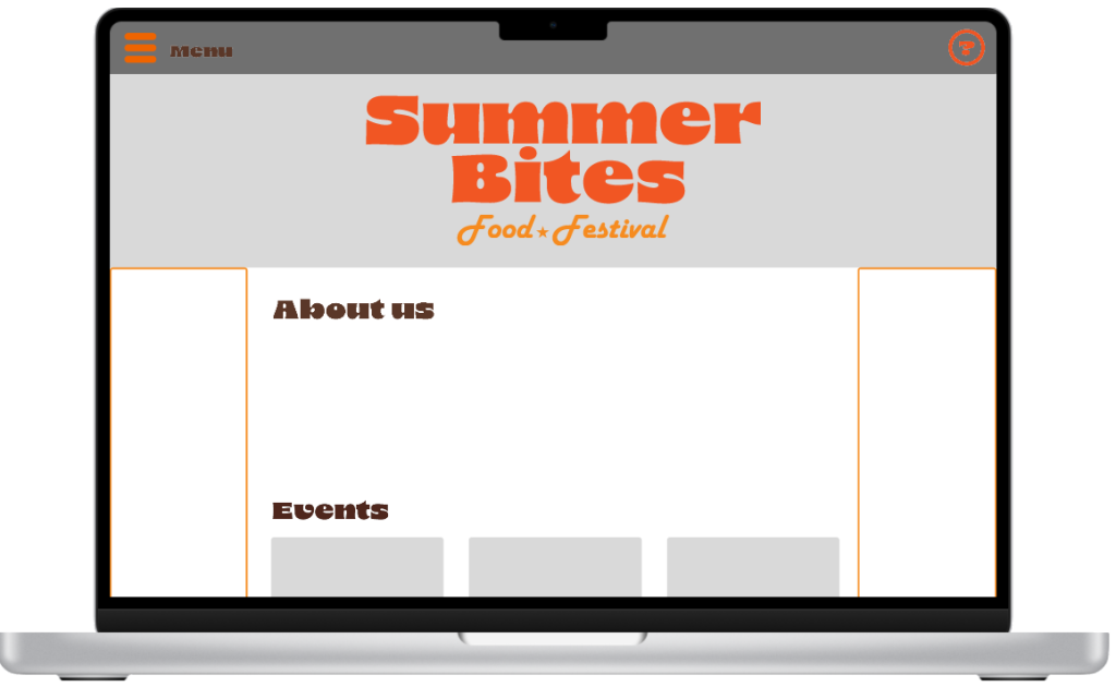
My home page on a laptop
Mood boards
This is what I envision my festal to look like. The festival will be outside and have a hippy and recycled 70s vibe. This also give stakeholders a clearer view of what the festival will look like. This mood board also shows the ascetic I want my app and website to follow. I think this would be a good inspiration for my festival because the association festivals have with the 70s and the overall nostalgic vibe that the decade has. One main inspiration is the posters because they are so vibrant and can catch peoples attention. I also like the patterns from the 70s that I think would look good especially in my final piece as it would make my app and website stand out. I will make sure my text and headers are still visible despite the patterned backgrounds in my high fidelity layouts.
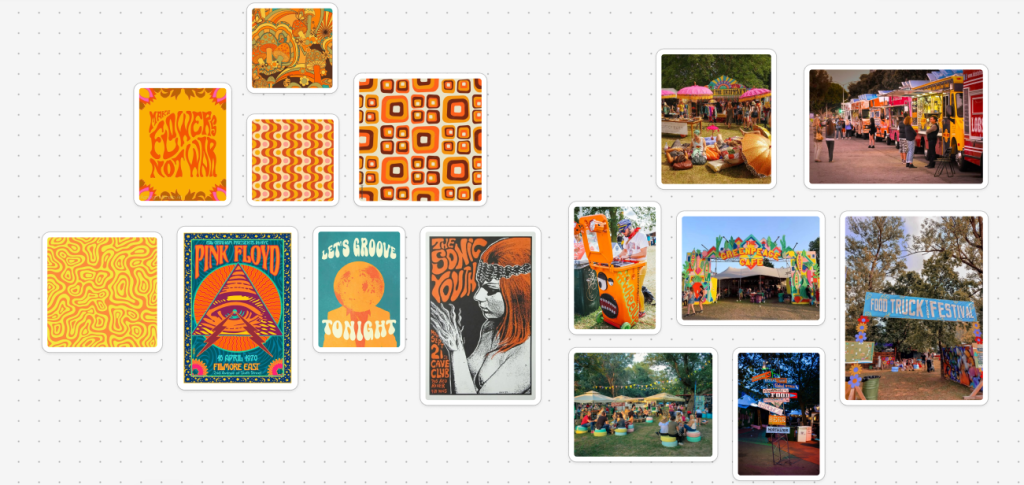
My mood board