Logo
This is the development for my logo, this is used at the top of my main page for both website and app. Based off my mood boards I wanted a bigger font that follows the 70s ascetic and is clear so users with sight needs will be able to read it.
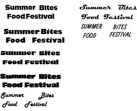
Experimenting with fonts
Here are some samples of the various fonts that I have tried. I wanted a bold font that would stand out and a smaller font on the button that compliments it. Once I selected my font, I changed the spacing between the letters and put the second word underneath the first. This was to make the overall logo size thinner so when its on a phone, the logo can be bigger.
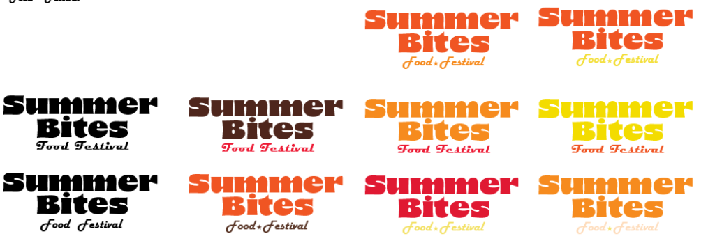
Experimenting with different colours for my logo
These are some of the different colour combinations for my logo. I wanted my logo to be colourful and give the user the feeling of summer. I decided it would be better for the main part of the logo ‘summer bites’ is a darker colour so it stands out more against any background. The smaller font works better in a lighter colour so it does not take away from the main part of the logo.
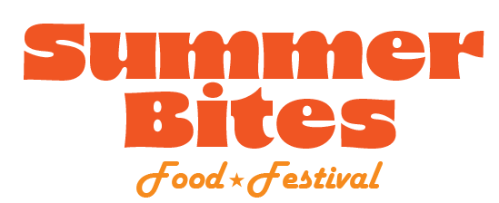
My final logo for my festival
This is my final logo that I have chosen for my festival. The summer bites text is in the 8 Heavy font and the ‘food festival’ is in the Harlow Solid Italic font. I put a star in between the word food festival because the space felt empty.
Typography
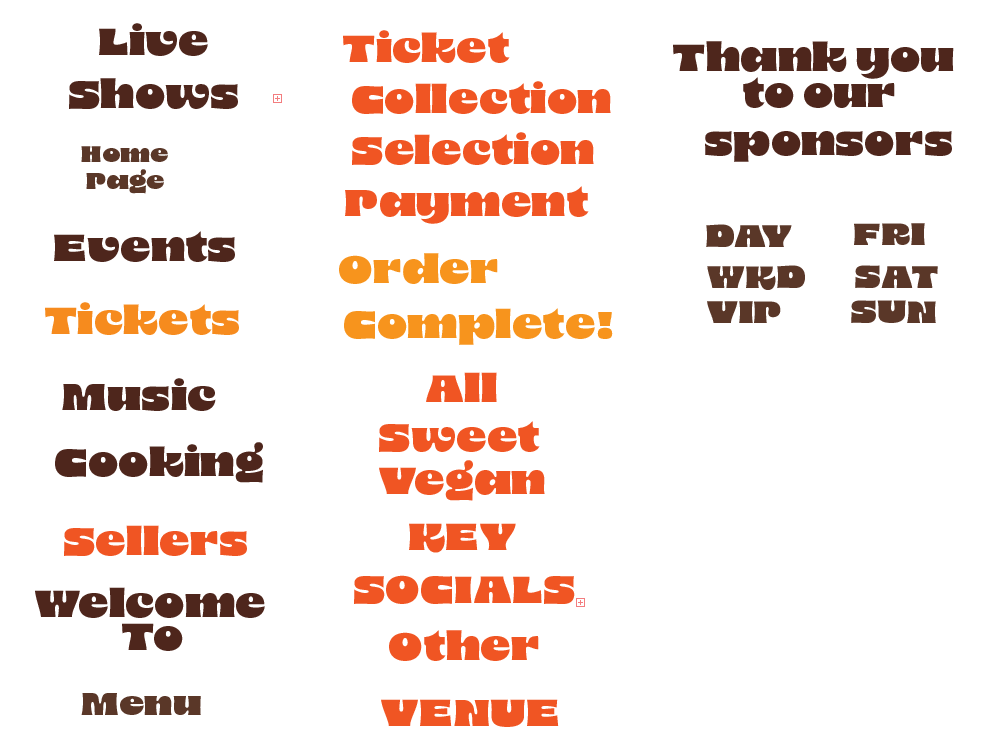
Headings for my website and app
All of these headings for my pages are in the same font as my logo, 8 Heavy, they appear at the top of my website and app to let users know what page they are on. All of the headings are in different colours as the background they will be on. All of these are large and clear so users with sight needs and dyslexia can understand.
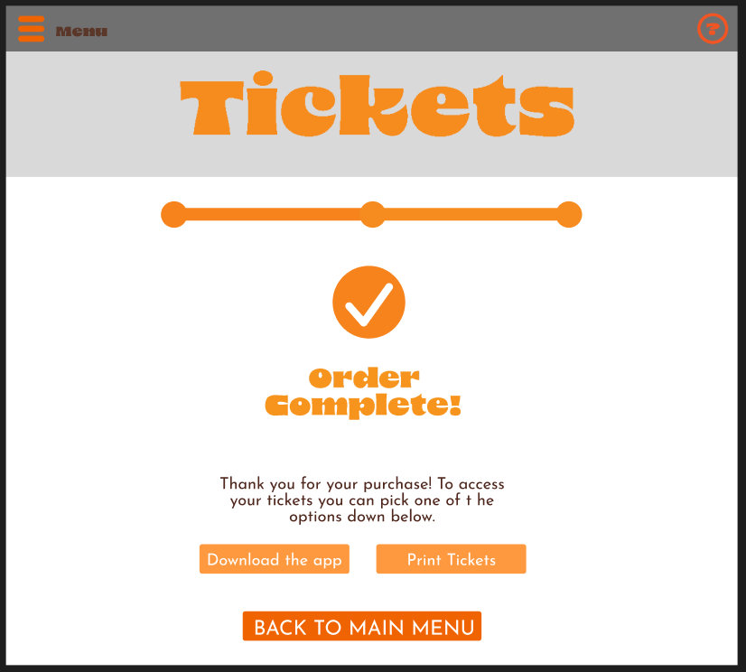
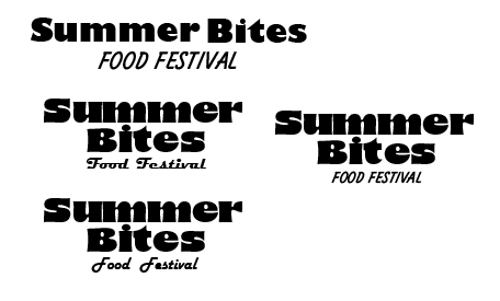
Example of both fonts being used
This is another font I used called Josefin Sans, I chose this font because its clear even when its in a small size. This is better for smaller texts an buttons.
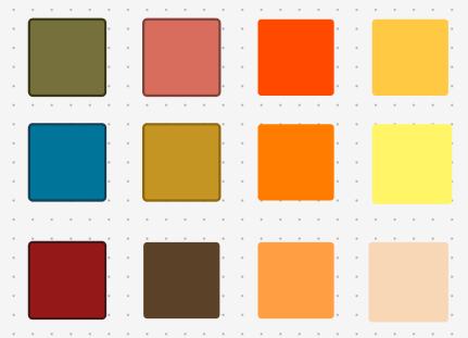
Colour planning
This is my colour palette for my festival. Since the festival will be taking place in summer, outside, I wanted the colours to match. I used warmer colours such as orange and yellow to ‘create a feeling of heat, brightness, and an atmosphere of warmth and illumination’ (figure 1). Another reason I chose these colours is their relation to the 70s. The fonts I used for this project are inspired by the 70s so I decided to make the colours match. In my design I made sure that I did not include any colours that contrast my palette such as neon colours.
References
Figure 1: Color Meanings (No Date) Jacob Olesen. Warm Colors: What Are They and How Do You Use Them? | Color Meanings (Accessed 14/04/25)