Here are my mid-fidelity layouts I created in Figma. These layouts include pages include the home page, sellers page, a page to buy tickets and more. When creating these pages, I kept my user journey map in mind so my app would be accommodating to as many users as possible. I tried to make the most clear and understandable process to buy tickets as that is the most important part for users. This was also what a lot of users wanted based on my user personas.
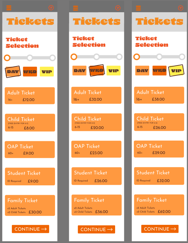

On this page I’ve used a clearer font that is easy to read for users with sight problems or dyslexia. At the bottom of these pages is a continue button, this is so users will have a clear indicator of what to do next. Also, at the top of each page is a clear progress bar that I wanted to make to show the user how close they are to finishing the goal, this is because of the law of Goal-gradient effect which is using ‘a checklist to tell users how much of the job is complete, therefore, leveraging the goal-gradient effect to encourage them to complete the onboarding process.’ (Figure 1).

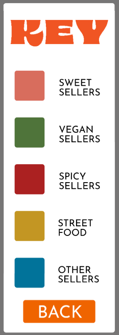
This is another set of pages I made to show off the types off stalls that will be there as based on my research users like to know what will be at the festival before they get there especially for families who want to plan out their day. This is important as it can get users excited for what will be at the festival and can also allow users to see if there will be any food served that will cater to their dietary needs. This was important for my festival as a lot of users in my user journey map had a variety of different diets. Each type of stall is clearly indicated by the colour box its in. To the right of the page is a key that when clicked pulls out tells users what the colours mean.
Rejected Designs
Here are some rejected deigns from creating my mid-fidelity. The first design I rejected was for the overlay that appears when you press the menu button then one of the options. I first designed it so when a selection is made, e.g. the tickets page, the second overlay appears next to the first overlay with an orange translucent rectangle covering the first overlay so nothing can be selected. However, this didn’t work out as this could confuse the user due to how busy the page is and the first overlay, while having a translucent cover over it, still looking like it can be selected. I changed this by having the second overlay directly appear over the first one.
Overlay before I changed it

Overlay after I changed it
Another design I had to change was the location of the menu button, originally it was closer to the top left corner but when I went to prototype the page, I realised the iPhone camera was covering half of the word. To fix this I moved the button down, so it was in full view on the prototype.

Menu button before I moved it
Menu button after I moved it
The final change I made was moving the help button to the first overlay. The reason I did this was to make space for the ticket button which will allow users to pull up their purchased tickets in the app so they can be scanned on entry to the festival.
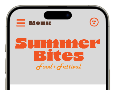
Old location of the help button
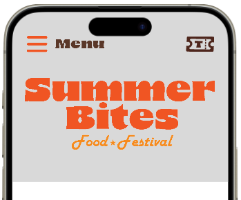
Ticket button that replaced the help button

New location of help button
References
Figure 1: Maze (Jun 10, 2021) Masooma Memon.https://maze.co/collections/ux-ui-design/ux-laws/ (Accessed 7/4/2025)