
These two layout are the first designs I rejected. The design on the left is not pleasing to the eye which could put users off and not want to buy tickets. Another problem with this design is the buttons at the top to select which allows the user to set which piece of information they want to read, are too close together. This could make it difficult for those on a smaller screen or users with mobility problems to click. The design on the right also rejected because the top is too close together and have the same problems as the first design. At the top of the design there is also a ‘about us’ subheading which is unnecessary because it already says it further up in the design. All the headings together may be hard for some users to read especially older users. To fix the problems with both of these designs i will make sure the buttons to select the page have equal gaps between them.
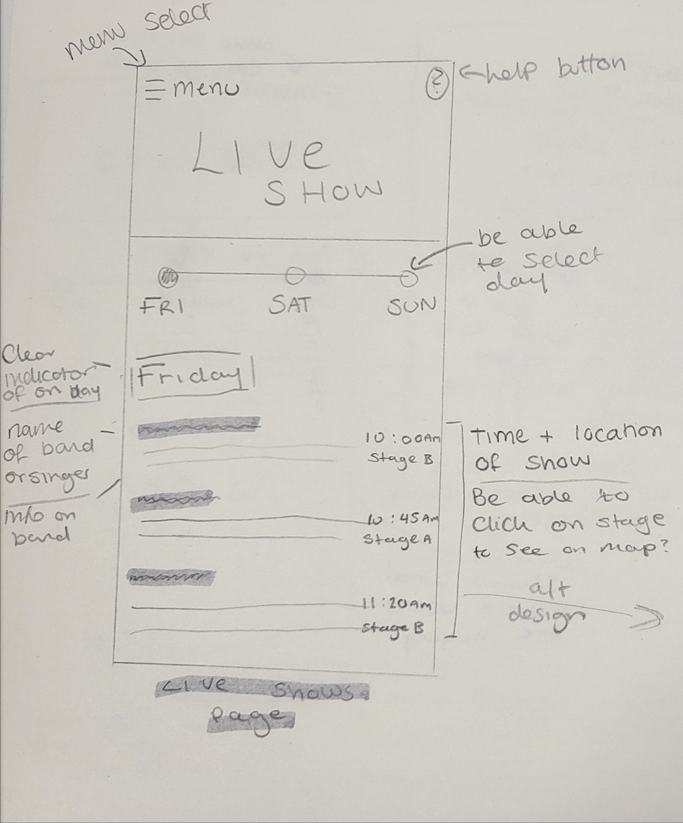
Here is another design I rejected. The reason for rejecting this designs due to the way live shows are listed is boring. Just lists of text might not look interesting to the user and put them off reading what the page is about. This also doesn’t give the user a visual to look at as most people tend to look at pictures before reading anything. Another problem is users can’t get a good idea of what type of band it is just from the name. To fix this I will add a small box which will have the bands logo or picture to get the user interested and make them want to read more.
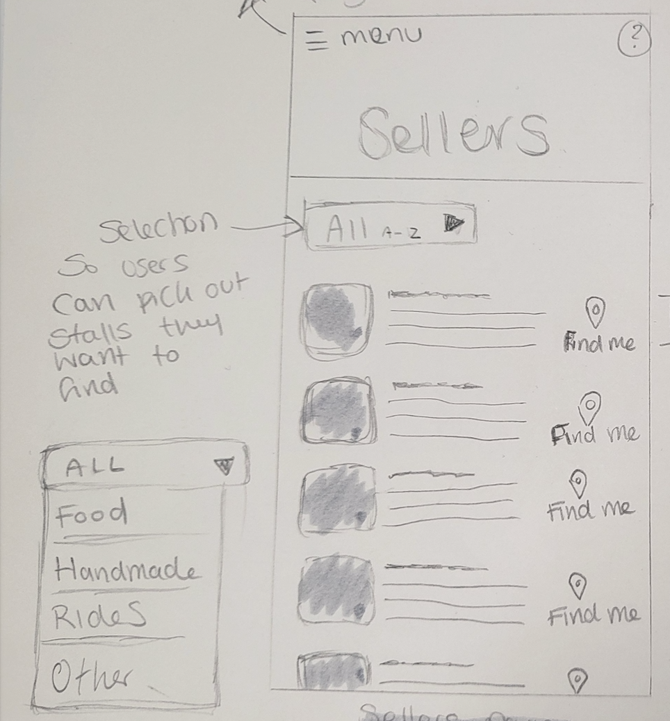
This is the final design that I rejected. The reason I rejected this design is the page selection is too complicated and older user might not know to click on the ‘all’ button to filter the different sellers. Instead I will put a selection of buttons at the top of my design with space so users will be able to read them and not accidentally press the wrong button and will also require less movements from the users. Another part of the design I won’t be using is the ‘find me’ button, this will over complicate my design and could confuse users. Instead I will just add a zone and stall number to guide users in the right direction.