Paper-based prototyping
Here are some low fidelity prototypes I drew out. These sketches show how different pages will look like in my app.
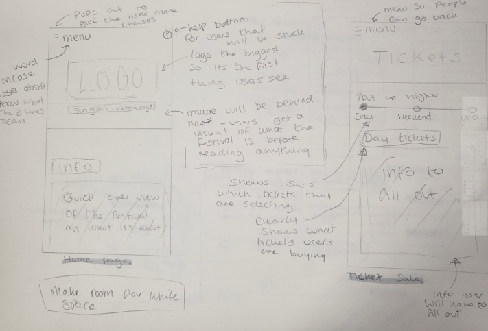
This is the prototype for my home page and ticket sale page. On the page I’ve annotated around key points I want to try include in my work such as a help button to help users who are having trouble navigating the app or website. Another key thing I want to include in my final design is a menu button, this is so users can find what thy are looking for in one area and need minimal movement in the process.
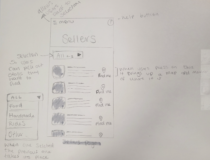
This is a prototype of my sellers page. This will inform user of what types of stalls there will be and what they are selling so it can get users interested in the festival. Another reason this is important is so users can check to see if any sellers will be serving food that applies to their specific diet or allergies. Also another feature I want to add to my work is a find me button, pressing this will give the user a marked location on a map showing them exactly where it is. If I don’t have time to do this I will instead add the location e.g. number of stall and zone its in.
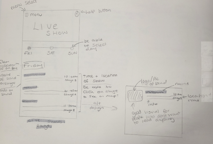
This is my prototype for my live shows page. This will inform the user on the live events that will be preforming and also which stage the performance will be taking place. I prefer the design on the right for the way the events will be displayed.
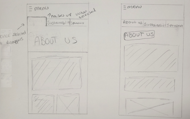
This is another page layout I created that is for extra information users might want to know before going to the festival.
considered constraints within your design to guide stakeholders to correct choices within your interface?
I’ve added a help button just in case users get confused at any point. There will also be clear and easy instructions that guide stakeholders through important processes such as buying tickets. I will also add a progress bar to show user progress and make them more encouraged to finish the process.
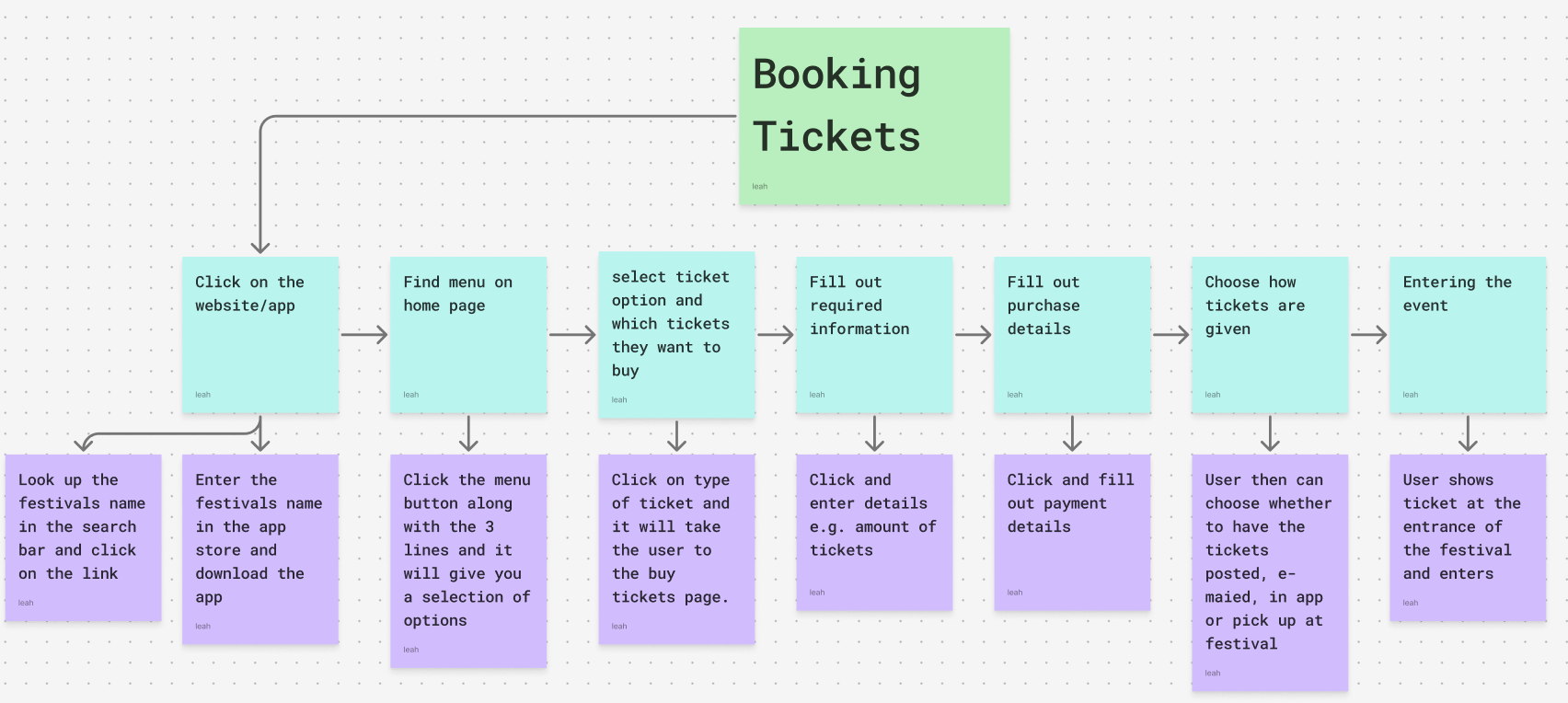
HTA
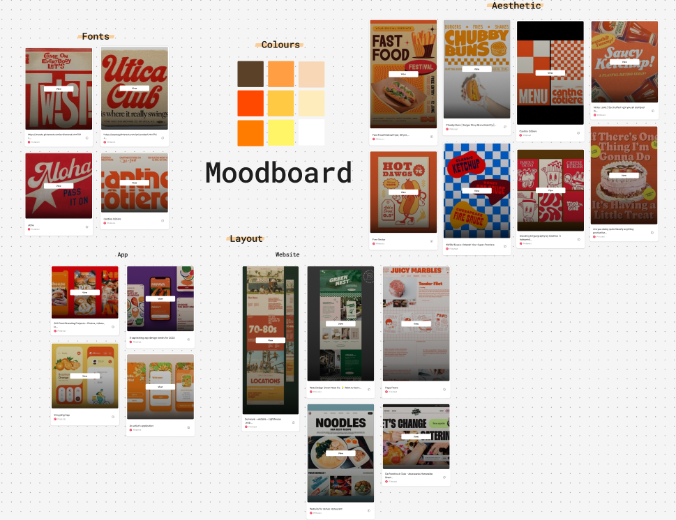
Mood board
Here is a mood board I created to give the stakeholders a good idea of the overall aesthetic of the festival app and website. I’ve chosen more warmed tone colours to give the feel of summer, these colours are also associated with fast food like burgers as they are the main colours of advertisement for them and also colours of the food themselves. The mood board also shows an old American diner look, this could give older users a feeling of nostalgia.
Wireframe
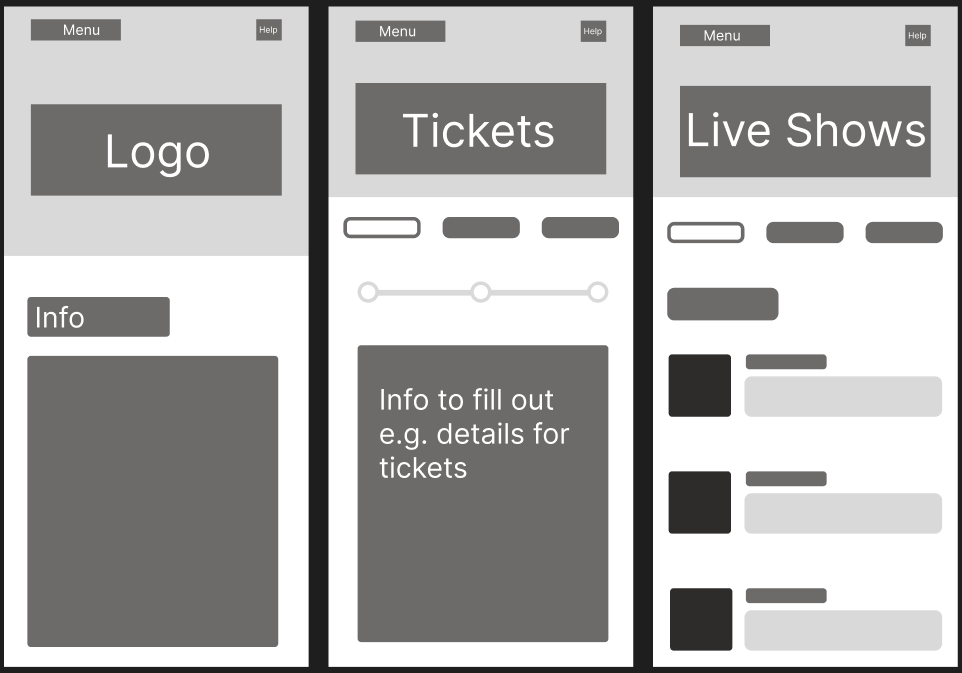
This is the wireframes I created to structure content from my paper based prototypes I created.