For my project I wanted to make a food festival because I’ve personally been to a couple myself and have my own experiences that can help in my project. One of the largest problems with festivals is booking tickets online, especially for those who aren’t as good with computers or navigating websites. This isn’t accessible, especially for people who aren’t familiar with technology e.g. elderly people, I will try to make this more accessible by providing clear instructions that will be available in larger, clearer fonts so they’re easier to see and understand. I’ll also improve the sale of tickets by to have minimal amount of buttons and steps to click and fill out. Another problem with festivals, especially larger ones, is they’re harder to navigate so people might not be able to find a live show or food stall. To make this more accessible I’ll make a clear map that will be easy to understand with clear instructions on how to find what the user is looking for. A big problem for food festivals especially is concerns about allergens and specific food requirements e.g. vegetarian food. I’ll make this more accessible by providing a clear lists of ingredients for each stall, which can be easily found on the website and app so people can check before eating there.
The usability requirements will differ between the website and companion app. One difference is the motor needs that are required. For the website most movements will be done with a mouse or touch pad on a laptop, these require physical movement with a hand e.g. clicking. While the companion app will use smaller movements such as swiping, pinching and tapping. Another difference is the type of keyboard to enter details. When using the app minimal movement is requires as the keyboard is in your eyeline so only requires small movements with your thumbs or fingers. However when using the website the keyboard requires the user to look down at the keyboard and a lot more hand movement to press down the keys. To make this more accessible I will make sure the website won’t need a lot of mouse movement and everything only requires one click. For both the website and the app I will make sure the use of the keyboard is kept to a minimum and will mostly be check boxes.
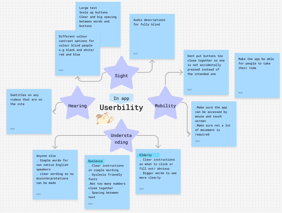
The useability map I created on fig jam.
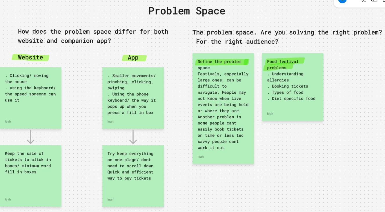
The problem space map I created on fig jam.