Here is my high fidelity outcome for my companion app. This app is made for a game company I created ‘Goodtek’. The purpose of this app is to have all of the companies games in one to make it more convenient for users to check game progress, updates and more.
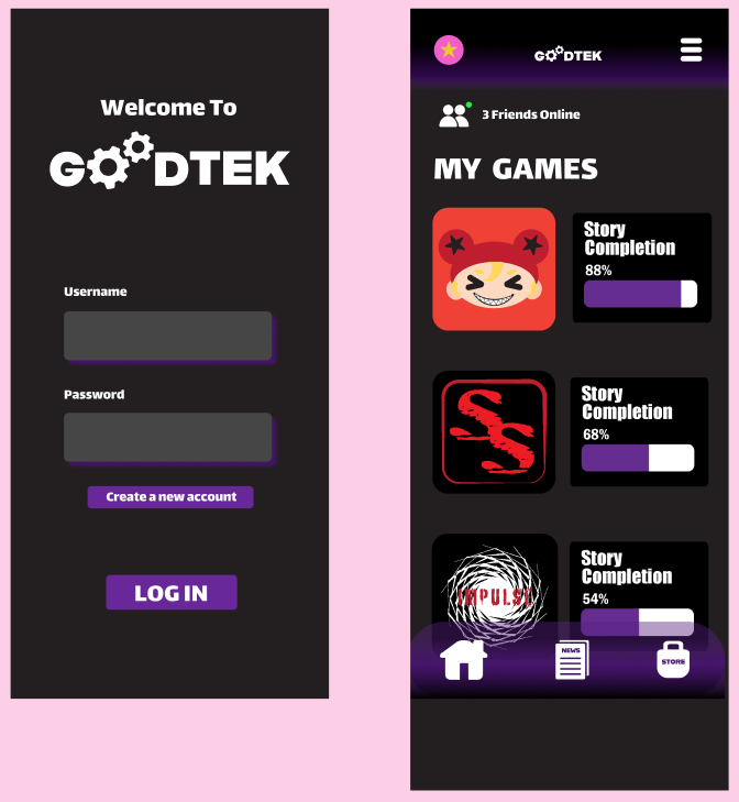
Here are the first two pages of my companion app. The first one is a log in page that allows users into their accounts, at the bottom of this page there is also a create new account button for new users. The second page is the hope page that shows users their games and the progress they’ve made in it. Each game is represented by an icon in the same style of the game. These icons can be clicked and leads users to the games own page. On the top left of this page is the users profile picture, this allows them to customise their own account and if users have multiple accounts, this can let them know if they’re on the right account. On the top left these a button with three lines, when this is pressed a pop out appears and gives the user more options. The reason I have created a pop out was to give the user more options without overloading the hope page and confusing the user.
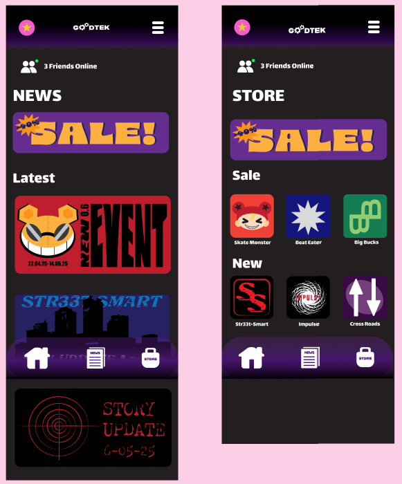
Here are my new and store page. These can be accessed by the icons at the bottom of the page which I created myself on illustrator. Both the pages are straight forward and only require the user to scroll and click.
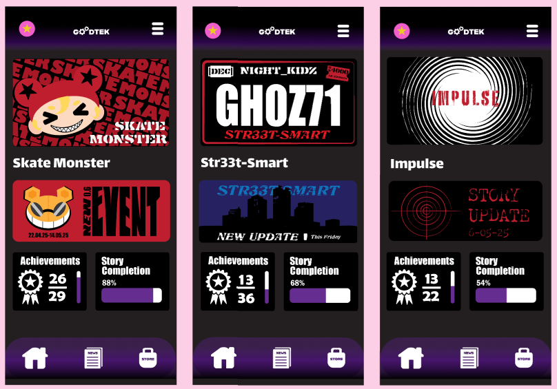
Here are the pages for each game I’ve created. All the logos, news and information at the bottom were made by myself. These are to show off the game to users and make them want to play them.
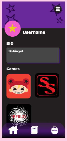
Finally here is the users profile. This give the user some customisation and lets players view their friends. The profile picture and top of the page are customisable to give the user more choice. There is still the three lines that opens the overlay but its in a circle so it stands out against any background the user picks.