For the website adaptation of my companion app, I changed around the order of things. Firstly I changed the over lay from my app to the bar on the left. This will always be there and has the same buttons as the apps overlay. The website also has its home, news and store icons on he right side. I have put a box around each side to make it clearer to the user that they are separate sections.
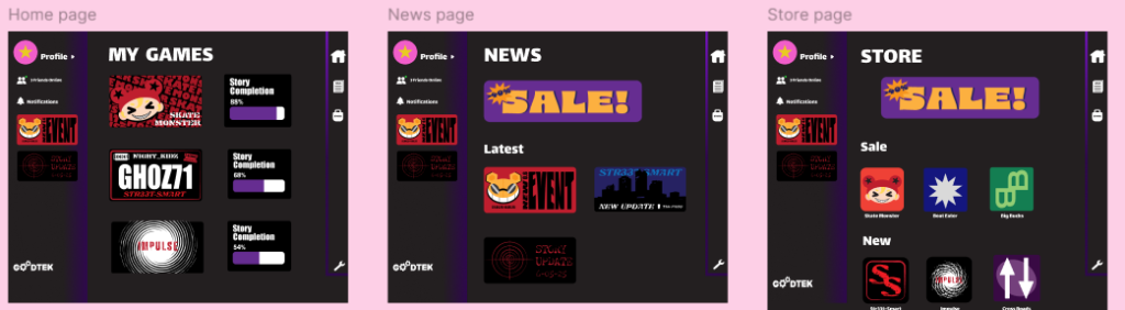
These are my home, store and news pages. Apart from the icons and pop out being switched to the side, the pages remain similar to the ones in the app.
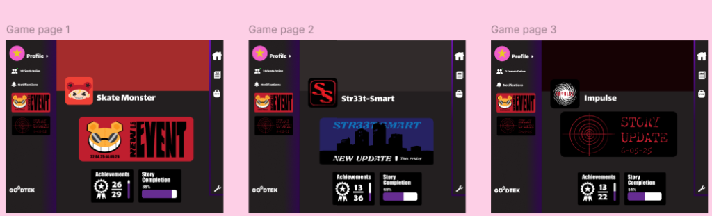
These are my game pages. The main difference between them in the website and app is the top of the website, this is because a big banner in the same place as the app will take up most of the page. So instead I have used the icons and placed a coloured banner behind them.
The wireframe of this website is similar to the one for the mobile version apart from no pop out. The only movements required for this is clicking and scrolling with will be good for users with mobility needs.
Figma Page
Here is the tablet version of my game companion app. It is more similar to the mobile version than the website. The tablet version is wireframed the same as the mobile version.
Figma Page