The subject I’ve chosen for this project is Aquariums. I have chosen this as my subject because I really enjoy going to the aquarium as I love sea creatures and find it calming. In this post I’m looking specifically at aquarium logos, how the graphic designer has used certain techniques to enhance the design and make it eye catching and therefor the viewer is able to instantly understand what it is advertising/representing.
Good Example
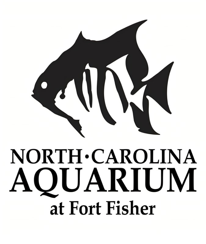
(Figure 1) A good example of typography
Here is an example of a good typography and use of images to make it stand out and clearly advertise what the business is. The font the graphic designer has chosen for this logo is a serif font, this gives the aquarium a more professional, elegant look and the whole logo is in the same font which ties it all together. The descender looks like an ocean wave and the two fish on the top of the logo are in silhouette which are easily recognisable and is a pictorial representation of what the business/aquarium is about. There’s a dot between the words ‘north’ and ‘Carolina’, this helps to break up the word. The word aquarium is bigger and bolder than the rest of the logo and this is helpful as it is the most important part of the logo which draws people in. The text at the bottom is the smallest part of the whole logo, which is because it is the least important to the viewer, especially if they’re already walking past the aquarium. It is also the last part you look at on a poster or advertisement. The location text at the bottom is also smaller because it changes with each location of the aquarium. The logo is memorable so when people see just the fish they associate it with the North Carolina aquarium.
Bad Example
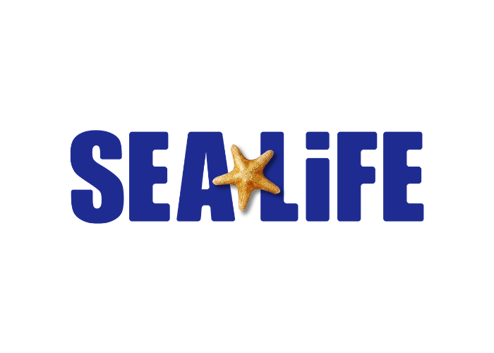
(Figure 2) A bad example of typography (Location cropped out of image shown in post)
This is my example of a badly designed logo by the graphic designer. The name sea life is enough of a clue to the public of what kind of place it is and doesn’t need the addition of the word aquarium so the designer has omitted this from the logo. The font is big and bold, so it catches your attention. The bold contrast of the dark blue font makes the light orange starfish stand out more, however the starfish is a real image on top of a 2d logo, this makes it look awkward and doesn’t blend in well, especially since there is a shadow underneath. A further criticism with this logo is the unnecessary lowercase ‘i’ in the word Life. This makes no sense as the dot on the top of the ‘I’ is not used for anything and doesn’t enhance the word or the logo at all. It could have been made into and used to represent a starfish which would have made it more interesting and better convey the image of Sea Life.
My re-design of the bad example
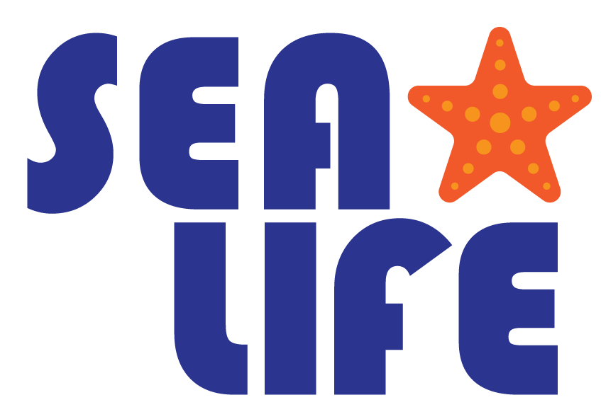
This is my redesign of the Sealife logo. I think it is important to keep the big bold font, partially for continuity of the logo that is recognised by the public, however I wanted it to be more rounded to appear more kidlike due to the place mostly being marketed towards children. I decided to break up the word into two because I think it flows better. I added the starfish in as it is a staple of the Sealife logo but with my design I made it 2d to blend into the rest of the logo better. I added some spots on the starfish to make it look more eye-catching. I also tried different colours and clipping masks, but I decided on the same dark blue the original logo had because I felt it was the best colour. The starfish is a darker orange than the original to make it stand out more and give more contrast.
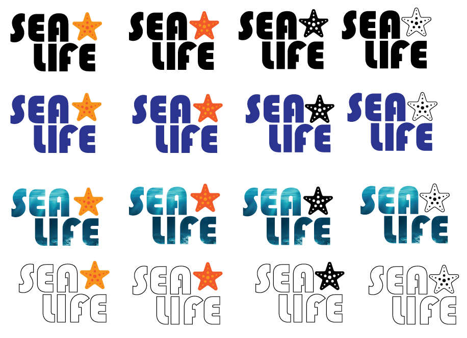
Here’s the sheet of logos I made for this. I tested out multiple colour combinations for this redesign. The reason I chose my final decision is because it was the most eye catching out of the lot. I think the colour choice looks the most like Sea Life’s original done by the designer compared to the rest and gives continuity to the brand logo
Original Logo / Redesigned Logo
References
Figure 1: North Carolina Aquarium at Fort Fisher (No Date) Logos and Brand. https://www.google.com/url?sa=i&url=https%3A%2F%2Fwww.ncaquariums.com%2Flogos-brand&psig=AOvVaw0gXd_gfMjzQf1YXRkFgIiB&ust=1729764088013000&source=images&cd=vfe&opi=89978449&ved=0CBQQjRxqFwoTCJiRq8KfpIkDFQAAAAAdAAAAABAT (Accessed 16/10/23)
Figure 2: Sea Life (2017) SEA LIFE London. https://www.google.com/url?sa=i&url=https%3A%2F%2Fswr-rewards.com%2Fproduct%2Fsea-life-london%2F&psig=AOvVaw3Zk4O2zos9DcnC_fgqavW1&ust=1729763777328000&source=images&cd=vfe&opi=89978449&ved=0CBQQjRxqFwoTCKiirq-epIkDFQAAAAAdAAAAABAm (Accessed 16/10/23)