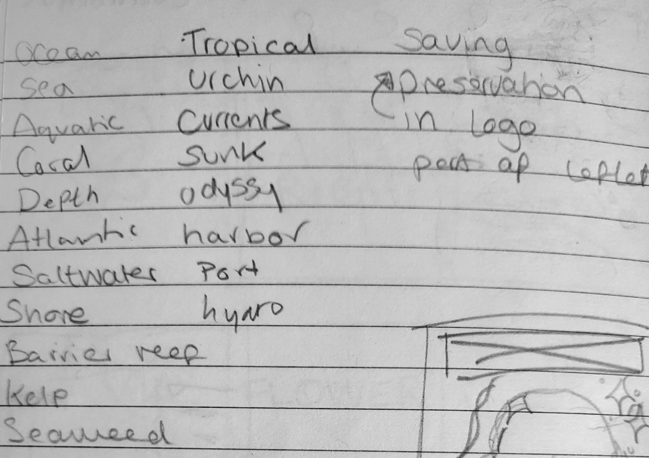
It was hard to decide on a name for my logo so to help me decide I made a list of different words that could be used in my logo. I then combined some of the words together to try find something I like. The words I chose are associated with the ocean or land marks you would find there.
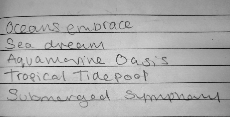
Sketches I made to come up with the name of the logo.
My first name for my aquarium was Tropical Wonders. I chose this because with the word tropical I could add more related themes like hibiscus flowers and sea shells. When I decided on this name I started to explore different types of fonts to find one I think would suit my aquarium well.
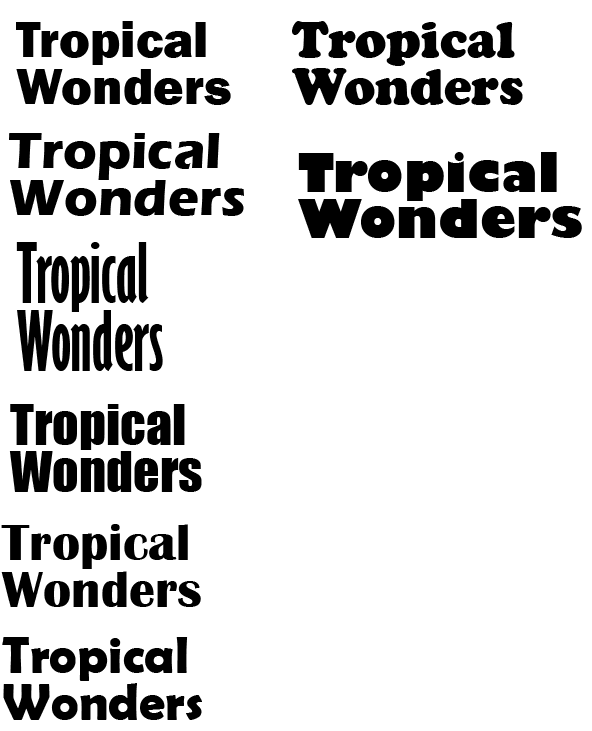
This is the different fonts I experimented with for my logo. I chose more sans serif, and bold fonts. I went this direction with the fonts because I needed the logo to stand out against the posters I will be making. The other reason I chose a more bold font is because I wanted to later experiment with filling the logo with an image. In the end I changed the aquariums name to Ocean Wonders because I felt the name Tropical Wonders by itself is not enough indication it is an aquarium.
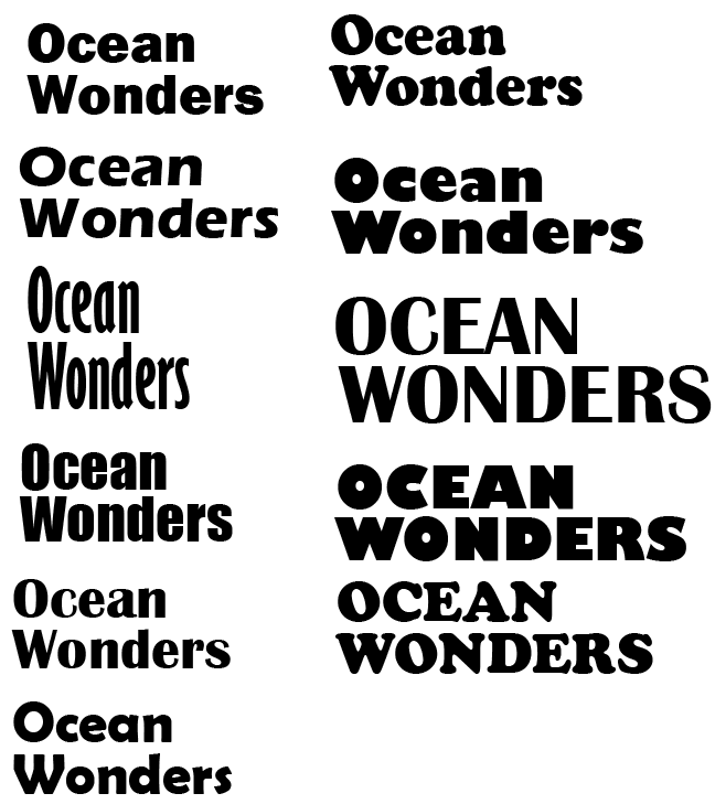
The name Ocean Wonders fits better for an aquarium because the tropical wonders sounds like anything tropical, even tropical flowers or drinks included, while having ocean in the name suggests it everything that is in the ocean.
I used the same fonts as the last logo plus a couple extra ones for the same reason, for it to stand out against the poster.
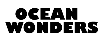
This is the font I decided to use in my logo
Before I fixed the logos spacing

After I fixed the logos spacing
The reason I chose this font is because of how attention grabbing it is. There is also a lot of room in this font to experiment with adding an image in there.
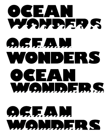
Experimentation with the logo
I tried adding a more ocean theme to my logo with adding different sized waves a the bottom of the words. I made the waves white so it looked like the shape of the waves had been cut away. I tried this for both words individually and together.
I did not like any of these so I decided to scrap the idea. The main reason is the words become illegible with the larger waves covering them. Another reason I scrapped the idea is because when I made the waves smaller so more of the words were legible, the problem then was from far away you could not tell they were waves.
This was my original plan for what I wanted my logo to look like. I chose this photo because I like the range of blues. I asked my classmate their opinions on it, they thought it was too busy. When I added the logo on to my poster I agreed the it looked to busy and was hard to read from a distance because of the background of the poster.
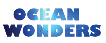
Final Outcome

This is the final outcome of my logo for my aquarium Ocean Wonders. I think the simplicity of the plain blue makes it stand out more due to the fact the font itself is so bold.