Good Example

(Figure 1) A good example of conceptual design
Here is my example of good conceptual design. The bottom of the ‘Q’ looks like a wave, just like the North Carolina Aquarium logo I used as a good example of typography. The word aquarium is bigger than the location as it is the most important part to see, especially when people are walking past. The logo is also simple which makes it easy to understand. The reason this is a great example of conceptual design is because the I in the word aquarium doubles as an eye for the fish in the logo. Also, the logo is also simple and easy to understand which can draw more people in even if they don’t speak English very well. The fish is well hidden so it might take a couple looks before you see it. This logo is a simple design with means it can be put on most branding and merchandise without it needing to be changed. The dark blue in this logo is also a reference to water. Overall, the design is bold, and it is obvious what it is advertising both in its wording and its design.
Bad Example
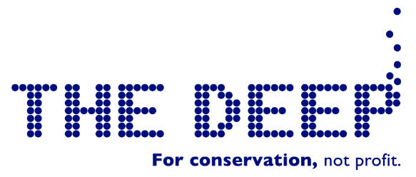
(Figure 2) A bad example of conceptual design
This is my example of bad conceptual design. This logo for The Deep gives no indication that it is for an aquarium or what ‘The Deep’ is about. The letters are created out of dots which are supposed to look like bubbles however this is not clear to anyone who doesn’t know what the deep is and this logo could be used for anything including a bar. Towards the right of the logo the dots are placed vertically to represent bubbles in a tank, which is in itself a good idea for The Deep as it is mainly designed around the idea of enormous tanks with sea life in it, but this is not obvious and could be made clearer by a more conceptual design. For example, wording underneath could include ‘aquarium’ ‘marine’ or ‘sea’ to make the association stronger. The Deep is well known within the Yorkshire/East Ridings but less so in other areas of the UK and for anyone new or visiting Yorkshire and the East Ridings it would not be clear what this attraction is. If this was seen by a visitor to the area, they would have to research what it is before making the decision to go.
My re-design of the bad example
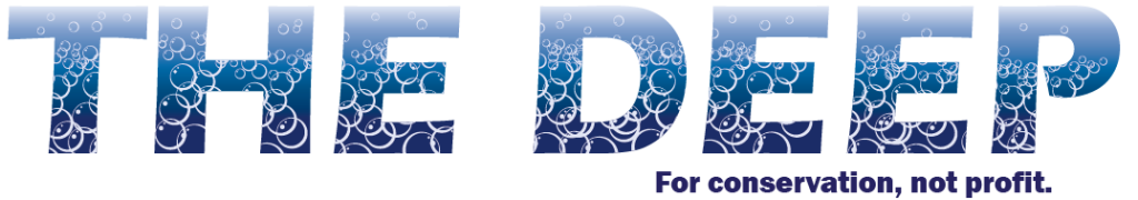
Here is my redesign of The Deep logo. For my first attempt I replaced the ‘D’ with a Jellyfish. I wanted to make it look like it was swimming through the letters. This will also give the audience a better idea of what the deep is compared to the original. However, the problem with this logo was that half of it is not legible due to the tentacles covering most of the word. Another problem is that the word, ‘deep’ is plain compared ‘the’. For my second approach of redesigning this logo I wanted it to relate more to the name itself. For this I added bubbles which would appear in a tank at the aquarium and has an immediate association with the sea/water. I then added the bubbles into the letters to make it look like it was under water. liked this design but I was not satisfied with the final result, so I added a gradient to the background to make the water look like it goes deeper. Finally, I added the ‘for conservation not profit’ back as I think it’s an important message to tell the audience who will be looking at it and increase interest in the work they do there. Finally, I kept ‘for conservation, not profit’ in bold as it highlights what’s important to the ethos of The Deep.
Original Logo / Redesigned Logo
References
Figure 1: Bristol Aquarium (2009) Bristol Aquarium. https://www.google.com/url?sa=i&url=https%3A%2F%2Fwww.accesscard.online%2Fproviders%2Fbristol-aquarium%2F&psig=AOvVaw2-wSJO28jT0Pj653ea8Mxk&ust=1729763245206000&source=images&cd=vfe&opi=89978449&ved=0CBQQjRxqFwoTCPCz3K-cpIkDFQAAAAAdAAAAABAK (Accessed 18/10/23)
Figure 2: The Deep (No Date) The Deep. https://www.google.com/url?sa=i&url=https%3A%2F%2Fwww.thedeep.co.uk%2F&psig=AOvVaw2k1a8toC415e8rpY43hPG3&ust=1729763437834000&source=images&cd=vfe&opi=89978449&ved=0CBQQjRxqFwoTCODw54udpIkDFQAAAAAdAAAAABA4 (Accessed 18/10/23)