Good Example
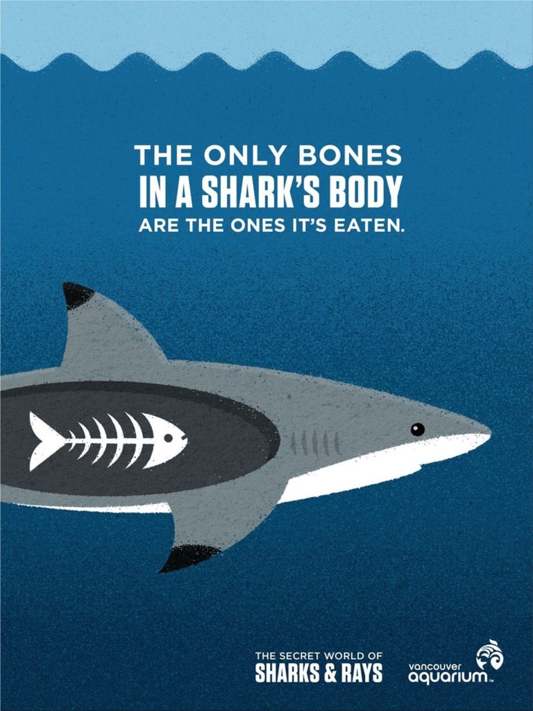
(Figure 1) A good example of composition
This is my example of good composition. This is a poster for the Vancouver Aquarium advertising their shark exhibition. This poster is a good example because it’s simple in it’s design but tells the audience everything they need to know. The main focus of this poster is the shark in the middle, I think it’s more effective that there’s only half of the shark on the poster, this is because it looks like it’s swimming past just like you would see in an aquarium. Another great thing about this poster is the text at the top, I really like this because it grabs your attention and is informative. If families are walking past this poster it is eye catching might and when they read it, they may want to learn more about sharks. The text also relates to the image below it. Each line of the text is in a different font however they work together well. The text highlighted in bold says ’in a shark’s body’ which directly relates to the shark’s body below. The aquariums logo and exhibit are in a smaller font and out of the way in the bottom right corner, I think this is good because it does not distract you from the main focus of the poster. I also think this poster is a good example of composition because it looks like most of the poster is under water. The water in this poster looks like it is a gradient from dark to light blue, this makes it look like the shark is in deeper water and helps separate the different blues used for the sea and sky.
Bad Example
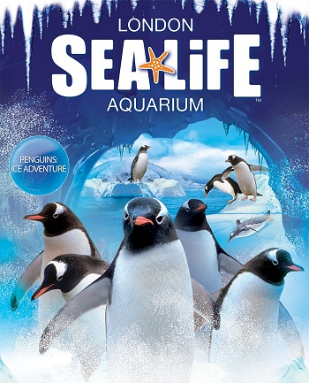
(Figure 2) A bad example of composition
This is my example of bad composition. This poster is an advertisement for penguins at Sea Life, London when they was introduced to the aquarium. The main focus that draws you in is the penguins that are at the front, especially the one that’s looking directedly at the viewer. One main problem with this is there is so much going on in the background, it draws attention away from the penguins at the front. The logo at the top takes up too much space which also draws you away from the penguins, who should be the main focus and purpose for this poster. I like the frost effects over the whole poster that the designer has included as it sets the atmosphere for the exhibit, however I think that the circle with the text ‘penguins ice adventure’ on the left is unnecessary and does not blend in well with the rest of the poster and is only telling you what is already being advertised. This poster also doesn’t say what type of penguins these are or any information about them. So overall the posters effectiveness is limited.
My re-design of the bad example

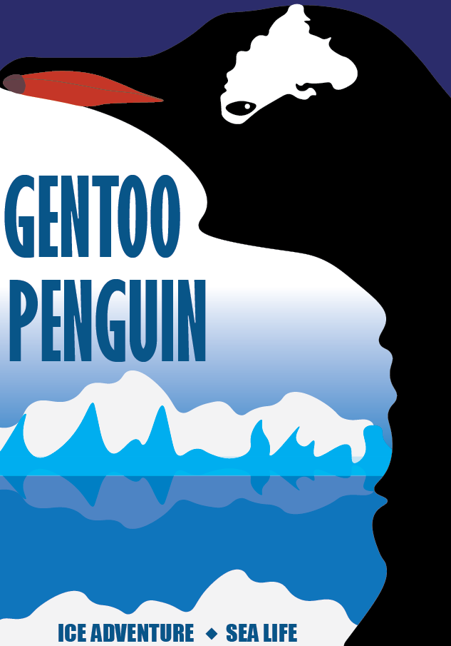
Images used to make this poster (Figure 3)- Penguin (Figure 4)-Iceberg
This is my redesign of the sea life poster. I wanted to completely start from scratch because the poster had too much going on for me to remove. I wanted the penguin to be the main focus of the poster, but I did not want there to be multiple penguins like the original. So instead, I decided to keep it to one penguin. I used an image like the one below (fig. 3) as a reference and drew over it to create the same type of penguin as the ones in the original poster. I did this so the viewers of this poster would not be overwhelmed with too much going on. It is also easier to understand. The next thing I changed was what the poster said, I included the type of penguin on the poster so the audience would know more about what they are seeing. To go even further I added a scene of icebergs and the sea to set the atmosphere of the exhibit like the original poster did. Then I created a gradient to blend the blue sky into the white of the penguin. The new font I chose blends in well with the poster and I changed its colour to a darker blue to match the colour pallet of the poster. The penguin in the poster however was not really visible so I added some dark blue to make the image of the penguin clearer.
Original Poster / Redesigned Poster
References
Figure 1: TAXI, Vancouver, Canada (2013) Vancouver Aquarium: The Secret World of Sharks & Rays. https://www.google.com/url?sa=i&url=https%3A%2F%2Fwww.adruby.com%2Fprint-ads%2Fvancouver-aquarium-secret-world-sharks-rays&psig=AOvVaw3dsdnro3QFN-mbNPqO-bFW&ust=1729758306970000&source=images&cd=vfe&opi=89978449&ved=0CBQQjRxqFwoTCJji2pWKpIkDFQAAAAAdAAAAABAb (Accessed 23/10/2014)
Figure 2: Sea Life London ( No Date) SEA LIFE London Aquarium Tickets. https://www.google.com/url?sa=i&url=https%3A%2F%2Fwww.1st4londontheatre.co.uk%2Ftickets%2Flondon-aquarium&psig=AOvVaw09Qfa96mRN8feEO_Oaf1Fy&ust=1729759361669000&source=images&cd=vfe&opi=89978449&ved=0CBQQjRxqFwoTCNjj3fONpIkDFQAAAAAdAAAAABAK (Accessed 23/10/2014)
Figure 3: MostafaElTurkey36 (2020) Gentoo Penguin Penguin Gentoo royalty-free vector graphic. https://www.google.com/url?sa=i&url=https%3A%2F%2Fpixabay.com%2Fvectors%2Fgentoo-penguin-penguin-gentoo-bird-5530277%2F&psig=AOvVaw3C1fwpxOxuLfejztWeB33l&ust=1729759871188000&source=images&cd=vfe&opi=89978449&ved=0CBQQjRxqFwoTCLClk-mPpIkDFQAAAAAdAAAAABAJ (Accessed 23/10/2014)
(Figure 4) Dreamstime (No Date). https://thumbs.dreamstime.com/b/cartoon-winter-polar-arctic-antarctic-ice-landscape-iceberg-sea-vector-illustration-ice-berg-ocean-glacier-arctic-117144160.jpg?w=768 (Accessed 23/10/2014)