Good Example
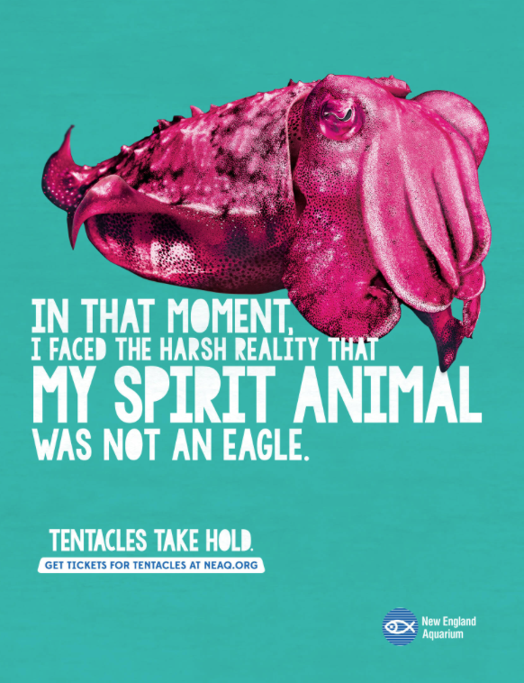
(Figure 1) First good example of colour
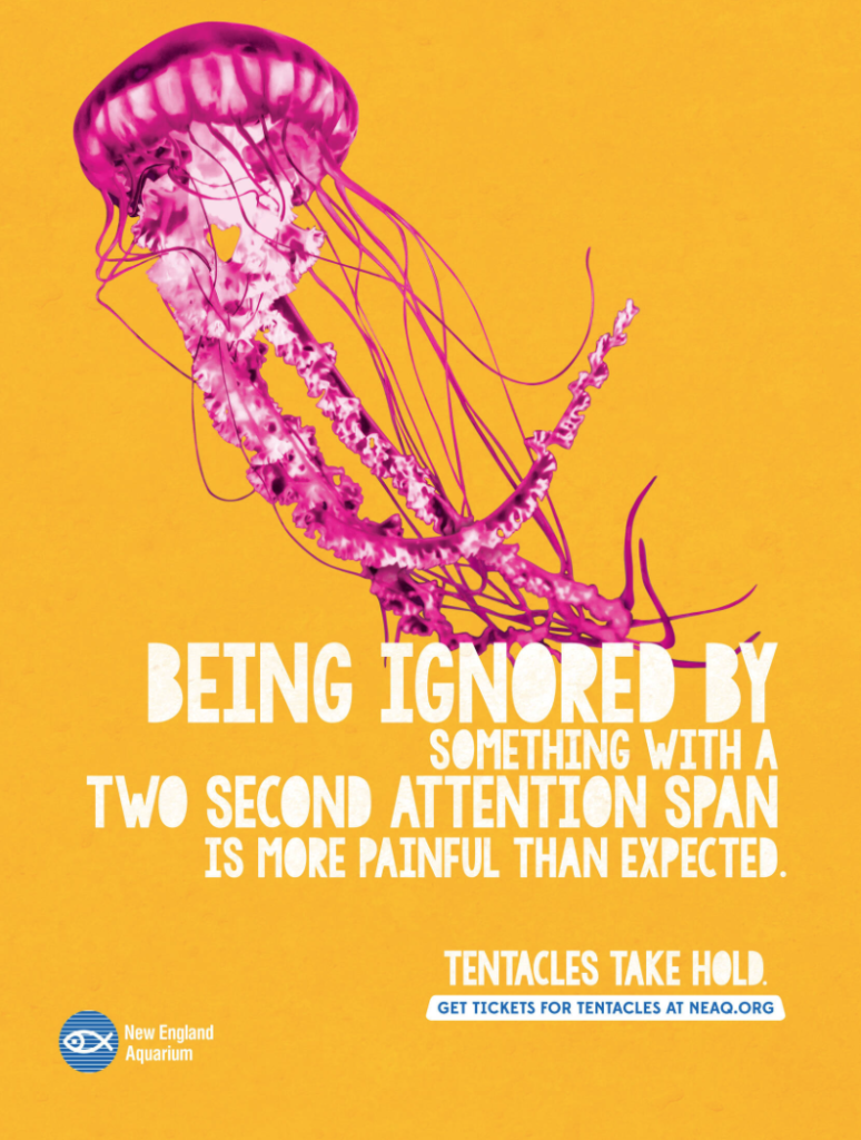
(Figure 2) Second good example of colour
This is my good example of colour used in advertisements. These are posters to advertise a new exhibit at the New England aquarium. In these posters they use contrasting colours to catch people’s eyes and make them want to visit. The first poster shown uses a pastel blue background which could represent the water in the tanks at the aquarium. Then the sea creature is in a bright pink which contrasts the blue background well. The sea creature being bright pink also draws the viewers eyes towards the text directly underneath. The second poster uses the same bright pink that makes the sea creature stand out more and direct your eyes to the text underneath. However, this time the background is a mustard yellow. This colour is slightly darker than the previous poster but still stands out. Both of these posters use different colour backgrounds, but the same bright pink is used for the sea creatures and the same white font is also used. Both draw the viewers’ attention. The aquariums logo being darker blue stands out well against the mustard yellow and will make people look down to the text. However, the logo is not as visible in the blue poster because the dark and light blue blends in together. The designer has not used the normal blue you would expect from an aquarium which more often tends to be a deep blue.
Bad Example
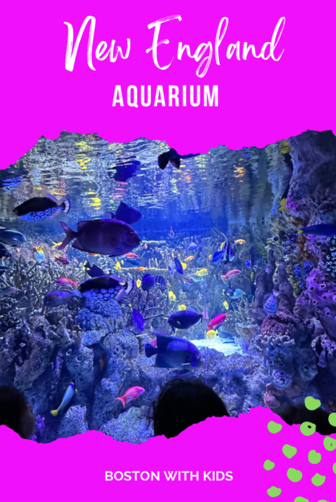
(Figure 3) A bad example of colour
This is my example of a bad use of colour in a poster. The colours used by the graphic designer for this poster clash with the image in the middle. The bright pink is eye catching but takes your attention away from the picture of the aquarium, so it is overshadowed by the bright colours at the top and the bottom. It also causes the image to make less sense until you really look at it. The white text is lost in the bright pink and almost looks pink itself. In the right corner of the poster is some neon green spots that don’t add anything, clash with the pink and has no meaning. The colours in the picture are predominantly blue and purple/pink so would need a colour to match better with it.
Redesign
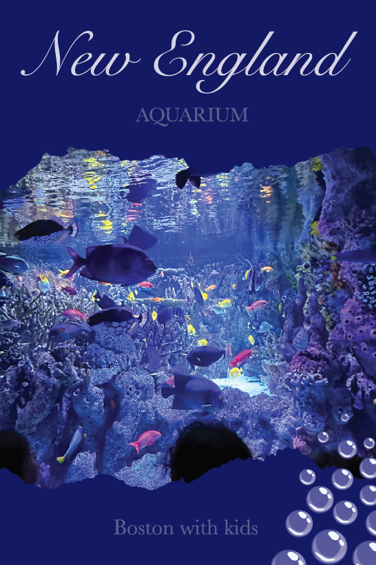
This is my redesign of the poster (Figure 3). I decided to change the bright pink to a more neutral blue that matched the image better. I wanted to make it look more pleasing to the eye by taking away the bright colours. I then changed the neon green spots to bubbles, so it related to the poster more to the aquarium and was not as bright. I changed both fonts however kept one in cursive and one in print, so it still related to the original poster. I then changed the colours of the font from white to dark blue to blend more into the poster. I made the poster a dark blue because it makes the image stand out more and appear brighter.
References
Figure 1: Connelly Partners, Boston, USA (2016) Tentacles take hold. https://www.google.co.uk/url?sa=i&url=https%3A%2F%2Fwww.adsoftheworld.com%2Fcampaigns%2Ftentacles-take-hold&psig=AOvVaw0KXOxira6lu3JDUtyyT4V_&ust=1729764474284000&source=images&cd=vfe&opi=89978449&ved=0CBQQjRxqFwoTCICyv_ugpIkDFQAAAAAdAAAAABAJ (Accessed 23/10/24)
Figure 2: Connelly Partners, Boston, USA (2016) Tentacles take hold. https://www.google.co.uk/url?sa=i&url=https%3A%2F%2Fwww.adsoftheworld.com%2Fcampaigns%2Ftentacles-take-hold&psig=AOvVaw0KXOxira6lu3JDUtyyT4V_&ust=1729764474284000&source=images&cd=vfe&opi=89978449&ved=0CBQQjRxqFwoTCICyv_ugpIkDFQAAAAAdAAAAABAT (Accessed 23/10/24)
Figure 3: Crystal (2023) Indoor activities, Massachusetts, New England Aquarium. Activities in New England for young kids. January 18. https://www.google.co.uk/url?sa=i&url=https%3A%2F%2Fkidfriendlynewengland.com%2Fnew-england-aquarium%2F&psig=AOvVaw0KXOxira6lu3JDUtyyT4V_&ust=1729764474284000&source=images&cd=vfe&opi=89978449&ved=0CBQQjRxqFwoTCLDlqJehpIkDFQAAAAAdAAAAABAJ (Accessed 24/10/24)