For my 4 editorial pages I decided to make a leaflet that advertises my aquarium, Ocean Wonders. This is to inform families about what they can do on their days out and see what is on offer at the aquarium.
Sketches
Before started working on these leaflet pages in illustrator I did some sketches to help me plan out what I wanted my pages to look like.
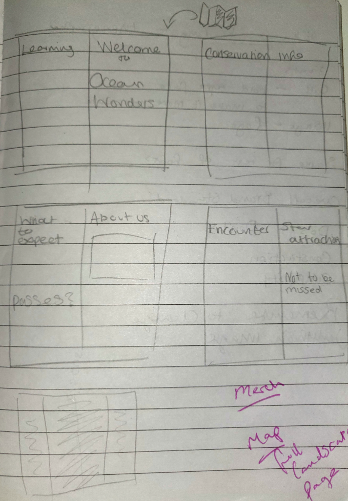
Sketches I made to plan out my pages.
First Page
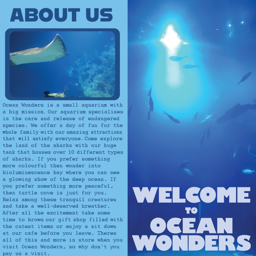
The front cover and first page of my leaflet.
This is the first page of my leaflet. The page on the right is the first page people will see when they look at the leaflet. I used an all blue image and blue text so it would stand out against the multi colour leaflets you’re used to seeing. The logo is in a light blue font to stand out against the darker blue image because it needs to stand out so people will see the name and get curious. The next page is an information page about the aquarium, this is to give people a better idea of what the aquarium is about and tells them what to expect if they visited the aquarium. In this leaflet page and future pages I keep this colour scheme to tie it all together and also relate to the 3 posters I made.
Second Page
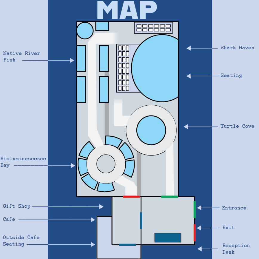
The second page of my leaflet, a map showing visitors where the attractions are.
This is my second page for my leaflet. This time I created a map to show visitors a birds eye view of what the aquarium looks like. The map points out to people what attractions the aquarium has to offer to encourage them to visit. It will also allow visitors to navigate the aquarium easily while there and so add to the enjoyment of the day.
Third Page

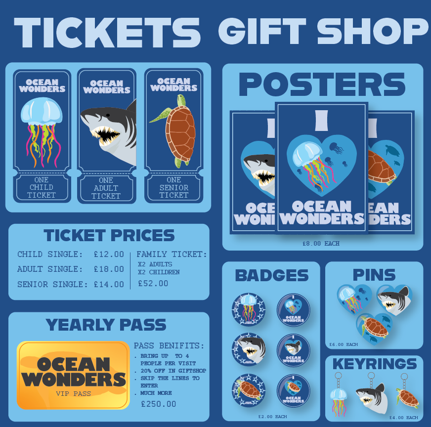
The third page of my leaflet advertising ticket and merchandise prices.
This page split has been split into two where the creese would be when the leaflet is folded properly, just like the first page. The page on the left is to show potential costumers ticket prices and a yearly pass that they can purchases to enter the aquarium. For the tickets I reused the same illustrations I made for the posters as so gives continuity. I made the tickets into a classic ticket shape with a dotted line towards the bottom so it can be tore away. The second thing I made for this page is the VIP pass. I made the background of the pass a yellow gradient to give it the effect it is made out of gold. The right page shows what merchandise is available in the gift shop at the aquarium. I reused the illustrations from my posters to make different pieces of merchandise such as, pins, badges and posters.
Final Page

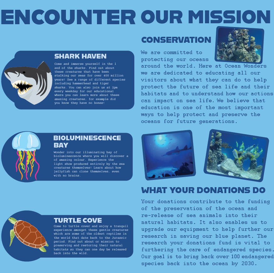
The final page of my leaflet, this is to show what the attractions offer and why the aquarium is important.
For my final leaflet page I also separated it into two, leaving some space for where the leaflet would be creased. On the left page I described what attractions my posters are about. I wanted to keep this part of the page simple so it would be easy to read and understand which piece of writing belongs to which attraction. I put the writing in a dark blue square and made the writing dark blue so it would not blend in with the dark blue writing on the other page. For the page on the right I wanted to tell viewers about the reason the aquarium is vital for sea animals. There was a lot of empty space on this page so instead of reusing the same illustrations from my poster like page 3, I used some photos I took myself at an aquarium. I put a dark blue border around the images to blend them in with the text boxes on the previous page.
Final Outcomes