For my three cover designs I chose to do three posters that advertise the attractions at the aquarium I created for Ocean Wonders. Each poster features a different sea creature in the same style of illustration. All posters look like they belong in a set however do not look the same.
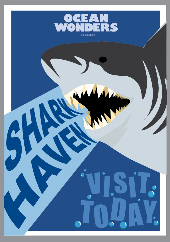
First Poster – Shark

This is my first poster advertising my aquarium, Ocean Wonders. Thy grey background is not part of the poster, it is just to make the white borders visible.
This was the first poster I created. I made the sharks more cartoon like to appeal more to a younger audience. The only thing in this poster that is not blue is the shark, this is so it stands out against the rest of the poster and is eye catching. I made the shark and the name of the exhibit name go over the white border the rest of the poster to make it look like its popping out of the poster.
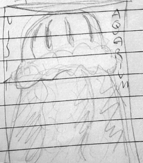
Sketches – Shark
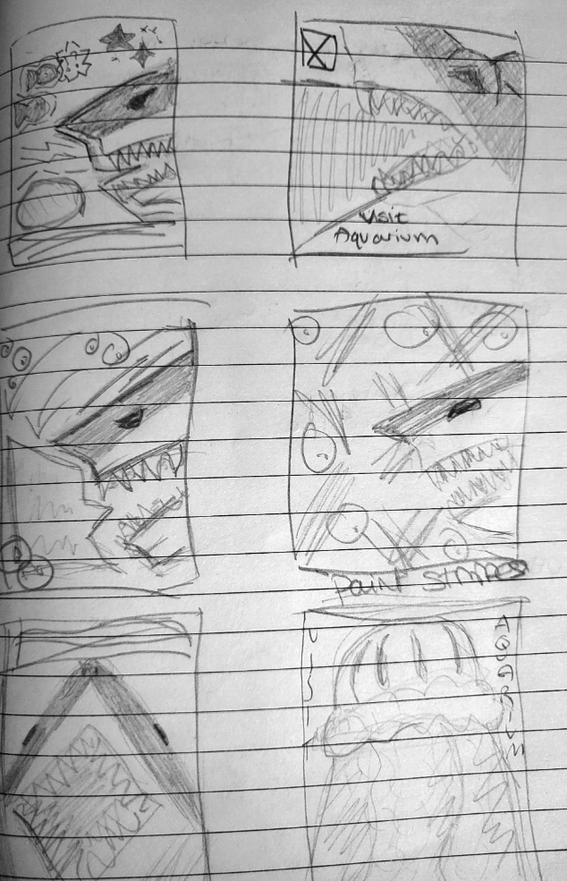
Sketches I made for my shark poster.
These are the sketches I made for my first poster. When I was planning this project I knew that I wanted to add a shark on one of my posters so I used the sketches to figure out the style. At first I made some sketches to work out what position I wanted the shark to be in. These sketches also help me figure out how I wanted the rest of the poster to look.
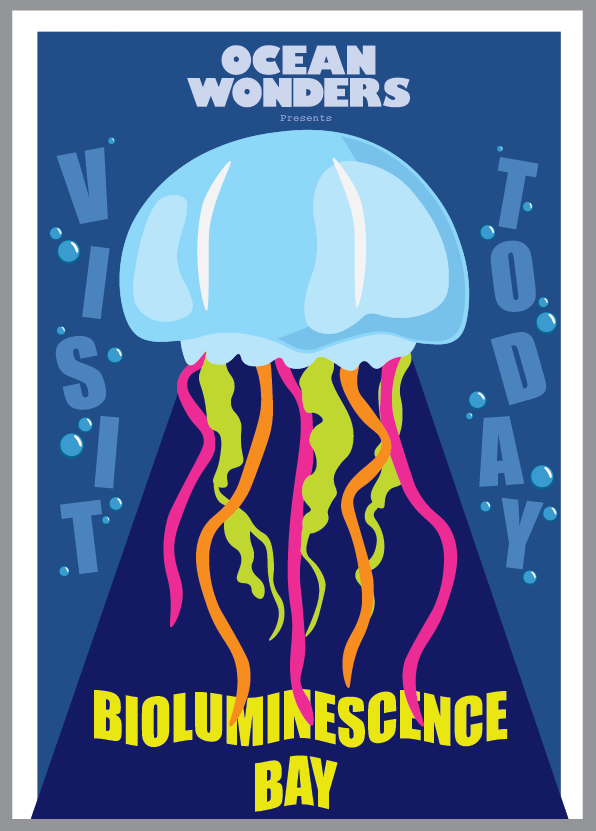
Second Poster – Jellyfish
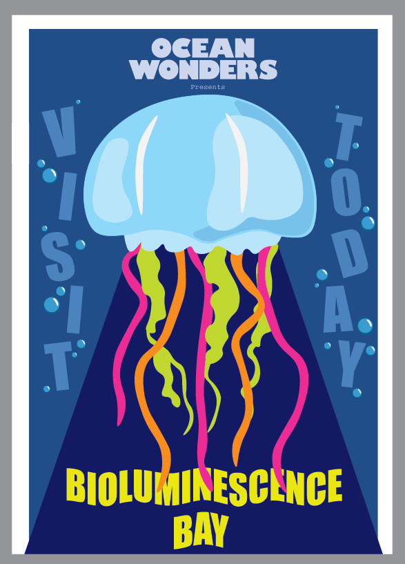
This is my second poster advertising my aquarium, Ocean Wonders. Thy grey background is not part of the poster, it is just to make the white borders visible.
This is the second poster I created of a jellyfish. I gave the poster the same effect as the shark one, colour coming from part of the sea creature, to tie them together. In my first draft of this poster the jellyfish was all blue. When I asked for my classmates opinion on this they said the blue jellyfish blend in too much with the rest of the poster. I remembered that some jellyfish are bioluminescent so I replaced the blue tentacles of the jellyfish with more neon colours. This change makes the poster stand out more but still tie into my previous poster.
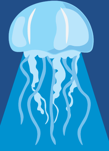
Poster before the colour change
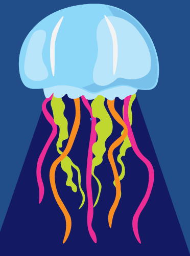
Poster after the colour change
Sketches – Jellyfish
The sketches below are ones I made along side the shark poster sketches. My original ides was to have multiple jellyfish on the poster but I didn’t think it worked well because it would be hard to have it relate to the previous shark poster.
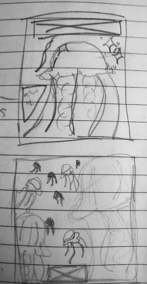
Sketches I made to plan out my jellyfish poster.
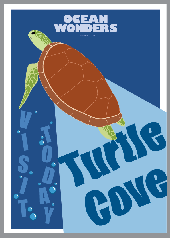
Final Poster – Turtle

This is my final poster advertising my aquarium, Ocean Wonders. Thy grey background is not part of the poster, it is just to make the white borders visible.
This is my final poster for my aquarium, Ocean Wonders. This poster took me the longest out of all three. The hardest part was getting the shape of the turtle right, especially the shell. I made the turtles head and legs more detailed so they would not just be one plain colour. When I first started adding the details to the shell I asked my classmate and teacher for their opinion on it, they said the detailed pattern in the shell does not match with the simple style my other posters are in. So I decided to keep the shell simple, which I think works best.
Sketches – Turtle
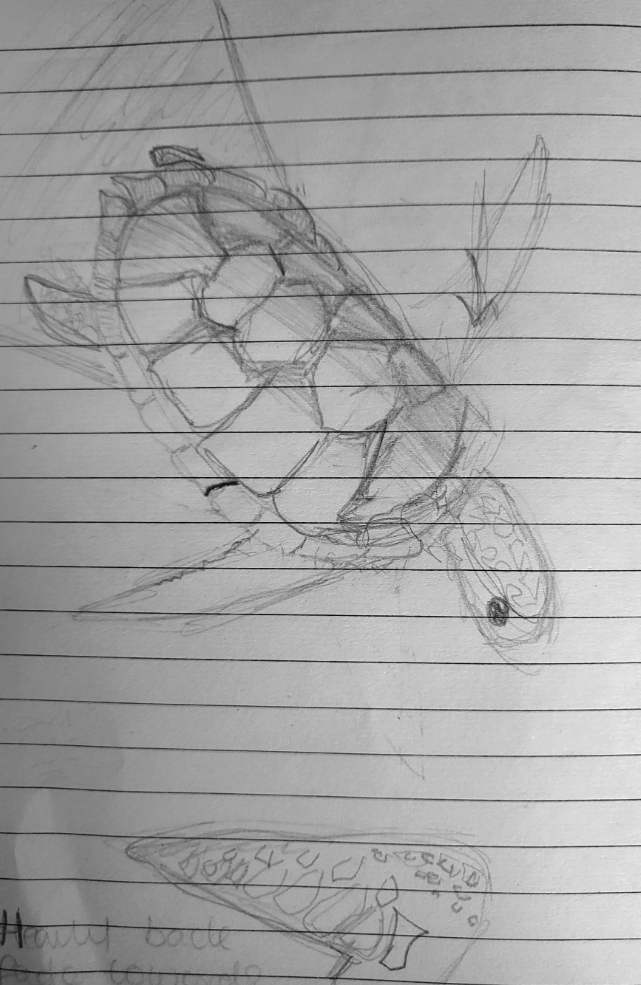
A sketch I made to plan out how I wanted the turtle to look.
I drew these sketches so I could better understand the angle I wanted the turtle to be. At the bottom of the page is a sketch of the turtles arm, this was to work out how I wanted the details to look.
All Three Posters
Here are all my final posters together. The blue background and same art style makes them go together. I also like all they all have a shape coming out of them and how they bleed off the page.