My Assignment
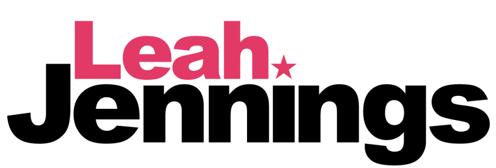
This was the first logo I created. For this logo I used my whole name. I have chosen this font because it represents my personality best, loud and bold. The type is also printed and not cursive, this is because I write the same way as I’ve never been able to write or understand cursive writing very well. My first name is smaller than my last name because I wanted it to fit nicely between the end of the J and the beginning of the I. At the top of the I there is a star, this is because stars are my favourite shape and a lot of the stuff I own has stars or star patterns on them. This star on the I looks like the dot on a lowercase I but also a full stop at the end of my first name. The reason I chose these colours is because black and pink are my favourite, with most things are these colours.
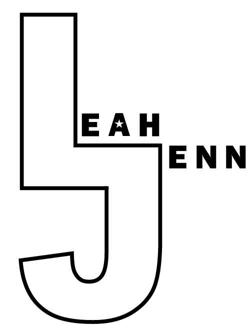
This is the final outcome for my second logo, it is very different from my first logo despite using the same type face. For this logo I shortened down my last name to four letters so it could match the amount my first name has and even it out. I joined up the L and J together to create one shape and I made it bigger so it can catch peoples attention more. I still wanted to add in a star somehow so I used it as the counter in the letter A. For this logo I did not use any colour as I think the outline of the L and J look better. I wanted this logo to look more clean as I’m a very clean and simple person that likes things to be organised.