First Outcome
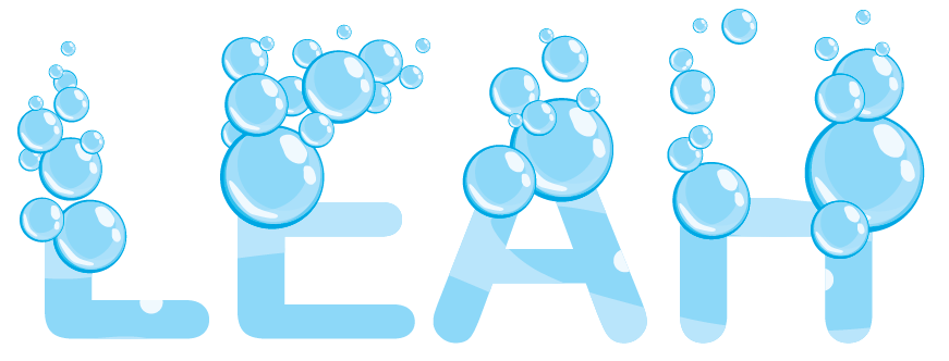
This is the first design I made. For this logo I used the word ‘bubbly’ as I think of myself as a bubbly person. I chose this sans serif font because it is more rounded and lends itself to a more complementary shape to the bubbles so helps them blend in more. I made these bubbles myself by layering different colour circles on top of each other and then added a shine on them by stretching a white circle. Doing this gave the bubbles a 3d shape and by placing the larger ones to the bottom it gives the effect of them floating up to the top. I originally just put the bubbles around the bottom of my name, however, I changed this so that the bubbles were coming out of the letters at the top to as I felt that this worked much better to the overall finished piece . I also made a water like background by using different shades of blue for the inside of the letters as it blends better into the bubbles and also adds depth to the letters.
Second Outcome
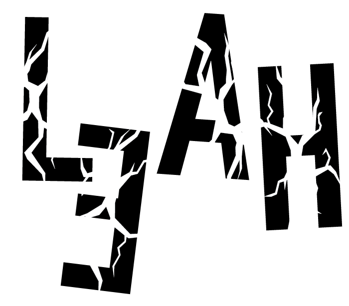
This is my second outcome for this project. The word I used to describe myself was clumsy. I first separated the letters and moved them around so they appeared like they have been messed up or someone has accidentally knocked them over. After this I wanted it to look even more messy so I turned the E the wrong way around and I then lowered it to look like its hanging off the L. To make the words look more like they had been knocked over I drew out a a cracked shape and put it on top of the letters to make them look like they have been shattered.