First portrait
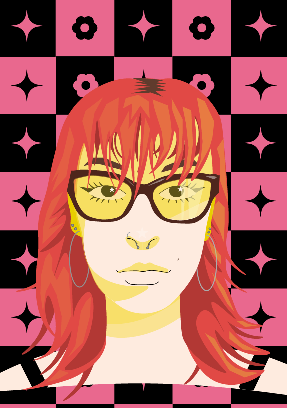
My first portrait, I used a simplistic style and yellow shadows
For this first portrait I first started to make it as accurate as possible to the photo of myself. I realized this would not work very well so decided to try a more simplistic style which worked better. For the shadows on my face, I used different shades of yellow. This originally was by accident, but I liked how it looked so I kept it. Most of my features are simple and only shaped by shadows. For this portrait I added in my glasses because I wanted to give it more definition. I also wanted to add smaller details into my portrait, so I included my piercings and mole I have on my cheek. The background of this portrait is inspired by a checkerboard. The symbols in the squares are flowers, because of my love of flowers and four pointed stars as I always have stars on everything. The reason they are four pointed is because I already completed the background of my other portrait, and I did not want both portraits to have the same looking stars.
Second Portrait
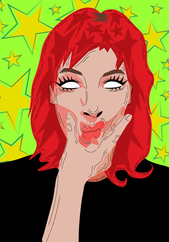
My second portrait, I wanted to experiment with lines and brighter colours
For this next portrait I used lines to make it look like it had been sketched out. For this second portrait I wanted to use a different face with a different expression. I used brighter colours than in my first portrait to make them contrast each other. I decided not include pupils for my eyes in this portrait because the white stands out more against all the heavy lines. This is also because I do not have my glasses on in this photo so I can’t see very well. For the shading in the hair, I used stretched out stars. I decided to keep my shirt plain black because there was already so many bright colours with my hair and the background that having a pattern on the shirt would make the portrait too busy. The background is bright green to contrast the red used for my hair. I added the stars so it wouldn’t be a solid colour and give the portrait more depth. I then outlined the stars and placed the unaligned to get a messier look.